Showing posts with label OUGD504. Show all posts

Wednesday, 15 January 2014

OUGD504 - Module Evaluation

What skills have you developed through this module and how effectively do you think you have applied them?
The main skill I have developed through this modules is my ability to create a concept and sustain it throughout the brief. I have always thought more about the design than the concept so doing this module where everything is concept driven has made me work hard to create solid concepts that make sense and fulfil the briefs set.

The other main skill I have developed in this module is coding with HTML. Coding in general isn’t that new to me, but coding for web is. I found it was something easy to get a hang of because of my past experience, and found it very easy to build up a website quickly. This particularly aided me when I changed my whole visual aesthetic of my website at last minute and had to recode it all.
On top of this my practical design skills have improved with me doing workshops and inductions into some of these.


What approaches to/methods of design production have you developed and how have they informed your design development process?
For this module I have experimented a lot more with hand rendered and other forms of design production, trying to look away from the digital design production. I engaged in screen printing, foiling, flocking, spot varnishing, laser cutting and book binding. On top of this I did an induction in embossing & photo-etching. I found that these were all valuable skills and benefitted me in the development of my briefs.

I have experimented with the format of the briefs given and have tried to design to specifications that I haven’t done in the past, and wouldn’t instinctively go with. This has benefitted me as I feel it has developed my skills as a designer and helped me see that I can apply my skills to different areas of Graphic Design.

What strengths can you identify in your work and how have/will you capitalise on these?
The main strength in my work is the final outcomes. My practical skills when it comes to the final designs have always been strong and I have continued to develop my skills in this area to continue to get the best outcome I possibly can.
Another strength I think I have is in layout and grid designs. I feel I am able to utilise the space given and design to it appropriately. I have used this skill throughout the three briefs and I think this skill has benefitted me in the visual qualities of the final outcomes.
I also do a lot of development of my work by hand and digitally, and have found that this has benefitted me in making more resolute solutions to my briefs.
Another strength of mine is my ability to learn skills fast. I found this particularly useful when it cam to web design and doing the inductions/workshops. I was able to quickly grasp the instructions and skills necessary to fulfil these tasks and get a successful outcome from these.

What weaknesses can you identify in your work and how will you address these in the future?
The main weakness in my work is in my conceptual work behind my responses to briefs. I focus more on the design than the concept and even though I have definitely improved in this throughout this module, I do still feel it is the weakest area of my work. I will continue to spend more time on conceptualising my ideas before getting to the design part of my briefs.
Researching is another part of my work which I think is a weakness of mine. I need to spend more time on this in the future to fully get a contextual background behind my concept and design ideas. I need to particularly focus in on getting better at audience research as this is definitely where I lack the most.

Identify five things that you will do differently next time and what do you expect to gain from doing these?
I would like to spend more time on building up a stronger concept through better research and development instead of jumping straight into the designing stages. Doing this will help me develop as a designer and help me create outcomes which are consistent and useful.
I would like to engage in more inductions and workshops in the future as I have seen the benefit of these throughout this module. These have given me more options to consider for my designs and more way to push these to their full potential.
I would like to experiment further with the formats and scales of my designs as I have found that working to these has challenged my skills as a designer and stops me doing the same thing over and over again.
I would like to work more with photography and experiment with this and combining it with other digital and hand rendered processes to create more exciting outcomes.

I would like to start using more colour in my designs as well. For this modules the outcomes have all been using only one or two colours plus stock, so I would like to work in full colour or more colour.

Wednesday, 8 January 2014

OUGD504 - Design For Print & Web: Final Crit

Today we had the final crits for our Design For Print & Web briefs. For this we were put into groups and each given a Crit Feedback sheet to fill in for the person to our left.
We were given around ten to fifteen minutes each to talk through our response to our chosen brief, and told that the feedback must not be about changing the content or design of it as there are time constraints, that it must be about the response in general and what could be included to improve it.

The feedback I was given:

Strengths

  • The type used on the inside of the packaging is effective
  • Good use of packaging
  • Really strong concept
Areas for Improvement
  • Experiment with fading out the type pattern on the front of the menus
  • Consider working with more of the photography - it works really effectively
Overall the feedback was positive about my response to the brief, with everyone seeming quite enthusiastic about the concept and about the work I had done for it. I think the feedback given as definitely helpful and the points made will improve my final printed outcomes.

Saturday, 14 December 2013

OUGD504 - Final Web Crit

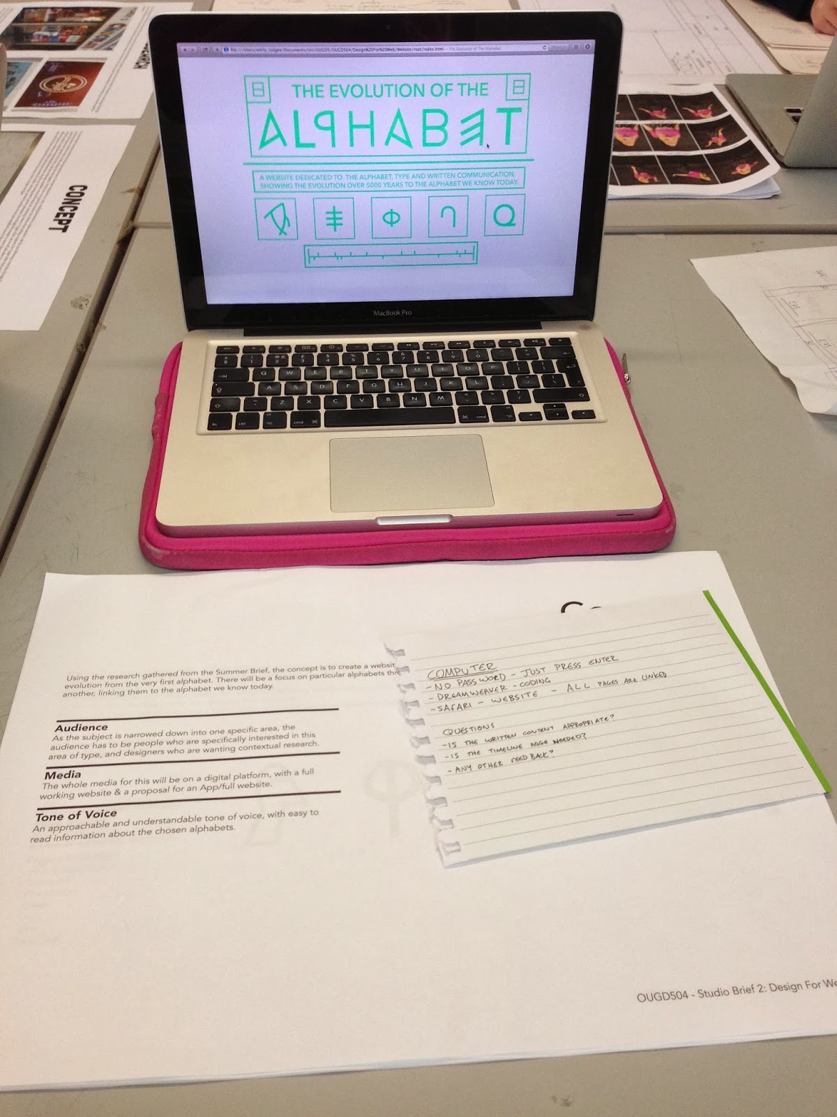
For this crit we were asked to prepare design sheets and leave our laptops to show how far we had come on with the website. We we were also told to think of some questions that we wanted answering.
My questions:

  1. Is the written content appropriate?
  2. Is the timeline page needed?
  3. Any other feedback?
The majority of my feedback didn't actually answer my questions, which was a little annoying, but the couple of people who did answer those questions were helpful and made my decisions easy for those two queries.
The majority of the feedback was design related. There was positive feedback in terms of the overall aesthetic and control of the website. The main point that was brought up was the colour scheme again. Although they agreed that the green was easy to read on screen, a darker colour might be more fitting for the subject and audience as it makes everything a little easier to read.


A comment was made about the navigation being 'daunting' because you didn't know what you were going on until you hovered over it. Although that's sort of the whole point to the rollover buttons, I have taken this comment into account.
One person said that I should consider the audience and their wants and needs for this website, saying that they might not necessarily want such a contemporary design.
Overall I found the crit to be a bit of a mixture between helpful and not. My main queries weren't really answered, but I was given a lot of other feedback related to the design that I will have to take into consideration.

Tuesday, 10 December 2013

OUGD504 - Visiting Lecturer: Numiko

Numiko are a Web Agency within Leeds.

Common perspectives of Graphic Design for web:

  • Too many limitations
  • Need to be able to Code
  • Designing websites must get boring
  • Lack a formal understanding of Design
  • You need to move to London
They have done work for:

Nesta Charity
"Make Things Do Stuff" Campaign

Water Aid Charity
Branding needs to be considered when making for Web

Lewis Hamilton
How Layout and Type translates onto screen

National Lottery
Illustrations of an Entire Typeface


National Statistics
Illustrator made Info-graphic


Channel 4 Documentary
Full screen Experience


IPTV
Designing for TV


Film 4
Scene Stealers


BBC
Using a Framework called a Gel- when companies want consistency through the site

Links to some of their work
http://scenestealers.film4.com
http://www.lotterygoodcauses.org.uk
http://www.bbc.co.uk/arts/yourpaintings/
http://www.time-to-change.org.uk/youngpeople
http://comedyblaps.channel4.com

Discover - Define - Design - Develop - Deploy = Research - Idea - Design - Make - Apply

Understand the Audience

  • Who the audience are? 
  • What they need? 
  • Understanding their digital lives? 
  • What the organisation needs from the digital platform?

Personas
Fictional people created who you can design for with statements of their needs

Write a Creative Brief which is for everyone

guidelines put in place for everyone to follow on any particular brief

Wireframes and Grid system for the Website is to work on all platforms
Like having to make 3 websites - iMac, iPhone and iPad
Make web guidelines - same thing is applied by all designers

Why they want Graphic Designers:

  • Typography is Key Online
  • A Knowledge and Understanding of Designing for Brand
  • Unique Layouts and Concepts
  • Iconography
  • Illustration
Working time
Typically it takes 2 to 3 days for a Proposal piece

3 weeks for Design
6-8 weeks in Front End Design

Looking for Designers with a wide range of skills that can be demonstrated across a range of design

Tuesday, 3 December 2013

OUGD504 - Print Final Crit

Today's crit was the final crit for the 'What Is Design For Print?' brief. For this I brought the mock-ups of my final outcomes for this brief.
This included:
  • Process Flowcharts
  • Format Posters
  • Stock Concertina
  • Book Binding Cards
  • Colour Cards

Mock-ups
For this crit we were split into two groups, where one will leave their work and the other group will crit it anonymously. We were told to write down a number of questions which we specifically wanted feedback on.
My questions:
  • In the book binding cards - Should I keep the stock as it is, with the white stock for text & yellow for the image, or should I have the whole page in one stock colour?
  • In the stock concertina - Should I use white stock or yellow?
  • In stock concertina - Should I keep the black card on the back?
  • In stock concertina - Does the booklet need samples/something else other than text?
Crit Layout
Crit Feedback
Overall the feedback was constructive and helpful. I will definitely take the comments on board that were made. Comments were that I should stick with the stock choices for the book binding sheets and that I should keep the black on the back of the concertina.
Aside from this helpful feedback, the general feedback was that I had a good concept which was interesting and interactive for the reader/user. There were also a couple of comments made on how to improve a couple of points of design, which I will definitely look into.
Although I didn't like the format of this crit as it is anonymous and people criting it don't know the full picture and reasons behind the outcomes, I found that it did answer the specific questions truthfully and fully.

Tuesday, 26 November 2013

OUGD504 - Web Interim Crit

For this crit we were put into groups and had to present our website concepts, wire frames & potential coding, talking through the way in which the website was going to work & navigate.
I showed the three wireframes for my pages as well as the half finished website, which had all the images on but no written content.
Content shown:
 Feedback was generally positive, with people liking the simplicity of the design and the use of vector images instead of photographic images.
The only slightly negative feedback I got was about the colour chosen, more on the reason on why I chose the colour as there was not much significance to it, or a related reason to use it for the content. It was suggested that I change all the colour to black as some people felt it would be more striking.
However I think that colour choice is down to personal preference at the end of the day and I certainly prefer having the green colour over black.
I found this crit useful as it affirmed my ideas on this brief and gave me some useful suggestions and other people's insight into how well the website worked and put across the content & concept.

OUGD504 - Visiting Lecturer: Evolution Print

Evolution Print are a Sheffield based Print House which uses Litho Print and Digital Print
  • Aluminium Plates and Full Colour Prints that can produce 1500 sheets an hour
  • CTP Computers to Plate System
  • Single sheet of cut paper of different sizes- SRA2 (The size of 16 A4's) to B1 (720x1020) - must leave a 2cm bleed around the work
  • Won't print anything less than 70gsm and go up to 450gsm
  • Don't do a spot varnish or laminate
  • Binding is out of house
  • Use 3 paper types: Gloss, Silk and Uncoated
  • Uncoated gives a hands-on organic feel - doesn't give a sharp image
  • Gloss and Silk is sharper and usually for corporate
  • Uncoated bulks up heavier in stock than in Silk - gives a hands-on quality

Differences between Litho and Digital Printing:
  • Litho is better quality - more expensive
  • The maximum size for a Digital print is 2 pieces of A4 (SRA2) which is very limited
  • Digital inks are powder based so you can feel the poster on top of the surface
  • Litho uses vegetable inks
  • Litho allows you to use an extra spot colour
  • Digital is a full colour process
Digital Costing Charge
  • Click charge means a charge per sheet
  • 5 to 10p for black and white or 30p for a colour sheet on just one size
  • Litho is cheaper to print on a large scale
Litho Costing Charge
  • Litho has an initial fixed cost based on Make Readies (£60) 
  • Plate Costs for a Full Colour (£100)
  • Make Readies include getting the inks to the right levels and printing 200 practise sheets to get the prints to the right standards
Printing Methods
  • Work and Turn - one side printed and then you turn it & print same
  • Sheet Work - one side printed then completely different on the other side (8 Plates more expensive)
Printed work for:
  • Judge Gill
  • Pete McKee
  • Manchester City Football Club
  • Lee Goater
  • Activision
  • Design Republic
  • Manchester Modernist
Basic Mistakes made by Graphic Designers before Printing:
  • Bleed - 3mm include Crop Marks and Trim
  • Separate all Designs individually
  • Don't send books as spreads, send as single pages - send as PDFs & as original artworks
  • For books, send covers separate
  • If Spot Colours are not needed, set the to CMYK.
  • Foils/ Separations/ Perforations - Set as a Spot Colour and Overprint so it can clearly be seen on the file
  • Use correct image sizes and at 300dpi
  • To save money when making a booklet, work in either a set of 8 or 16
  • Using just 1 or 2 colour is less expensive
  • They use cylinders rather than tins for ink so they can be reused and have less waste and water used
  • They do work for charity as it is their corporate responsibility
  • The inks and plates used are bought from local supplies but the paper isn't 
  • Coloured stocks are available

Monday, 18 November 2013

OUGD504 - Visiting Lecturer: GF Smith

Paper Merchant
  • 120 year old independent British brand
  • High Quality and well Respected
Specifications
  • Think about the product and consider the stock before
  • 1 million hand-made envelopes a year
  • Printers buy from GF Smith, Designers buy from printers
Products
Black & White or Colour
There are 4 paper types available:

  • Colorplan - 50 Colours, 8 Weights and 25 Emboss Texture
  • Smooths - Creams, Whites and Blacks
  • Textures
  • Specials - Wood Pine, Metallics, Fibreglass Inspired
Factory Services
  • 4 Paper Machines Half a Mile Long
  • Handmade Envelopes
  • Cut Sheets to Size
  • Packaging Prototypes
Beauty In The Making Exhibition - Showcase of work, live envelope making & paper making

After this we were then given the opportunity to look at their types of stock & some of the work that has been produced for them by Made Thought for the ColourPlan range. They made a creative way of displaying the stock choices.

Tuesday, 12 November 2013

OUGD504 - Progression Crit

Design for Print/Design for Web Crit 2

For this crit we were put into groups of six and also had a tutor (Lorraine). Like the last crit we were given a few minutes each to talk through our two briefs and talk about any queries and concerns we had, as well as getting feedback in terms of the concept/design ideas.

Design for Print
For this crit I brought along my new concept for helpful information for new students at LCA, producing a couple of print outs of the flowcharts I have been creating, and talking about the supporting material which will go with them.
Overall the group was positive about my concept, a lot more positive than in my last crit. They thought the concept of flowcharts was an interesting one and was genuinely useful, especially if they were to be put in the right places, near the technology/processes they are associated with.
I was told to think more about the supporting materials and the form in which these will take, maybe thinking about something more interesting than standard booklets/leaflets.

Design for Web
I also brought along my new concept for the website, looking into the evolution of the alphabet instead of into hand drawn type.
I got a positive response to the minimalist layout design and simplicity of it, however it was mentioned that it is hard to know exactly what the website is about, so a small description or 'about' section will be useful to include.
In reference to content, it was said that I need to focus it down and read over the research and pick out the important points to write about and make it relevant and worth knowing instead of just writing content for the sake of writing it. It was suggested that I look into why the alphabets are the way they are and why people needed the alphabets in their times.

Overall I found this crit was a lot more positive than the last and did help me in reaffirming that I had made the right choice changing both of the ideas in the way I have. The feedback was constructive and definitely something I will consider when designing further material for both briefs.

Tuesday, 5 November 2013

OUGD504 - Peer Interim Crit/Study Task 7

Design for Print/Design for Web - 5/11/13
In this crit we were put into groups of about 8 and given a couple of hours to go round and talk about our project concepts and design decisions, and then criting each other. In our group we decided to talk about Design For Print first as we thought this brief was more important for the minute, and then do a quick crit for Design For Web at the end for those who wanted it.

Design for Print
I presented my initial ideas for my brief, which was to create a book containing all the information a new designer would need to know about designing for print and information on how to design for print, with tips and illustrations to show print processes etc.
I showed my initial design ideas, showing the two completely opposite ideas I had for the overall aesthetic of the book; the first being a more playful & hand drawn aesthetic which largely played on screen printing, with packaging that highlights this. The second is a completely digital look with a very clinical & clean approach.
Overall the reaction to the first idea was positive, especially for the packaging, however it was commented on that I hadn't narrowed the research down because I hadn't chosen a specific audience. As I had gone for a broad audience, it is hard to narrow the research down, so I had planned to make a book including everything.
At the time I didn't think this crit was successful as it made me question every design decision I had made until this point, however in hindsight it has had a positive affect because it has made me think a lot more about who this will be aimed at, why, and what they would need it for.

Design for Web
I presented my plans for a website on hand-drawn type, and like the crit for print, audience was brought up again. Who would want to go on the website, and what would they expect/want to find on it?
Initial thoughts were that they liked the layout design I had done for the homepage, but needed to think more about the content I was using on the website and why I was using it. To do this I need to go back to my research and look over it, research further and decide exactly what needs to be included and have a good reason for it.