Monday 16 December 2013

OUGD502 - A Design Strategy: BVD

Website

BVD is a design company based in Stockholm, Sweden. They work in a variety of different fields from branding to environmental design.
"Simplify to clar­ify. Together with our clients, we move brands and make them innovative, sus­tain­able and con­tin­u­ously prof­itable. Being based in Scan­di­navia we believe that dia­logue, hon­esty, inclu­sion and hard work are key ele­ments when cre­at­ing good and last­ing design"
I have been following BVD for a good while now after finding them through a design blog. While I had originally only like around half of the work they had produced, I have found that their newer work is much more appealing to me and have found myself following them much more than before.

The first project that drew my attention to them was their 7-Eleven coffee shop update. I found that it was contemporary, colourful but had a very simple concept behind it which was executed very well.

7-Eleven
7-Eleven decided to update their cof­fee con­cept for the Swedish mar­ket and empha­size a smart and con­ve­nient brand expe­ri­ence. The iconic stripes is the take-off point of our design. Mod­ern and clear branding.

Jakob Fridholm
All. About. One. A web­site for a pho­tog­ra­pher should be sim­ple, yet beau­ti­ful. As a vis­i­tor you want a quick overview. You want big pho­tos pre­sented with­out clut­ter. Finally, you want to meet the photog­ra­pher. Meet Jakob Frid­holm. jakobfrid​holm​.com

Reitan
More and more we choose a quick sand­wich, wrap or salad for lunch. But if you are in a hurry, it can be dif­fi­cult to see what is hid­den in the pack­ag­ing and tricky to find what you are look­ing for. Is the food fresh? Is it healthy? With new pack­ag­ing 7-Eleven and Press­byrĂ„n in Swe­den want to enhance their fast food range.

Saturday 14 December 2013

OUGD504 - Final Web Crit

For this crit we were asked to prepare design sheets and leave our laptops to show how far we had come on with the website. We we were also told to think of some questions that we wanted answering.
My questions:

  1. Is the written content appropriate?
  2. Is the timeline page needed?
  3. Any other feedback?
The majority of my feedback didn't actually answer my questions, which was a little annoying, but the couple of people who did answer those questions were helpful and made my decisions easy for those two queries.
The majority of the feedback was design related. There was positive feedback in terms of the overall aesthetic and control of the website. The main point that was brought up was the colour scheme again. Although they agreed that the green was easy to read on screen, a darker colour might be more fitting for the subject and audience as it makes everything a little easier to read.


A comment was made about the navigation being 'daunting' because you didn't know what you were going on until you hovered over it. Although that's sort of the whole point to the rollover buttons, I have taken this comment into account.
One person said that I should consider the audience and their wants and needs for this website, saying that they might not necessarily want such a contemporary design.
Overall I found the crit to be a bit of a mixture between helpful and not. My main queries weren't really answered, but I was given a lot of other feedback related to the design that I will have to take into consideration.

Tuesday 10 December 2013

OUGD504 - Visiting Lecturer: Numiko

Numiko are a Web Agency within Leeds.

Common perspectives of Graphic Design for web:

  • Too many limitations
  • Need to be able to Code
  • Designing websites must get boring
  • Lack a formal understanding of Design
  • You need to move to London
They have done work for:

Nesta Charity
"Make Things Do Stuff" Campaign

Water Aid Charity
Branding needs to be considered when making for Web

Lewis Hamilton
How Layout and Type translates onto screen

National Lottery
Illustrations of an Entire Typeface


National Statistics
Illustrator made Info-graphic


Channel 4 Documentary
Full screen Experience


IPTV
Designing for TV


Film 4
Scene Stealers


BBC
Using a Framework called a Gel- when companies want consistency through the site

Links to some of their work
http://scenestealers.film4.com
http://www.lotterygoodcauses.org.uk
http://www.bbc.co.uk/arts/yourpaintings/
http://www.time-to-change.org.uk/youngpeople
http://comedyblaps.channel4.com

Discover - Define - Design - Develop - Deploy = Research - Idea - Design - Make - Apply

Understand the Audience

  • Who the audience are? 
  • What they need? 
  • Understanding their digital lives? 
  • What the organisation needs from the digital platform?

Personas
Fictional people created who you can design for with statements of their needs

Write a Creative Brief which is for everyone

guidelines put in place for everyone to follow on any particular brief

Wireframes and Grid system for the Website is to work on all platforms
Like having to make 3 websites - iMac, iPhone and iPad
Make web guidelines - same thing is applied by all designers

Why they want Graphic Designers:

  • Typography is Key Online
  • A Knowledge and Understanding of Designing for Brand
  • Unique Layouts and Concepts
  • Iconography
  • Illustration
Working time
Typically it takes 2 to 3 days for a Proposal piece

3 weeks for Design
6-8 weeks in Front End Design

Looking for Designers with a wide range of skills that can be demonstrated across a range of design

Monday 9 December 2013

OUGD502 - A Design Strategy: Catalogue

Link
Catalogue is an independent graphic design studio founded in 2010 in the North of England. We specialise in design for print, branding, identity, books, exhibition and web. We work for both commercial clients and on self initiated projects. 
Extended self initiated projects include an independent publishing platform Catalogue Library and a bi-annual magazine Library paper, both of which are stocked in shops worldwide.
I came across Catalogue while searching for different kinds of design agencies in Leeds. While I find their work is very different to mind, I do like some projects and find that it is quite refreshing to find a agency who really has a very clear vision and style to their work.

I also like the fact that this studio is mainly based in editorial design. That isn't something I have found previously. A lot of studios are mainly in branding, but to find one which has a larger interest in editorial is really great to see, especially because I enjoy editorial work myself.

I really like their use of image across all of their work. They mainly work with photographic images, and seem to like using them in monotone colours, contrasting against a text overlay.

Below is a selection of work which shows off the unique style of Catalogue.

The National Skateboard Co.

Gig posters

SlowDownJoe


Vibrations Magazine

Tuesday 3 December 2013

OUGD504 - Print Final Crit

Today's crit was the final crit for the 'What Is Design For Print?' brief. For this I brought the mock-ups of my final outcomes for this brief.
This included:
  • Process Flowcharts
  • Format Posters
  • Stock Concertina
  • Book Binding Cards
  • Colour Cards

Mock-ups
For this crit we were split into two groups, where one will leave their work and the other group will crit it anonymously. We were told to write down a number of questions which we specifically wanted feedback on.
My questions:
  • In the book binding cards - Should I keep the stock as it is, with the white stock for text & yellow for the image, or should I have the whole page in one stock colour?
  • In the stock concertina - Should I use white stock or yellow?
  • In stock concertina - Should I keep the black card on the back?
  • In stock concertina - Does the booklet need samples/something else other than text?
Crit Layout
Crit Feedback
Overall the feedback was constructive and helpful. I will definitely take the comments on board that were made. Comments were that I should stick with the stock choices for the book binding sheets and that I should keep the black on the back of the concertina.
Aside from this helpful feedback, the general feedback was that I had a good concept which was interesting and interactive for the reader/user. There were also a couple of comments made on how to improve a couple of points of design, which I will definitely look into.
Although I didn't like the format of this crit as it is anonymous and people criting it don't know the full picture and reasons behind the outcomes, I found that it did answer the specific questions truthfully and fully.

Monday 2 December 2013

OUGD502 - A Design Strategy: Pentagram

Link

Pentagram is a design agency that I have been following since my foundation year. At the time, however, I didn't realise quite how big they were and how much they had done. Over the past couple of years I have begun to appreciate the amount of work they do, all over the world.

I find it pretty incredible to see a design agency on this scale, doing so much different kinds of design work, from packaging, to information display or interior space design, all while keeping a high standard of work.

This is definitely a design agency which I would love to visit in the future and potentially get a placement there.

Below is some of the work that I particularly like.

Billboard

Archtober 2013

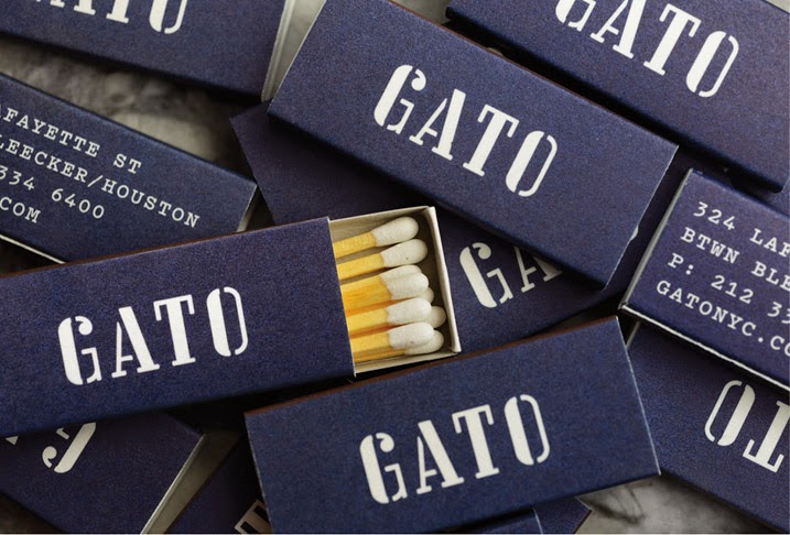
GATO

Saks 5th Avenue

ila
I really like the range of work that Pentagram do. As they are such a large design company, they are in all areas of design, and create some really incredible work consistently over these.