Currently I have the following:
- An identity - bespoke icon & bespoke typeface
- An A3 Portfolio
- A coptic bound portfolio
- Business Cards
- Website - Run on Cargo Collective (+ Personal Domain)
- Behance
Overall I have a variety of things which to an extent do promote me, but there are a couple of other things that I definitely need in moving forward in networking etc.
A CV - When looking at design studios for their requirements for applications, a lot require a portfolio and a separate CV. At the minute, my CV is included in the portfolio, so I need to create a simple document which is just the CV. This also needs to be updated with comments that have been made previously.
A mailout - This will be instead of the coptic bound portfolio. The coptic bound portfolio is large, and with the stitching, it means that it can't be freely updated easily like the A3 portfolio. As something small to send out to studios, a mail out with maybe four or five projects in, instead of the amount in the A3 portfolio will be much better. As it is small it will be easier to work with and change when necessary.
Stationary - A selection of letterheads, invoices etc need to be created. To have a web version of these will also be good as not all clients will be in reach of a paper copy.
Realistically, these are the only three things that I need to complete my professional brand. It seems a bit wasteful to brand other items when its not necessary.
With the portfolio I previously created - the coptic bound one - I had chosen a new identity marker for myself. This is something that I am still happy with, and with a bit of editing, I have decided to continue to use it.
At this point I have also developed a sans serif version of the typeface previously used, so I will be using that from now on instead of the slab serif version. It looks a bit more professional as it is a cleaner and more consistent design.
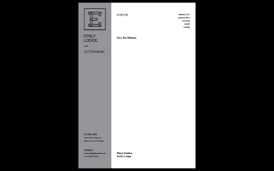
I have also decided on a brand colour of grey to go with the black logo. It's quite professional and I think it works really well with the logo.
CV
For the CV I wanted a very simple layout, and while developing this I found that I really liked the use of a 'side bar' as it were - a strip of the grey along the left hand side where the branded information and contact information would be. It's something quite different to what I have done in the past.

Mail Out
I wanted the mailout to follow the same appearance as the CV in being a structured layout. The main thing for the mailout is that I wanted it to be easily changeable when it comes to the projects in it. To do this, I decided on a very simple layout with switches for each page turn. The grid is also simple so the image spaces can be changed depending on the project.
For this mailout I decided on including projects that showed a variety of skills.
Digital Version:
Stationary
Now that the CV design has been completed it is just a case of applying this to the stationary items which I need - a letterhead and invoice.


With the portfolio I previously created - the coptic bound one - I had chosen a new identity marker for myself. This is something that I am still happy with, and with a bit of editing, I have decided to continue to use it.
At this point I have also developed a sans serif version of the typeface previously used, so I will be using that from now on instead of the slab serif version. It looks a bit more professional as it is a cleaner and more consistent design.
I have also decided on a brand colour of grey to go with the black logo. It's quite professional and I think it works really well with the logo.
CV
For the CV I wanted a very simple layout, and while developing this I found that I really liked the use of a 'side bar' as it were - a strip of the grey along the left hand side where the branded information and contact information would be. It's something quite different to what I have done in the past.

Mail Out
I wanted the mailout to follow the same appearance as the CV in being a structured layout. The main thing for the mailout is that I wanted it to be easily changeable when it comes to the projects in it. To do this, I decided on a very simple layout with switches for each page turn. The grid is also simple so the image spaces can be changed depending on the project.
For this mailout I decided on including projects that showed a variety of skills.
Digital Version:
Stationary
Now that the CV design has been completed it is just a case of applying this to the stationary items which I need - a letterhead and invoice.


Something extra that I decided on adding is an A5 pad of paper with lists for every day. This is due to the fact that I like to write lists of things to complete for a specific piece of work or to complete in a day. It's something that reflects my design practice.

No comments:
Post a Comment