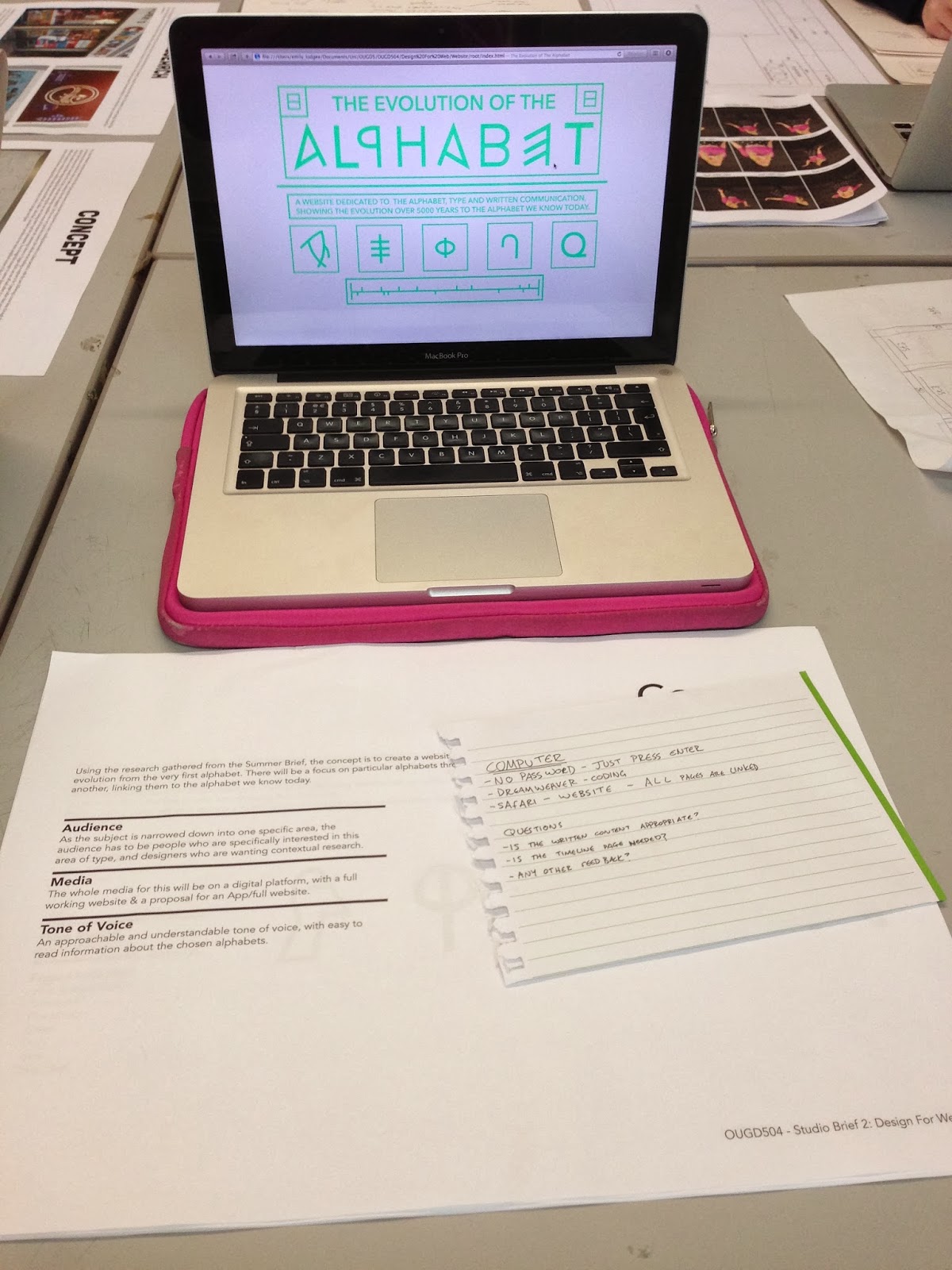
- Is the written content appropriate?
- Is the timeline page needed?
- Any other feedback?
The majority of my feedback didn't actually answer my questions, which was a little annoying, but the couple of people who did answer those questions were helpful and made my decisions easy for those two queries.
The majority of the feedback was design related. There was positive feedback in terms of the overall aesthetic and control of the website. The main point that was brought up was the colour scheme again. Although they agreed that the green was easy to read on screen, a darker colour might be more fitting for the subject and audience as it makes everything a little easier to read.
A comment was made about the navigation being 'daunting' because you didn't know what you were going on until you hovered over it. Although that's sort of the whole point to the rollover buttons, I have taken this comment into account.
One person said that I should consider the audience and their wants and needs for this website, saying that they might not necessarily want such a contemporary design.
Overall I found the crit to be a bit of a mixture between helpful and not. My main queries weren't really answered, but I was given a lot of other feedback related to the design that I will have to take into consideration.
No comments:
Post a Comment