Promotional pack - Promoting myself in personality, practice, what I have learnt, skills, my influences and how I design.
Things to consider:
- CV & contact
- Skills - Strengths & digital experience
- Work Portfolio
- Information about personality
- Information about how I design
- Business Card & Branding
- Leaflets
- Booklets
- Posters
- Postcards
- Pins/Stickers
- Something interactive
- Packaging & overall aesthetic
When first presented with the brief, I was unsure as to how I wanted to create the pack. Before doing research into promotional packs in general I had two different ideas of a starting point for this brief.
Idea 1:
This idea is just a basic set of cards, each with a word I would use to describe my design work, and then on the back, an explanation of why etc.
Mock up:
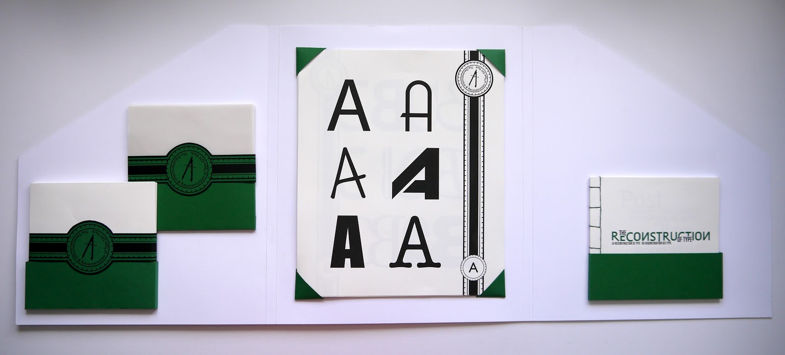
Idea 2:
This idea was either creating a poster, or cards again, going from A - Z, all in different typefaces/looks to show how diverse my work can be, each with a paragraph relating to my work and relating to the letter design.
Mock up:
As Idea 1 is my initial idea and starting point, I did find that once I did research it became a very small idea that could be incorporated into a bigger pack, not so much the pack as a whole. So because of this I think the best course of action is to scrap this idea altogether.
Idea two is more interesting, however limiting myself to the premise of it is a little frustrating. Although creating each letter would be interesting and take time, I did feel that it maybe wouldn't be so much as about promoting me as a designer because the main focus would be on the alphabet, not so much what would be on the other side. Also the fact that there are 26 letters means I would have to find 26 different things to say about myself and my work, which I would find quite hard.
Take these two ideas as a starting point and after doing research into self promotion packs, I decided to start with the basics and choose myself a colour scheme.
 |
| Colour scheme ideas |
As this is a personal project about me, choosing a colour which best fit in with me was easy. The colour schemes above are a few variations into what I could have, however I did go with the first colour scheme as I do feel it represents me better than the rest.
I wanted to keep the idea of some cards of some sort in the pack, so started to design the back of them, with the colour scheme incorporated in it:
After reflecting I have decided that although I do like the design, it doesn't really reflect my designing skills or overall look of my designs very well. I work to block colours with a contemporary look to them, but I feel that although this is a pattern and block colour it doesn't work well and I don't think this is the way forward.
Branding:
Branding myself is a crucial part of this brief, as it will set the tone for the whole pack. I wanted to use shapes, make it simple and recognisable, but a little more interesting than just a couple of letters from a block typeface. So i decided to construct my initials out of shapes as shown below:
I am pleasantly surprised as to how this turned out. It turned out a lot better than I initially expected and I don't think I need to make any changes at all to this. I started variating all the different ways it could be coloured in, using block colours and gradient colours.
I have decided that as all of them are interesting and are all clear, I could use any of these, depending on the context in what I'm using them in. I do think the block colour ones with outlines work better than the rest, but that doesn't mean I won't use the logos with the gradient colours.
Typefaces:
Typefaces are also a very key part to this brief as I want to get across my taste in typefaces. I like sans serif typefaces, but not ones like Helvetica or Arial. I prefer typefaces which are a bit more curved and have a more of a contemporary look to them, like Gill Sans. For headings or titles, I like block fonts which are all uppercase, like Bebas Neue or Franchise. The typefaces I have chosen below reflect this.
The typefaces I have chosen to use are the top one, Duke (filled in) and the 2nd to bottom, Quaver Sans. I think these two best represent the typefaces I like to go for and me as a designer.
Business cards:
Although I plan to have a standard business card as well, I wanted something which was a different shape from a normal card. As I like geometric shapes and like to work with them, I decided to settle on a triangle, but with curved edges so it came out like a plectrum shape instead.
I tried it in four different variations, and quite liked the idea of having the front and back in two different colours.
As I only have a colour scheme at the minute, I wanted to work on creating something which would tie every element of the pack together, so started working on creating a geometric shape pattern which was made up of triangles and keep in with my contemporary style of work.
Creating the pattern:
From here I then started to variate the colour scheme around it to try find the best visual look of it.
I started using black in the pattern, but quickly found it was far too dark and really didn't look good at all.
So I decided to use just white, the turquoise and a darker or lighter shade of this colour too.
I also looked at not using white, just using shades of turquoise, but found that this was also too dark and that the white was needed to break the pattern up a bit.
I decided upon using a lighter shade of the turquoise as it definitely made the pattern look a lot more contemporary and is definitely easier to look at.
 |
| Final chosen pattern |
After creating this pattern, I printed out a copy of it and found that it was very green, so went back to look at the colour scheme. I found that at first it did look turquoise on the screen but as I had nothing to compare it against I didn't realise how green it was at all until now.
So I changed the colour so there was a lot more blue in it:
When creating the standard business card, I experimented with the idea of using the pattern as the front with the logo over the top, but I definitely found it was a bit too much and was definitely better when it was just a block colour.
Initial printouts:
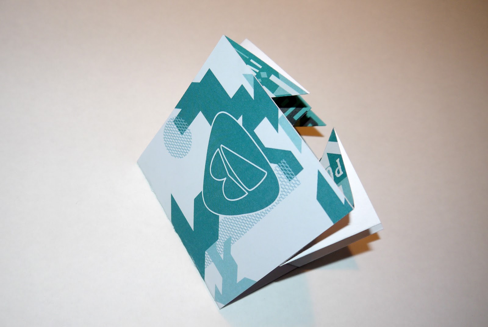
Foldout:
I wanted something which described my work in a page/sheet, and after looking into promo packs, I found quite a few had small foldouts with information on. I will definitely be incorporating this into my design, and I particularly liked this one:
It is quite a simple folding technique that can fit into a small cover and hold quite a bit of information without taking up much room in the pack at all.
I started work on a basic design:
Once all my text was in place, I started to variate on the colour scheme to be used:
When I had the colour scheme done I needed to work on separating each sentence and making them all very clear and balance the page. I didn't want to do anything which was over the top, so just incorporated shapes from my geometric pattern and made a few separators between each sentence, making it very clear where each started and finished.
Once happy, I created a cover which was just simply build up from the shapes from the pattern I created earlier, with a logo on the front .
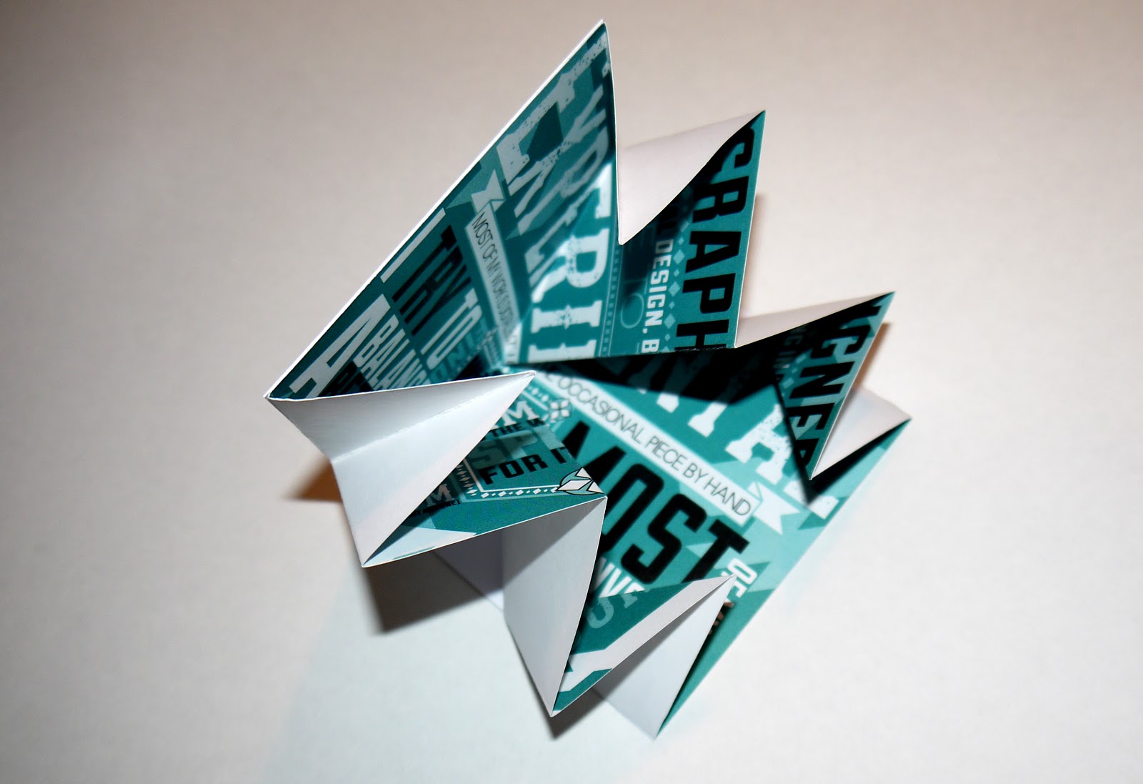
Mock up experiments:
Before printing and trying to fold the design, I did a couple of mock ups to see how easy it was to do.
In mock up 2 I changed the paper size so it was a square, just like my design, and found this worked just as well.
Once confident in my ability to create this foldout easily, I printed the design out and created the foldout.
Although I liked the design I created, I did think it was maybe a bit too much on the eyes and could be simplified down, so I went back into Illustrator and changed it all to the turquoise on white, taking away the geometric pattern shapes as well to simplify it all down. I think it definitely looks a lot better and works better with the cover I created for this foldout as well.
I printed it out and created the foldout again.
CV & Skills:
I didn't want to make the whole focus of the pack on this element of it, so decided to just do one simple sheet with everything needed on it.
I did basic contact information and a list of my education relating to design as a subject, as well as a list of practical skills. This is the most important part of the CV and I did it in a simple format which made it very easy for the viewer to look at. I took the 10 things I feel are most important about myself as a designer and gave them a rating out of 10 as to how good I think I am at each, as well as the three Adobe programs too.
Print out:
Booklet 1 - What I go by to Design:
This first booklet is all about the way I go about design, the similarities in my work and what I continuously do to create my work.
When trying to come up with what I do in all work, I split it down to the main areas and built on it from there.
Main areas - Type, Layout, Ideas, Colour, Aesthetic qualities
From here I thought about what I do in each of these five sections, looking back at my work and the work of designers who influence me, as well as which design work most appeals to me.
I came up with 8 areas which I go by to design:
- Structured layouts
- Simple Ideas
- Geometric shapes
- Variating typefaces for each brief
- Low colour palette
- Colour scheme for a brief
- Incorporating my own typefaces
- Aesthetics of fonts for each part of the brief
From this list, I created the pages which related to them directly.
Final PDF
Booklet 2 - Work Portfolio:
This booklet is essentially just a photo book of all of my past works for the year. I kept it simple by splitting it into two parts, and going in chronological order. The first part of the book is a type & typeface gallery, going through the typefaces and type work I have created within this past year. The second part was a chronological look through the rest of the work I have done.
I decided to keep the layout simple and clear, with only a small border around the work for decoration, as I don't feel there needs to be anything else on the pages so it doesn't detract from the work itself.
Final PDF
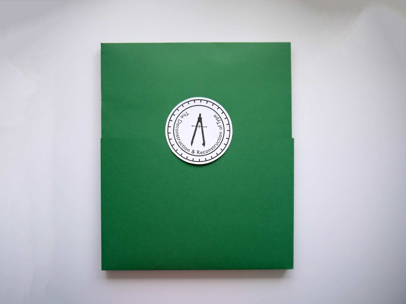
Packaging:
I wanted to keep the packaging simple and easy to open and look through, with each element of the pack with it's own section and slot.
My initial idea was to create a box of some kind to hold everything, but after looking through some promotional packs with this, I didn't like it at all, so decided upon something a bit more interesting.
I decided upon a fold out case, like a cd case, but that opened up twice, and went into a slip to hold it all together.
For the slip, I wanted it to be in black so it was contrasting. Instead of having just a plain black slip which the foldout just went into, I decided to make it a bit more visually interesting by taking some of the shapes from my geometric pattern and cutting them out of the front of it. I also did this on the first two inside pages.
Final Images: