An element to my self branding which I have not done yet is the creation of my proposed website. At this point I do have a Cargo Collective website, and I am in the middle of making that my permanent online presence, updating it with all of my new work before it goes live.
Before getting the Cargo and paying the money to get my own domain name for that, I did look into building my own website, however I felt that I did not have enough experience in website building to be able to do this successfully. Instead, I will work on the proposed website and hopefully in the future this can become a reality.
Second year website
To begin this process I looked over the website I proposed for my previous self branding at the end of second year. It's fair to say that I don't like it at all now and think it's quite childish, and just doesn't look professional at all. It definitely is not reflective of me as a designer anymore.


The main difference in my design from this time last year is that I have been able to refine my skills a lot more, particularly in web design, where I now feel I am excelling at and learning to improve on that every day. With this in mind, I decided on completely scrapping everything I did for the second year and starting fresh.
I wanted a really simple layout with large space for imagery and a consistent approach across all pages.
Development


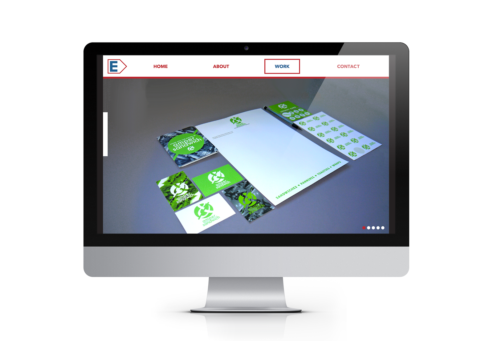
Final Designs

Homepage - I wanted this to be really simple and for the top image to flick through images of my work, giving the viewer a taster of what I do. Below this is a short summary of my design practice. The latest work bit is something just so the viewer can see the most recent work and be able to click on these immediately.

Projects - I decided on a really simple layout in the end, removing the additional information of the date and tags. I think it works really well with just the thumbnails and project titles. It's clean and simple, and I think the choice of typeface works really well here.

Individual Project - After trying a variety of designs for this page, I settled on this one because it is consistent with my branding and the previous pages. The text at the top and imagery below means that the viewer can look through all the imagery together. I also think the layout variation of one large or two side by side images works well and this is something to keep consistent through these pages I think.
Overall I am really happy with the way this final website proposal has turned out. I think it is much more professional than my previous attempt, and the white space works really well in creating a clean and consistent layout and experience. It works really well alongside my branding as well, and I hope that I can have this built some time in the future.
No comments:
Post a Comment