Thursday 15 May 2014

OUGD502 - Module Evaluation

1.  What skills have you developed through this module and how effectively do you think you have applied them?
The main skill I have developed in this module is my ability to be able to go through the motions of setting up a business in a collaboration. I found that as I have a good understanding of business studies, this really helped the group and helped myself understand what was needed to set up a business and how important these skills were. This gave me the experience of a realistic setting up of a business, with a lot of time spent on figures and making sure everything was realistic. It was also an eye opener into how as a new business we would have to promote ourselves to get exposure. Running through these ideas was useful to me as a designer as well as if I were working in a collaboration.

2. What approaches to/methods of design production have you developed and how have they informed your design development process?
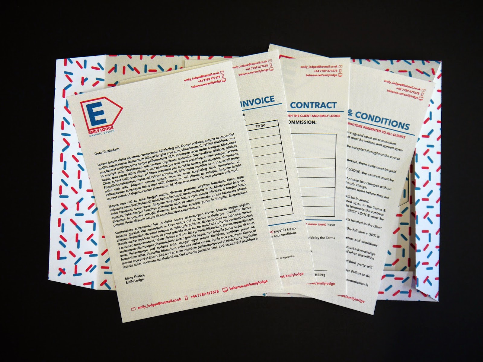
The main method that I have learnt in this module is to do with the paperwork side of the business, learning about how to protect myself as a designer and what I can do and should do when starting freelance work, in terms of payment, copyright, terms and conditions. I found that this was really helpful as it gave me an insight into how I could work if I were freelance or working for a studio.

3. What strengths can you identify in your work and how have/will you capitalise on these?
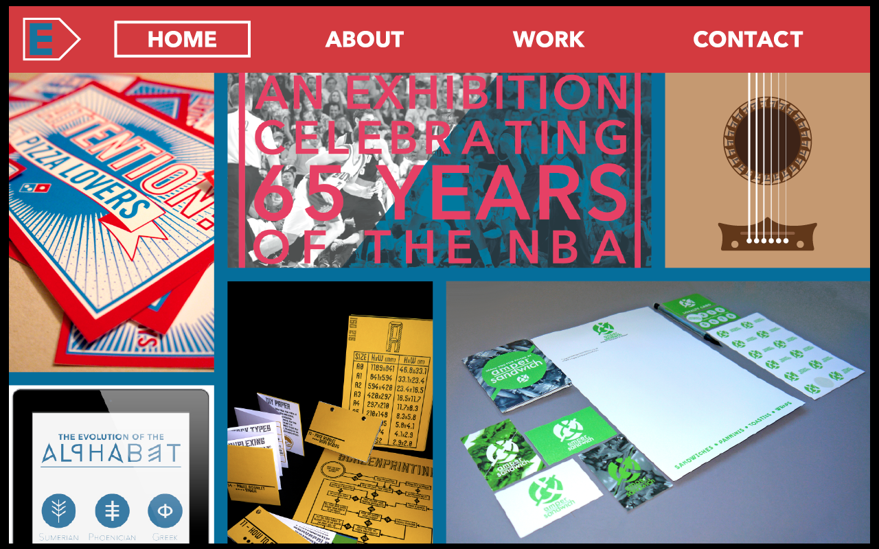
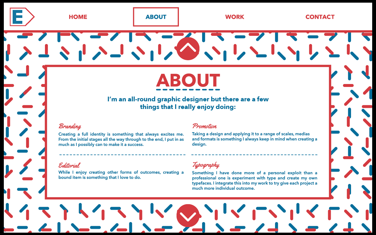
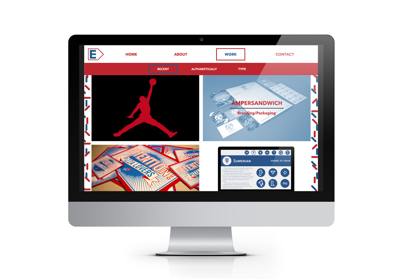
I think the main strength in this module is down to my self branding. I think my ability to create an identity for myself and spread it across a number of different media, scales and formats, has been the strongest of this module. I did find it initially hard to try represent myself with the branding, however when I got it, I went with it and I think it turned out really great. The skills I have developed throughout this year and through this self branding project are ones that I will take forward with me.

4. What weaknesses can you identify in your work and how will you address these in the future?
I think my definite weakness of this year is in my networking. While I have set up a Behance account and taken part in a lot of live/competition briefs this year, I don't feel I am at the point where I would have liked to have been. I would have liked to have more communication with studios and designers, but due to my own shyness and lack of confidence in this, I feel I have wasted an opportunity. Over the summer I would like to visit studios over the country, hopefully and get a placement, or plans for a placement in the next year.
I also think that my oral presentation wasn't as good as it could have been. I think that this was down to lack of preparation and thinking about my own presentation skills. I did a visual, minimal presentation on the idea that I would talk a lot and not have to flick through the slides much, however I found that without some of the images on, I forgot to talk about some important things of the year, which was a bit annoying.

5. Identify five things that you will do differently next time and what do you expect to gain from doing these?
  1. Network more - exposure is just as important as creating the work. I think that networking next year will be fundamental to me getting a placement and job next year as I will be more confident in myself as a designer and in talking to other designers/studios.
  2. Make a presentation which suits my presentation style. Making a presentation that suits my style will mean that I will be able to have a much more fluid and confident presentation.
  3. Spend more time on my self promotion pack. Giving myself a few more days to do the self branding and promotion is something that I would have liked this year, but there wasn't enough time for me, so hopefully next year I will be able to organise my time a bit better to get a bit more time.
  4. Create, code and make my website live. I think getting myself a website up and running live on the internet would give myself a bit more exposure and potentially get myself some clients in the future.
  5. Spend more time researching studios and work that I like. I think that researching a bit more would have helped me generate more ideas throughout the whole of this year, and helped me get an idea into what kind of area I would like to go into as a designer.

OUGD502 - UNIT Studio Visit Reply

Today Si got back to Charlie and I about our request to visit the studio.

Unfortunately due to other students who clearly weren't serious about visiting the studio, UNIT no longer accepts visits.
We feel that this is a real shame because we were both serious about visiting and speaking to him about design, the industry and how we could get ourselves out there and into the places that we want to go. The fact that students didn't turn up/were late to visit is pretty ridiculous to us, as we both feel visiting a studio is something that should be kept to and is an opportunity. The fact that this has stopped our chances of visiting is disappointing.

However, I decided that this shouldn't stop us speaking to him, so discussed with Charlie the idea of sending a few questions in an email that he could answer, and hopefully build up a bit of a relationship and get some good experience down from him.

We both came up with a few questions and sent them to him and now we're just waiting to see if he replies.

Email sent:
Hopefully he will get back to us, even if it's just to answer one of the questions. We also think that sending this will show that we were serious about seeing/speaking to him will make him realise this, so hopefully he will reply.

OUGD502 - A Design Strategy: Behance Update

This is where my Behance profile is today after two months.
 From here, I still have a few projects to upload from this year, so hopefully things will improve. However I am quite happy with how it's going so far. I didn't expect so much so it has been quite a nice surprise to have the amount of project views I have had.

Wednesday 14 May 2014

OUGD502 - UNIT Studio Visit

As Robot Food are currently too busy to have us visit, we decided that we would look around for a couple of other places in Leeds that we would like to visit.

We decided that UNIT was one that both of us would like to visit, so emailed them with the request.


We are waiting to hear back from them, but hopefully we can get a visit with them.

OUGD502 - A Design Presence: Presentation

Monday 12 May 2014

OUGD502 - Studio Brief 2: A Design Presence (3)

Today I photographed all the work that I have done for this brief. I am happy with the way everything has printed and turned out so feel confident that I can get a good set of final images.

Final Images

Promotional Pack

Stationary

Full Set

I am really happy with the way these final photographs turned out. Photographing them against the black made it easy for me to edit them well while keeping all the colour as vibrant as they are. One issue I do have is that the blue on the business cards has turned out a lot darker than on the envelopes. This isn't so obvious on the printed material, but photographed it becomes very clear.

To fully show off my branding, I created some design boards which show every aspect to my personal branding.

Final Design boards:


Overall I have found this project to be enjoyable. While I didn't have much time to get through everything, I don't think that this was an issue at all. I feel I worked at a very productive rate and got a lot of work done in the short space of time I gave myself to do it. With this, I have made work that I am happy with and that is quite strong in terms of visual identity. Choosing a logo, colours, typefaces and a pattern initially really helped me when it came to quick production of the work.

I think that while I have done a lot of the typical stuff for branding and self promotion, I have approached it in a way which represents me as a designer and clearly shows this throughout my designs. I am much happier with this self branding than with how it was last year and feel that it does represent how much I have moved on and developed in a year.

Sunday 11 May 2014

OUGD502 - Studio Brief 2: A Design Presence (2)

After everything was printed, I set about putting it all together before starting work on the rest of the promotional material.

I still need to get a range of appropriate stationary, and design my website, so there's more than enough to keep me busy.

The prints look really good and the stock works really well, so I'm very pleased about that. I was a bit concerned about how everything would look once printed on this stock as it's not one I've used before, but it all worked out well.

The one issue I do have is that some of the images in my portfolio haven't printed as well as they would have on a smoother stock. However it's not a disaster, or close, so I won't be reprinting the pages on other stock. I could always experiment with this in the future, but right now it looks good as it is.

I then started to think about everything that could be included in my branded stationary set. I don't want to do anything for the sake of it. I want everything to have a reason for being there and branded, so this is something I need to think about for a while to decide what I would need right now, and as a designer in the world.

I decided I needed the following things in my stationary set:

  • Letterhead
  • Business Card
  • DL Envelope
  • Poster Tube
  • CD Sleeve
  • A5 Book - Sketch Pad
  • A6 Book - Note Pad
  • Stickers
  • Invoice
  • Terms & Conditions
  • Contract
  • Stickers
  • Paper File
I feel that these items are more than enough to cover everything I would need and use. As I have already produced a few of these, I don't have so much work to do.

I looked over everything I had printed and made up to this point and decided that in this stationary I could use red as a block colour. This means that I'll have a variety between the red, blue and the pattern.

As the envelopes are in blue, I decided that the notepads should be in red. For these, I decided that the covers would be in the watercolour paper, and the stock inside would be cartridge paper, because this is more realistic for me to use and is a lot smoother stock than the watercolour. On the back of the two pads I want to put a piece of card to give it a more sturdy appearance and feel.

Note pad covers:
I like the way these work so decided to keep the red when it came to the cd sleeve. On the inside of this I will put the pattern for a bit of a difference.

CD Sleeve:
 I also made a band to go around the poster tube in the same style.

Poster slip:
Invoice:
 Terms & Conditions:
 Contract:
While I think that the three forms above are essential to my branding as they are giving me a realistic approach to the way I will run if I were a designer, I do think that these will obviously need work in the future. However as they are at the minute, I am happy with them and think they serve their purpose in this project.

After finishing the stationary set I moved onto designing a proposal for a website. At this point I do already have an online presence in the shape of my Behance Page. However, eventually I would like my own website as I think that this is something I would benefit from.

I started by doing a few sketches of a few ideas I had of how the pages could be displayed and work.

I knew I wanted the designs to be very visual and have the main focus on the images over the text, but there are so many different ways in which this can be done, that I found it quite hard to figure out which route I wanted to go down.

To try sort this problem, I started creating the pages using InDesign and developing them as I went along.

I started by creating the navigation bar that I wanted to be fixed throughout the whole website. I decided on four links; Home, About, Work & Contact, as well as the logo in the top left corner.
I then moved onto the page which would display the work. This is the page which I have a bit more of a clear idea of how I wanted it to work.

Design:
 With content:
I decided that it definitely looked better in white, however the image in the bottom left needs to be changed because it isn't framed well in the white.

Work page:

I then moved onto the individual project page, starting with the following design.
 While I don't think this will be the final design, I do like the look of the white strip, so decided to apply this to the navigation bar.
While I originally liked the strip across the bottom because it shows the image off in a large area that's undisturbed, I don't think the text works well down there so I experimented with a couple of different ideas.
I do think that this one looks better as the image is larger and the text seems like it has a bit more of a place on the page instead of just being along the bottom.

One thing I thought was a bit too big was the text in the navigation bar. I originally thought the size was ok, but now I do think it is too big and will make the website look that bit more professional if it is at a more reasonable and understated size. I applied this across both of the pages.
I then thought about the text on the individual project pages. I originally had it along the bottom so it didn't interfere with the image, but where it is now, it does just that, so I want to add to the design that it can be slid away.
I then thought about how I wanted the Home page to be. As the navigation bar is white, I wanted to have a contrast against it so first tried the red.
I definitely don't want to do this on the front page, however I do like what I did on the navigation bar to a selected button with the word turning blue. I applied this to the other pages.

Instead of using the block red colour, I tried out using the pattern and using the same format that I used in the split pages in my portfolio.
I am much happier with this design and think that it has a bit more of a contemporary look and transfers my branding across well. I then started working on the 'About' and 'Contact' pages. I thought that from the Home page, the user can scroll down and would automatically be taken to the About pages.

With this being the navigation, I decided on keeping these mainly text pages to the same format with the pattern and a box around the text. Something that I wanted to do was link it back to the work that I had created for my promotional pack. I think that this would really bring all of my branding together.

I decided to break the About page down to a few different pages, just like the pages I did in the promotional pack.
Happy with these pages and the use of the pattern, I applied this to the 'Work' page and redesigned it to fit in more with how everything else was looking. I also added a bit of a filter system to this page.
 I then tried out a couple of different ideas for the colours used on this page.
I decided that the pattern looks better going right to the edges of the images as it looked a bit abrupt before.

At this point I reviewed all the pages and am very happy with how they all look and work together. I believe I have created enough pages to show exactly how the website would work and the interactive elements.


Final Website Pages:

Home page:

Scroll down from the home page - First About page:

Scroll down - second About page:

Scroll down - third About page:
Work page:

Scroll down - second Work page:

Hover over an image - project name appears:

Click on an image - individual project page: 

Click the text arrows - full screen image: 

Scroll to next images:

Contact page - interactive buttons:

After this I decided to go through the pages and refine them to look more professional because, at the minute, I don't think that everything is as good as it could be.

Final Website