Identify, record and evaluate 5 websites/blogs that:
- Help define information & way finding design
- Help define product & packaging design
- Help define branding & identity design
- Help define editorial & publishing design
- Help define retail & promotion design.
Then:
- Write a brief statement defining your understanding of each of the design areas
- Identify 10 examples of each discipline and categorise them by genre, audience, content, sector, budget and/or any appropriate methods.
- Comment on the effectiveness of the examples with regard to content, format, function & media
Information & Way finding
Information & Way finding is about making life easier for the consumer. It is an
aid or visual representation of data. These are mainly environmental, such as
road signs or directional signs, but also come in the form of data visualisation or
maps. Media form depends completely on context & use.
Categories: Maps, Outside, Environmental, General Audience
 |
| Cardiff University |
This is an interesting way to put up information. Instead of a poster or large piece of media to have this up, projection is used.
Categories: Projection, Event, Scale
 |
| The Design Surgery for The Times |
This is a more classic way of representing data and information created by the Design Surgery for The Times. Using simple pie charts, graphs and percentages it clearly represents the information it needs to and makes it very easy to read, especially with the use of colour.
Categories: Editorial, Charts
 |
| The Design Surgery for The Times |
Another design by The Design Surgery, which is created using the same kind of basis, however this one uses the world map instead of charts, specifically designed for the content it is representing; coffee flavours. Once again the layout is simple, making it very clear to understand all the information.
Categories: Editorial
 |
| Lono Creative for Tropicana |
An interesting spread from the annual report created for Tropicana by Lono Creative. It shows that annual reports can be playful and colourful instead of serious and bland. Using the fruit with percentages makes it very easy for anyone to understand and read, and the colours and simple design help this as well.
Categories: Editorial, Reports
 |
| Axel Peemöller for Eureka |
This is an effective piece of way finding design as it was specially made so that it can be viewed the right way from one direction only, the correct direction to go. It is placed in a car park, and with the large letters and bold colours, makes it very easy to read when in a car. The way it is aesthetically created will also make it easy for the driver to see where they need to go to read it correctly, and by this time, they will be going in the right direction.
Categories: Environmental, Scale.
 |
| Lono Creative for Euro 2012 Campaign |
Another design by Lono Creative, this one of a very different client. The same principles are used however, colours to represent each individual piece of information, but on this one it is done in a way not to overpower the viewer with it, using grey to balance it out and using the colours in a limited sense.
Categories: Editorial
 |
| M&S cardboard signage by Grafic Thought Facility |
This piece of way finding design is effective in the fact that it is very clear with the typefaces, arrow directions and colours used. As there are only five different locations, all with different directions, it makes it easy for the viewer to know which direction to go in to get to the appropriate place.
Categories: Environmental, Inside, Retail.
 |
| Selfridges London designed by Cartlidge Levene |
Like the image above, this piece of way finding is also located in a retail centre. This is a more general way finding design, split into floors instead of being as specific as a way finding system dedicated to one floor of the shop. It is effective in the fact that it is a concise list of what is available on each floor, and is especially good in a situation of a shop with many floors.
Categories: Environmental, Retail, Inside.
 |
| Annual Report by Service Plan |
A visually interesting Annual Report by Service Plan. There isn't much information on each page, but the way it is laid out and shown is the most interesting part. It shows that information graphics can be very simple and don't need to have a huge amount of data on each sheet. The clear colour scheme makes it easy to read each part of the information as well.
Categories: Editorial.
Product & Packaging
Product and Packaging is the relationship between the product, it’s packaging,
and how it is represented to the audience. It is all dependant on how the client
wants the product to be seen by the audience. Packaging can either be part of
the product, something diverse, or just holder of the product.
http://designmuse.typepad.com
 |
| Swear Words for Jacqueline Evans |
This is a simple take on packaging. It is straight to the point, in an easy to read font with nothing to distract you from text. It's effective because of this.
Categories: Simple, Label, Drink
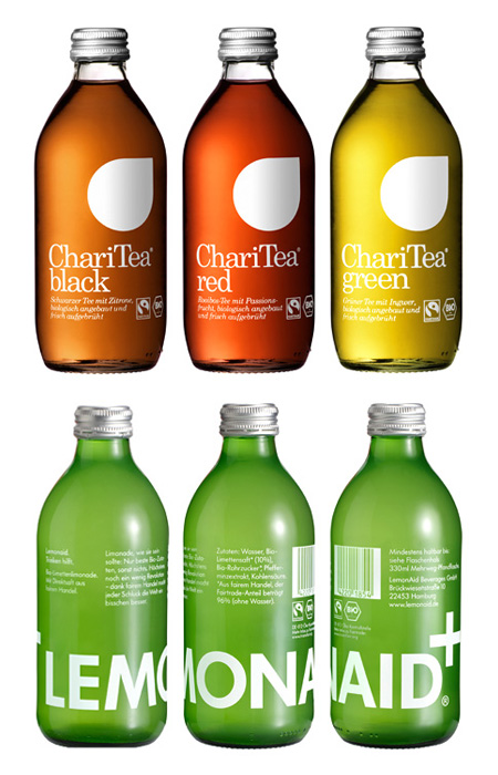
 |
| BVD for LemonAid Beverages |
Like the image above, this is effective because of how simple the designs are. Instead of a label, the text is printed directly onto the bottle and working completely on a minimalist level, taking away everything and anything that could be distracting to the consumer.
Categories: Simple, Drink
 |
| Experimental Jetset for Helvetica |
This is an interesting piece of packaging because of how simple the concept is and how it has been manipulated to be a visually interesting piece of design. There's no colour to cause distraction and no decoration that is unnecessary, with a clear title on each of the designs to indicate what is inside.
Categories: CD packaging
 |
| Parker Williams for Telco |
 |
| Studio Conran for Gordon's Gin |
 |
| Mash Design & Design Museum |
These are effective pieces of packaging because of the simplicity and personalisation of the text. It is very to the point, so the consumer is clear on exactly what it is, and the personalisation element gives the consumer a sense of connection to the product.
Categories: Selection, Simple, Stationary.
 |
| JWT Brasil for Smirnoff |
This is an effective piece of packaging design purely down to the fact it gives an interactive element to the bottle. Peeling off an outer shell, like it is a present, gives the consumer a little extra to make it that bit more exciting.
Branding & Identity
Branding & Identity is the visual representation of a business. This directly
affects how they are perceived by the general public and targeted audience. It
can be as little as designing a simple logo for a brand, to designing and creating
a whole interior for a retail space or creating environmental designs.
http://justcreative.com
 |
| 1968 Mexico Olympics |
This is an effective piece of branding & identity because of the fact a typeface has been created for a specific purpose. It can not be associated with anything else or confuse anyone. It is very clearly for this one purpose and will be recognisable when put on promotional items.
Categories: Sport, Type.
 |
| Manic Design 28 HongKong Street |
 |
| The Consult for Stack Architects |
 |
| Burberry |
This is an effective piece of Identity design as the company Burberry is completely recognisable because of this single pattern, colour and aesthetic look. It might not necessarily be classed as graphic design as such, but someone created it with the idea that it would be the identity for the company.
Categories: Retail, Clothing.
 |
| Inhouse for Caravan |
This is an effective piece of Identity design because it sticks to the same visual look all the way through the products, keeping the same typeface, colours and design. It creates a strong company identity and one which makes each drink relatable to the other.
Categories: Drink.
 |
| Paul Rand for Next |
 |
| Paul Giambarba for Polaroid |
 |
| BVD Identity |
BVD's own personal identity, using embossing and a colour scheme using the stock instead of printed colour is an interesting way to brand themselves. It is simple, contemporary and clean.
Categories: Visual Identity
 |
| BVD for 7-Eleven |
This branding identity is definitely one of the most visually consistent ones I have come across and appeals to me as a designer. BVD reinvented the 7-Eleven brand by reusing their original branding and giving it a contemporary update. It is memorable and the colours used are simple yet very effective.
Categories: Food, Drinks, Visual Identity
 |
| Mucca Design for Brooklyn Fare |
The main thing that makes this a strong piece of Identity design is the use of the typeface and consistent use of block colour backgrounds with no kind of decoration. It is simple and to the point on each element, and has a slight sarcastic humour throughout which gives off the idea that the company is quite a playful one.
Categories: Food, Drinks, Humour.
Editorial & Publishing
Editorial and Publishing is the relationships between image and text on a page. It
involves putting the message across in an appropriate way, visually and con-
textually. It includes; format, presentation, typefaces, point sizes, grids & guides,
stock. It could be creating one single page, or a whole publication.
Categories: Books, Covers.
 |
| Carine Collin |
 |
| John Broadly for Codex magazine |
 |
| Ryan Atkinson for HypeForType Magazine |
 |
| Jean-Pierre Graber - 1985 Issue 6 |
 |
| Andre Meca - London Guide |
Retail & promotion
Retail & promotion is all about the consumers experience in a retail environment,
or when seeing a promotional piece. This can take the form of shop displays
and environmental designs for retail spaces, but also includes events promotions
and advertisement for a client in the form of posters or leaflets.
 |
| Braun |
This array of promotional items are effective because of how simple and to the point they are. They show the product and have the information below, each with it's own colour coded system.
Categories: Promotion, small scale.