At the end of the final crit for our main competition brief we were told that we should review where we were up to in the module at this point and evaluate ourselves against what we set out to do at the beginning, writing an interim evaluation of our progress.
The main aim I had when starting this module was to experience and take part in live/competition briefs. Typically I have shied away from this completely during the first year as it seems like such a huge step to take, to show my work and have other people judge it. Within this aim I had a number of different points I wanted to accomplish through these briefs. The first was that I wanted to work on a variety of different design challenges to expand my skills and improve my confidence in all areas of design. I also wanted to take part in briefs which were different in size, doing some quick ones and other longer ones.
Looking through all the competition briefs I have completed/completing at this point, I would say I have designed for different areas of the industry as I have been consciously looking for these. For example, I have designed a brand label for 'Glacier Coffee', but also designed a pizza box design for '131Pizza'. I have also done design in Christmas Cards for 'Tiger Print' & created a label for 'Pickled Pelican' jams. On top of these four briefs I am currently designing my submission for a CD cover for this years Secret 7" competition, and have another recently found a brief for an editorial design competition. The main competition brief I am taking part in is a large campaign proposal. This all shows that I am consciously taking on briefs which are fulfilling the aims that I set out for when it came to which briefs to choose.
Throughout these briefs I have undertaken I have tried to variate the designs, colour schemes and design elements. I am a designer who likes to work with primarily text, using image to back it up, so what I wanted to accomplish in this module was to be more competent and confidence in my design skills for vector images and creating images using Illustrator. I took this aim head-on when choosing my second competition briefs in the 'Glacier Coffee' branding. For this they wanted it to be very image driven, using an image of a mountain goat to be recognisable for their brand. This gave me the challenge in creating an Illustrator image which needed to be easily recognisable. During this brief I experimented with different styles of drawing in Illustrator, first going for a more realistic look, and then afterwards designing to a much more contemporary square look. Working on this brief gave me a lot more confidence in my ability to create images in Illustrator, and even though my design didn't win I do feel I did a pretty good job on it.
In regards to doing a substantial brief along with these small ones, I chose the YCN Domino's Pizza Campaign as it is a very open brief with a lot of possibilities. Throughout the course I haven't really had the opportunity to create a campaign of any kind either, so this would give me that chance to design over a range of media. Working on such a well known brand was something I wanted to experience as well as in reality I could potentially be asked to design collateral for a company with branding already. This brief gave me an idea of how to get into the mindset of designing for a branded company and how to use their guidelines for the designs and come out with a design which best represented them as a company. With this being such a large brief time management is key, and I have been actively making sure I kept on time for the deadlines given for studio sessions to do with this brief as it will give me a better chance to improve my response. I have found that keeping on time has benefitted me greatly in this module and in others as it leaves me in a much better position and gives me more time to spend on developing designs and concepts.
One thing that I wanted to experience in live briefs is creative compromise and meeting the clients needs even if it isn't what I feel is best as the designer. I found that this was definitely met while creating the 'Pickled Pelican' label. At the beginning the brief was completely at a minimal with no direction so that was a challenge to overcome, and then on top of that, when I thought I had created a good response to the brief, the client wanted large changes made, so in the end it looked nothing like the original idea, and was not anything that I was proud of at all. However I did win that brief and was paid for it so can't complain too much.
At this point in time it would seem that generally I had fulfilled the aims I had set for myself at the beginning of the module, but I do feel that these can still definitely be worked on. I would like to continue to work to find a variety of live briefs in different industries and with different needs. Something I haven't designed for yet is something that would be viewed digitally. This is definitely something that I would like to at least consider doing as it would give me more experience and confidence in this area of design.
Overall I am quite pleased with my progress in the aims I set myself. I'm not usually one to just go out and do live briefs or anything, but by throwing myself into the first one I got the confidence to take part in more, and I do think I am much more confident in this aspect of design. I think my design skills have improved throughout this module, and I am learning how to adapt them better to the design task given. I would like to do a few more briefs which are a bit more substantial and have a bit more to them than just creating a single brand image or something quick. I think working on the editorial brief will give me a decent start in working to complete this aim. Another thing I would like to work on is doing a piece of design which is much more conceptually driven, which is what I think the editorial design can start to help me work on. From this point forward I am going to continually develop my skills in the aims that I set myself and will continue to work to try better myself as a designer.
Thursday, 23 January 2014
OUGD503 - Domino's Final Crit
For this final crit we were asked to create five boards for our competition brief. We were also asked to bring any collateral we had to go along with it.
Boards:
We were then put into groups of six and split into pairs. We then were told to choose two other people in the group and go crit their work. We were given about an hour and a half to do this. I paired up with Anna, and we gave feedback to Sarah & Charlie.
Grace & Joe gave feedback for my work.
Comment on the effectiveness of the product/proposal in relation to the original brief
Strengths
Appeals to the target audience - youthful and current
Attention grabbing - campaign sticks in your head because it is offensive
Weaknesses
Tone the offensiveness down or focus the offence on everyone else but the individual, e.g. 'you're awesome because you do two for tuesdays. everyone else is a sad loner' etc.
Comment on the appropriateness of the response to the identified audience and/or context
Strengths
Young people don't get as easily offensive so it works
Weaknesses
Older people might be offended or not understand
Comment on the visual quality of the final resolution
Strengths
Very striking, eye catching aesthetic.
Very clear and crisp
In line with Domino's identity bus is extended well.
Like the use of pattern & line
Weaknesses
Strap line below banner on A5 flyer too small to read.
Comment on the quality/effectiveness of the presentation of the product/proposal
Strengths
Good Aesthetic & layout of boards
Good visual elements
Weaknesses
Understanding the concept was difficult - not obvious straight away. A bit more written explanation would be good.
A bit more written explanation would be good.
Also no explanation of audience & relation to concept
General comment on work presented
Pretty awesome
Tone down offence or direct it at everyone else but the individual - make that obvious
Overall the feedback was generally positive, with some suggestions that are very helpful. The main issue that they had with my brief response was that I didn't indicate my audience on the boards created, which in turn made it hard for them to generally judge whether the response was appropriate.
I have also taken into consideration what they have said about how offensive it is and maybe toning it down a little.
Wednesday, 15 January 2014
OUGD504 - Module Evaluation
What skills have you developed through this module and how effectively do you think you have applied them?
The main skill I have developed through this modules is my ability to create a concept and sustain it throughout the brief. I have always thought more about the design than the concept so doing this module where everything is concept driven has made me work hard to create solid concepts that make sense and fulfil the briefs set.
The other main skill I have developed in this module is coding with HTML. Coding in general isn’t that new to me, but coding for web is. I found it was something easy to get a hang of because of my past experience, and found it very easy to build up a website quickly. This particularly aided me when I changed my whole visual aesthetic of my website at last minute and had to recode it all.
On top of this my practical design skills have improved with me doing workshops and inductions into some of these.
Identify five things that you will do differently next time and what do you expect to gain from doing these?
I would like to spend more time on building up a stronger concept through better research and development instead of jumping straight into the designing stages. Doing this will help me develop as a designer and help me create outcomes which are consistent and useful.
I would like to engage in more inductions and workshops in the future as I have seen the benefit of these throughout this module. These have given me more options to consider for my designs and more way to push these to their full potential.
I would like to experiment further with the formats and scales of my designs as I have found that working to these has challenged my skills as a designer and stops me doing the same thing over and over again.
I would like to work more with photography and experiment with this and combining it with other digital and hand rendered processes to create more exciting outcomes.
I would like to start using more colour in my designs as well. For this modules the outcomes have all been using only one or two colours plus stock, so I would like to work in full colour or more colour.

The main skill I have developed through this modules is my ability to create a concept and sustain it throughout the brief. I have always thought more about the design than the concept so doing this module where everything is concept driven has made me work hard to create solid concepts that make sense and fulfil the briefs set.
The other main skill I have developed in this module is coding with HTML. Coding in general isn’t that new to me, but coding for web is. I found it was something easy to get a hang of because of my past experience, and found it very easy to build up a website quickly. This particularly aided me when I changed my whole visual aesthetic of my website at last minute and had to recode it all.
On top of this my practical design skills have improved with me doing workshops and inductions into some of these.
What approaches to/methods of design production have you developed and how have they informed your design development process?
For this module I have experimented a lot more with hand rendered and other forms of design production, trying to look away from the digital design production. I engaged in screen printing, foiling, flocking, spot varnishing, laser cutting and book binding. On top of this I did an induction in embossing & photo-etching. I found that these were all valuable skills and benefitted me in the development of my briefs.
I have experimented with the format of the briefs given and have tried to design to specifications that I haven’t done in the past, and wouldn’t instinctively go with. This has benefitted me as I feel it has developed my skills as a designer and helped me see that I can apply my skills to different areas of Graphic Design.
What strengths can you identify in your work and how have/will you capitalise on these?
The main strength in my work is the final outcomes. My practical skills when it comes to the final designs have always been strong and I have continued to develop my skills in this area to continue to get the best outcome I possibly can.
Another strength I think I have is in layout and grid designs. I feel I am able to utilise the space given and design to it appropriately. I have used this skill throughout the three briefs and I think this skill has benefitted me in the visual qualities of the final outcomes.
I also do a lot of development of my work by hand and digitally, and have found that this has benefitted me in making more resolute solutions to my briefs.
Another strength of mine is my ability to learn skills fast. I found this particularly useful when it cam to web design and doing the inductions/workshops. I was able to quickly grasp the instructions and skills necessary to fulfil these tasks and get a successful outcome from these.
What weaknesses can you identify in your work and how will you address these in the future?
The main weakness in my work is in my conceptual work behind my responses to briefs. I focus more on the design than the concept and even though I have definitely improved in this throughout this module, I do still feel it is the weakest area of my work. I will continue to spend more time on conceptualising my ideas before getting to the design part of my briefs.
Researching is another part of my work which I think is a weakness of mine. I need to spend more time on this in the future to fully get a contextual background behind my concept and design ideas. I need to particularly focus in on getting better at audience research as this is definitely where I lack the most.
Identify five things that you will do differently next time and what do you expect to gain from doing these?
I would like to spend more time on building up a stronger concept through better research and development instead of jumping straight into the designing stages. Doing this will help me develop as a designer and help me create outcomes which are consistent and useful.
I would like to engage in more inductions and workshops in the future as I have seen the benefit of these throughout this module. These have given me more options to consider for my designs and more way to push these to their full potential.
I would like to experiment further with the formats and scales of my designs as I have found that working to these has challenged my skills as a designer and stops me doing the same thing over and over again.
I would like to work more with photography and experiment with this and combining it with other digital and hand rendered processes to create more exciting outcomes.
I would like to start using more colour in my designs as well. For this modules the outcomes have all been using only one or two colours plus stock, so I would like to work in full colour or more colour.
Thursday, 9 January 2014
OUGD503 - Domino's Interim Crit
For this crit we were put into groups of five and given a couple of hours to talk through our briefs. The main aim of this crit was to make sure that the concepts and our responses made sense and were appropriate to the brief, as well as enough design ambition and scope.
I prepared the following design boards to show my proposal.
Feedback on the concept was positive as it wasn't a typical take on advertising the brand, more of an anti-advertising but still working to promote the deal. The focus on printed advertisements was agreed that it is the right direction for the type of design/concept I have, and it was suggested that I could experiment further with the digital side of the campaign.
After this crit we were told the final crit was in two weeks time where we would need 5 final design boards representing our responses in the best way possible.
Wednesday, 8 January 2014
OUGD504 - Design For Print & Web: Final Crit
Today we had the final crits for our Design For Print & Web briefs. For this we were put into groups and each given a Crit Feedback sheet to fill in for the person to our left.
We were given around ten to fifteen minutes each to talk through our response to our chosen brief, and told that the feedback must not be about changing the content or design of it as there are time constraints, that it must be about the response in general and what could be included to improve it.
The feedback I was given:
Strengths
- The type used on the inside of the packaging is effective
- Good use of packaging
- Really strong concept
Areas for Improvement
- Experiment with fading out the type pattern on the front of the menus
- Consider working with more of the photography - it works really effectively
Overall the feedback was positive about my response to the brief, with everyone seeming quite enthusiastic about the concept and about the work I had done for it. I think the feedback given as definitely helpful and the points made will improve my final printed outcomes.
Monday, 6 January 2014
OUGD502 - A Design Strategy: Bravo Company
Website Link
Bravo Company is a creative led, independent design studio based in Singapore. They work with a variety of individuals and organisations to deliver considered and engaging design. They specialise in identity & brand creation, print & web communications and art direction.
I came across the work of Bravo Company last year while creating a response to a brief. I found their work was fun, very individual and had a quirky style through some of the design responses, while others were formal and very sophisticated. This showed me that this design company has a wide range of skills and can apply them in a number of ways to create impressive and fitting responses to briefs.
Below are some of the work from their portfolio that I particularly liked, but also show the range of their skills and variety of briefs they respond to.
Mexout


Orita Sinclair Prospectus - Budget Version


Orita Sinclair Prospectus - Full colour version


Sopra


Bravo Company is a creative led, independent design studio based in Singapore. They work with a variety of individuals and organisations to deliver considered and engaging design. They specialise in identity & brand creation, print & web communications and art direction.
I came across the work of Bravo Company last year while creating a response to a brief. I found their work was fun, very individual and had a quirky style through some of the design responses, while others were formal and very sophisticated. This showed me that this design company has a wide range of skills and can apply them in a number of ways to create impressive and fitting responses to briefs.
Below are some of the work from their portfolio that I particularly liked, but also show the range of their skills and variety of briefs they respond to.
Mexout
"Mexout is a fresh-mex eatery in Singapore. We imagine Mexout to be a young eccentric Mexican food expert, or "Mex'pert" as we've coined it, who is living in his parents' basement. The shop's interior is therefore styled as such. As with most eccentric experts, he keeps a wall-of-clues with a Mexican map and pins of locations to track down the freshest ingredients and their suppliers.
Being anti-establishment, Mexout doesn't adopt the proper brand logo. Every time you see the name it appears differently. We've came up with about 20 hand-drawn logos for them to use in rotation. For the rest of their collaterals, everything is handwritten or hand-drawn. No computer was used for the creation of the graphics."
Orita Sinclair Prospectus - Budget Version
"Budget version for the Orita Sinclair design school prospectus, printed on newsprint with black and yellow overprint. The brief to the design team was to create something that we ourselves would want to keep and collect. Illustrations are interpretations of what the copy is about."
Orita Sinclair Prospectus - Full colour version
"Prospectus for Orita Sinclair, a boutique design school in Singapore. We set out to design a really eye-catching, colourful pack that will appeal to kids fresh out of high school. The brief to the design team was to create something that we ourselves would want to keep and collect. Card illustration is an interpretation of what the flip side is about. To keep production cost low, we print 1 colour (black) on multi-coloured stocks."
Sopra
"We were commissioned to rebrand Sopra, an Italian restaurant, for their Singapore outlet. The new Sopra Cucina & Bar is an ode to the glamorous days of post-war Italy, when Hollywood and the films of Federico Fellini and Sophia Loren first captured the imaginations of an enamored public."
Sunday, 5 January 2014
OUGD502 - A Design Strategy: Mock Ups
Today I decided that I needed to improve my design skills in the fact that I am not able to create very clean looking mock ups.
All over Behance and agency websites, there are multiple images that are clearly mock-ups, but they are far better than the ones that I have previously created. It was pretty obvious to me that there is some kind of way of creating these mock ups easily as there is such a huge amount of people with them in their portfolio. I had also come across a few free mock ups available on Behance but had not downloaded them.
I started by going to Google and trying to find some websites that had mock ups.
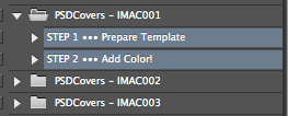
The first website I came across was psdcovers, which works with Photoshop Actions. This is something that I hadn't worked with or heard of previously, but the mock ups available on this website looked good enough to learn something new for.

On the website there was a section on tutorials which was very helpful in helping me get to grips with this software.


 Once this is done, two files are opened. The first is the file of the mock up.


 I copied it and went into the main file, finding the screen design layer in the right hand menu bar.
 Once clicked on, I paste the document in.
 I then reposition it to the right place.

 I pasted it into the space.
 At this point I then went into 'edit' and 'transform - distort'.
 This makes the corners free to move in any direction and skew the design to fit the actions.


 This is much easier to work than the previous mock ups as it works with smart layers, so I just have to put my design work onto the document and Photoshop does the work to make it fit properly.

 I double clicked on the layer to open up the document.
 I then edited it simply and saved it.
 Smart layer applied:

All over Behance and agency websites, there are multiple images that are clearly mock-ups, but they are far better than the ones that I have previously created. It was pretty obvious to me that there is some kind of way of creating these mock ups easily as there is such a huge amount of people with them in their portfolio. I had also come across a few free mock ups available on Behance but had not downloaded them.
I started by going to Google and trying to find some websites that had mock ups.
The first website I came across was psdcovers, which works with Photoshop Actions. This is something that I hadn't worked with or heard of previously, but the mock ups available on this website looked good enough to learn something new for.
On the website there was a section on tutorials which was very helpful in helping me get to grips with this software.
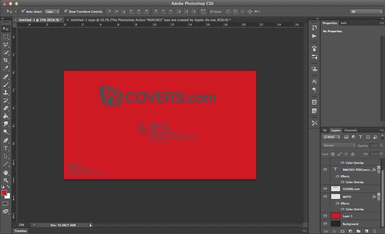
I downloaded the mock ups I wanted and installed them into Photoshop.
From this point the file appears in two steps. I then select the two of these and press the 'play' button at the bottom of the menu. This sends Photoshop through an automatic set of actions to set up the document.
The second is the file of the space where the design content will go.
In this case, the mock up is very easy as it is a straight design.
I went through and edited it quickly to see how it worked.
At this point I am happy with the mock up. It certainly has a professional feel in the fact that the screen glare is seen over the design now.
I then moved onto another mock up which involves the screen being at a slant. This is the kind of mock up which will be good to know how to work.
I opened the file and went through the same process.
This definitely looks much better than previous attempts I have done without a mock up as the exact screen size is given, making it easier for me to design to for these mock ups.
While I think that this website and mock up process will be good for straight forward designs like mac screens or something flat, when it comes to curved items such as cups or bottles, I know I will definitely struggle and something which does it for me is something I need to find.
I went back to looking for more websites with mock ups and came across Pixeden, which works with Photoshop smart object mock ups. These are the exact kind of mock ups I need, as it has branding sets and a lot more.
The majority of the mock ups are free, but the better ones do need a paid account to access. I decided against that as I have got what I need from the free selection.
I opened up one of the files.
Corresponding smart layer:
I think that this kind of mock up process is much easier than the previous mock ups I found. The smart layer tool makes it much, much easier to work and means I don't have to spend a huge amount of time on the mock ups. I just need to put the design in and Photoshop will do the work.
After spending a good while playing around with a few mock ups I found that I was much more confident in this area of design and think that it has been a very helpful and productive task I set myself. I think that the inclusion of this into my work is what I need to make it look that bit more professional.
Subscribe to:
Posts (Atom)