This is the brief that I was most excited about, but least looking forward to, just because Illustrator is a program that I have not used before, but the idea of learning it and finally being able to create images and work using it was the exciting aspect of this.
I have used Illustrator before, but only very recently and very little, just using the pen tool for less than half an hour while working on a project last year. I found that my skills developed quickly in these sessions and my previous understanding of a couple of the tools and Photoshop helped a lot.
At first I didn't see how I could use Illustrator to create the typeface I wanted, but after a couple of the sessions I found it was very easy, a lot easier than I thought it ever would be. However, I think this is down to the fact that the letters I created weren't overly different from the originals as my word was shatter. It meant I could create the letters without having to change the characteristics of the original typeface, just cutting and shattering it instead.
I think my typeface turned out well and stuck to what I wanted to do. It was an easy process once I knew exactly what I was doing, which led to me creating the lowercase for the typeface too. I found it very successful in the end, but next time I would perhaps use a more experimental typeface. I would also think about the anatomy of type and how the typefaces are created in relation to the sizing and heights of parts of the letters. Luckily it does not look like I haven't considered this, but there are a couple of letters that I perhaps would change now that I have thought about this.
Overall I found that this was a very useful process and I am now
confident in using the pen tool and a few of the other tools that we
were shown. I have already started using it in the other projects and am
learning to use the other tools slowly.
Monday, 29 October 2012
Saturday, 20 October 2012
OUGD403 - Self Evaluation: Typeface
When given this brief my first initial thought was that it was going to be relatively hard to put across someones personality through an illustrative alphabet. It would be a challenge, but give me the opportunity to research into things and considering styles that I perhaps wouldn't have. It gives an opportunity to expand my creative ability through something I personally might never have thought about.
When asking my partner (Sean) about himself it was a bit of an information overload, which is a good thing but also a bad thing at the same time. It gives a huge amount of information and routes I could go down, but it also leaves me with the task of cutting it all down to the primary things that I want to get across in the typeface.
The main thing at this point that I didn't necessarily think about was the whole thing working well as a set. I thought about it in a sense of trying to get as much information about him in as possible. This meant that I was doing a different thing for pretty much every other letter, and in the end I know it would not have looked like a set at all.
However, when I narrowed it down to what I was going to focus on, it became much simpler and flowed into a set. Looking into stencil and skateboard-style graphics, it became pretty easy, just using straight lines and circles based on Swiss-style design work. This made it very easy to manipulate the style into each letter and create the alphabet. There were a couple of letters which I found difficult to do, the ones that had more than one join or had half-curves in them. The 'G' was particularly hard to do as it had both, a curve and a complicated join.
Looking back at the final alphabet there are certainly a few things I would do differently. I made changes to five of the letter: G, S, X, N, Y. However, looking over that one, there are still changes I wish I had made during the design process. The main one is that the thickness of the black lines in each letter varies. For example, the 'H' lines are a lot thinner than the 'J' ones. I think if I could go back and change it, I would make all the lines as thick as the 'J' as it fits in a lot more with the circular letters than the others.
Overall I am happy with the final outcome and enjoyed the process. I surprised myself at how easy I could take one thing that Sean said and create a whole alphabet based on it, and manage to keep it interesting, with each letter having their own uniqueness. I feel I have developed my typography and Adobe Illustrator skills throughout this brief, and have a clearer understanding in typography and how I can manipulate it.
Friday, 19 October 2012
Monday, 15 October 2012
OUGD402 - What is Higher Education?
In today's session we stopped looking at 'What is Graphic Design' and started looking at 'What is Higher Education'. This led onto looking at feedback, and what we as individuals want to be commented on and criticised in our work by others in feedback sessions.

My individual list:
- Idea's and concepts - relative to the brief?
- The way my work is developing
- How I am improving/ What can I improve?
- Quality of work
- Strengths and weaknesses in work
- Blogging
After this we complied a list in our blog group:

From this we had to make a list of ten questions we, as a group want answering about our blogs, as they are the main source for all of our work.
We came up with nine bullet points:
- Quantity
- Quality of written work
- Quality of design work
- Consistency
- Clarity - navigation of the blog etc.
- Relativity - is the research/work we are doing relative to the brief
- Engagement - boring or engaging for the viewer
- Referencing - picture sources, labelling & tagging
- Evaluation
- Development - ideas progressing etc
We were given a task at the end of the session:
- Choose 5 questions I want answering about my blog
- Post these 5 questions as individual PPP posts
- Rest of group answer through comments on blog
- Agree a deadline for posting
- Agree a deadline for comments
Sunday, 14 October 2012
OUGD402 - Study Task 3: What is Graphic Design? Part 2
From this post, I had to identify a range of work from the five titles:
Context, Function, Tone of Voice, Messages and Scale.
- This is an ongoing process that will be constantly updated.
Context
The context for the design - Branding, Packaging, Infographics, Editorial, Retail etc.
Branding & Identity


Product & Packaging


Information & Way Finding


Editorial & Publishing


Retail & Promotion


Function
Function of design - Inform, Instruct, Educate, Advise, Promote, Interact
Inform


Instruct - Bayer Crop Science by Komboh


Educate


Advise


Promote - V&A Promotional packs by Irish Butcher


Interact


Tone of Voice
Tone of voice of design - Informative, Humorous, Emotive
Informative


Humorous


Emotive
Message
Message being put across in design - Events, Opinions, Facts & Figures, Personal interest
Opinions


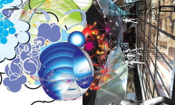
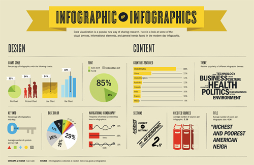
Facts & Figures


Personal Interest


Events


Scale
Scale of design - Posters, Business cards, Billboards, Environmental
Large


Medium


Small


Subscribe to:
Posts (Atom)