Today I came across this project which was newly uploaded to Behance by KIND, a conceptual branding agency based in Norway.
Una Kitchen & Microbrewery
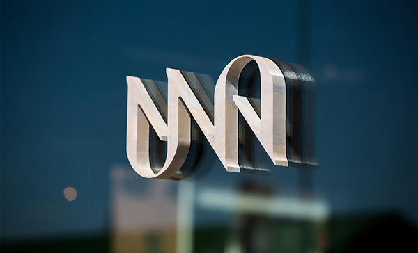
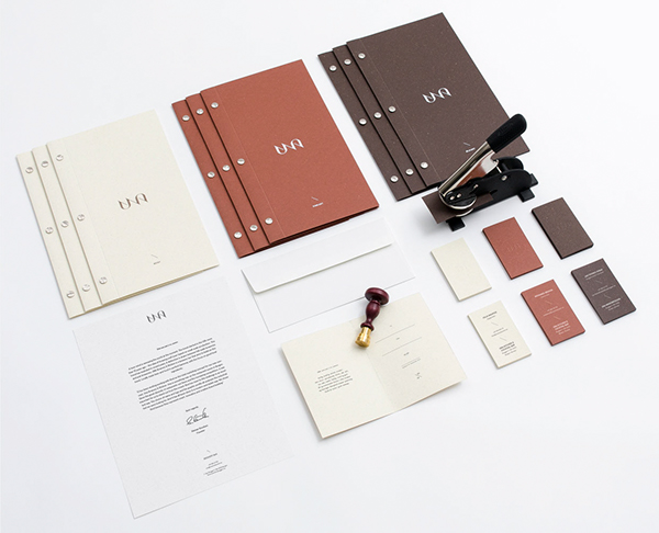
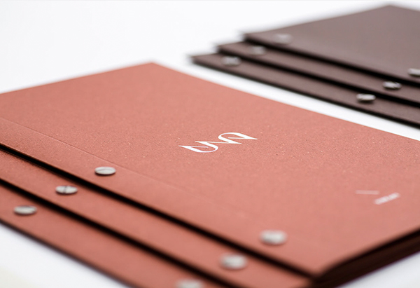
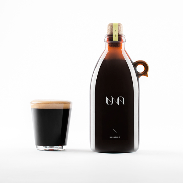
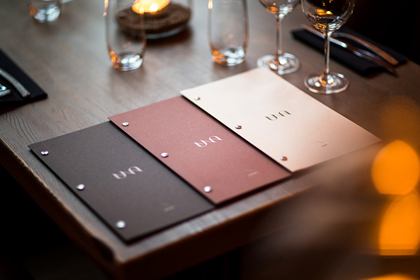
I really like the simplicity of the identity and how it has been executed across a range of media. I think that the use of stock for business cards and menu really helps create a professional and luxury appearance. It's also a stock that I haven't seen used in this way before. I like the use of the three colours and how they represent three areas of the brand. This is a simple idea which is used a lot, but in this case I think it works particularly well, and the colours work very well, together and separate.
As I am currently doing a brief around a bakery/cafe this does influence my opinion of some decisions I have made so far.
No comments:
Post a Comment