Website
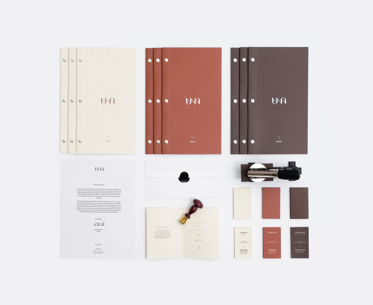
I found that I really loved the majority of the work and its clear that their style is something similar to what I would love to create and achieve to do. I particularly like 'Una' - one of their newer projects. I think it looks really great, and I have taken some inspiration from it to apply to my own brief around a bakery/cafe, as it is similar in the kind of aesthetic that I wanted to achieve.
Below are a couple of the projects I particularly liked.
Una
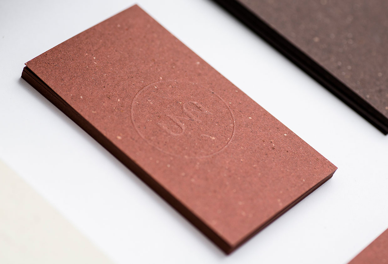
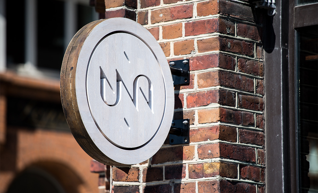
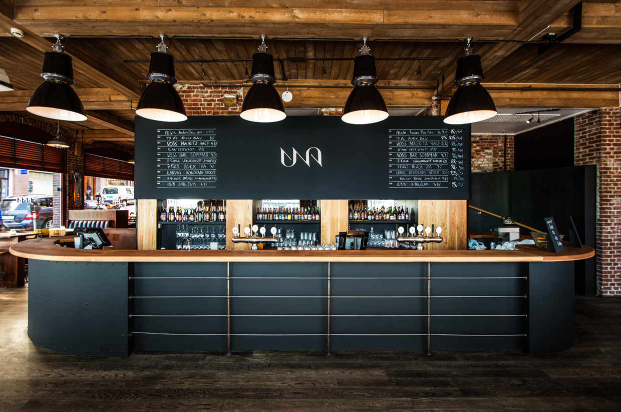
I really like the simple and sophisticated approach to this brief. The use of three different coloured stocks works really well together, and I love the small details such as textured papers and the style of binding the menus. It's these small details which really add to the sophistication. I think it all looks really professional, aided further by the photography of all the collateral.
Badaboom
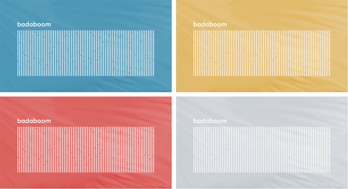
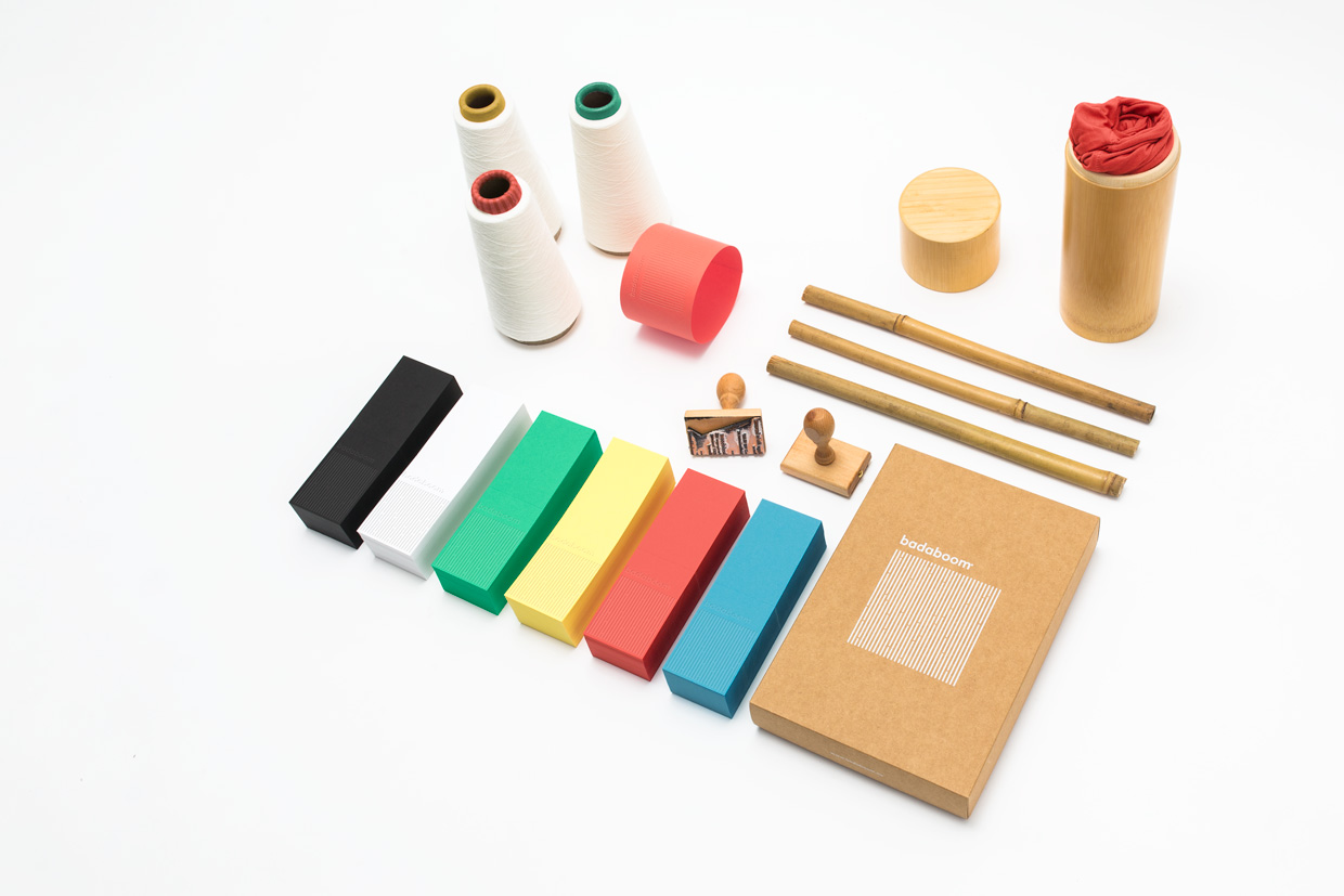
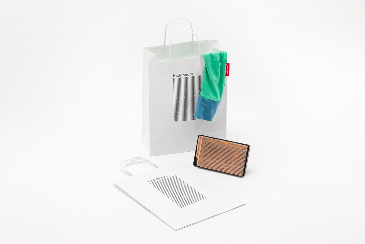
I think the concept behind this branding is fantastic, and the way it has been applied across a variety of colours and medias is something which I really aspire to do. I think it shows that branding can be fun with a huge range of collateral, colours and packaging types used. Like Una, I love the attention to detail throughout every piece.
I particularly like the branding itself. The way it has been constructed is simple, yet effective and visually interesting. I like how they considered the brand itself and how it makes its clothing in bamboo and integrated this strongly into the brand identity.






No comments:
Post a Comment