After everything was printed, I set about putting it all together before starting work on the rest of the promotional material.
I still need to get a range of appropriate stationary, and design my website, so there's more than enough to keep me busy.
The prints look really good and the stock works really well, so I'm very pleased about that. I was a bit concerned about how everything would look once printed on this stock as it's not one I've used before, but it all worked out well.
The one issue I do have is that some of the images in my portfolio haven't printed as well as they would have on a smoother stock. However it's not a disaster, or close, so I won't be reprinting the pages on other stock. I could always experiment with this in the future, but right now it looks good as it is.
I then started to think about everything that could be included in my branded stationary set. I don't want to do anything for the sake of it. I want everything to have a reason for being there and branded, so this is something I need to think about for a while to decide what I would need right now, and as a designer in the world.
I decided I needed the following things in my stationary set:


 I also made a band to go around the poster tube in the same style.
Poster slip:

I decided I needed the following things in my stationary set:
- Letterhead
- Business Card
- DL Envelope
- Poster Tube
- CD Sleeve
- A5 Book - Sketch Pad
- A6 Book - Note Pad
- Stickers
- Invoice
- Terms & Conditions
- Contract
- Stickers
- Paper File
I feel that these items are more than enough to cover everything I would need and use. As I have already produced a few of these, I don't have so much work to do.
I looked over everything I had printed and made up to this point and decided that in this stationary I could use red as a block colour. This means that I'll have a variety between the red, blue and the pattern.
As the envelopes are in blue, I decided that the notepads should be in red. For these, I decided that the covers would be in the watercolour paper, and the stock inside would be cartridge paper, because this is more realistic for me to use and is a lot smoother stock than the watercolour. On the back of the two pads I want to put a piece of card to give it a more sturdy appearance and feel.
Note pad covers:
I like the way these work so decided to keep the red when it came to the cd sleeve. On the inside of this I will put the pattern for a bit of a difference.
CD Sleeve:
Poster slip:
Invoice:
 Terms & Conditions:
 Contract:
 While I think that the three forms above are essential to my branding as they are giving me a realistic approach to the way I will run if I were a designer, I do think that these will obviously need work in the future. However as they are at the minute, I am happy with them and think they serve their purpose in this project.
After finishing the stationary set I moved onto designing a proposal for a website. At this point I do already have an online presence in the shape of my Behance Page. However, eventually I would like my own website as I think that this is something I would benefit from.
I started by doing a few sketches of a few ideas I had of how the pages could be displayed and work.

I knew I wanted the designs to be very visual and have the main focus on the images over the text, but there are so many different ways in which this can be done, that I found it quite hard to figure out which route I wanted to go down.
To try sort this problem, I started creating the pages using InDesign and developing them as I went along.
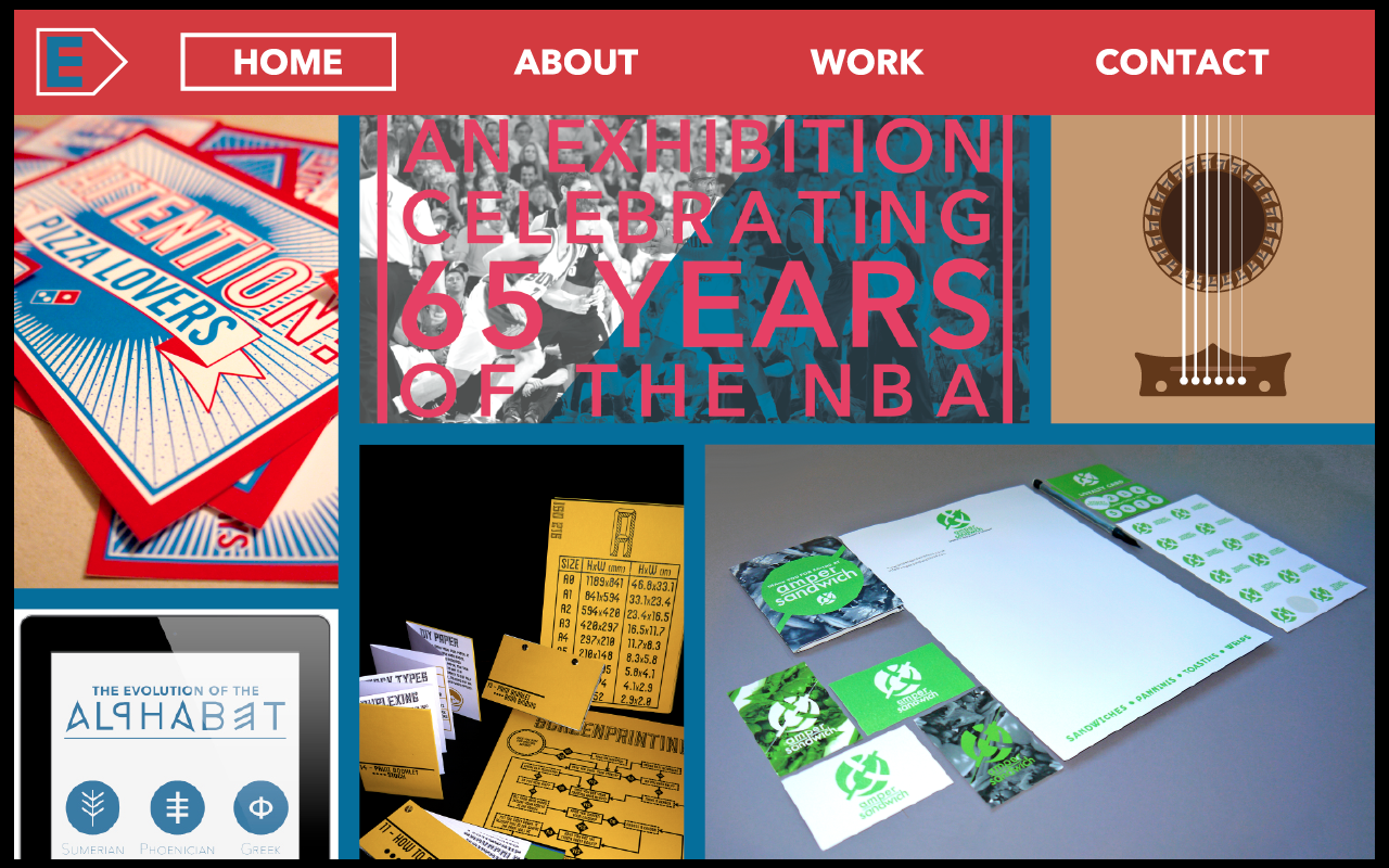
I started by creating the navigation bar that I wanted to be fixed throughout the whole website. I decided on four links; Home, About, Work & Contact, as well as the logo in the top left corner.

I then moved onto the page which would display the work. This is the page which I have a bit more of a clear idea of how I wanted it to work.
Design:


Work page:

I then moved onto the individual project page, starting with the following design.


I do think that this one looks better as the image is larger and the text seems like it has a bit more of a place on the page instead of just being along the bottom.
One thing I thought was a bit too big was the text in the navigation bar. I originally thought the size was ok, but now I do think it is too big and will make the website look that bit more professional if it is at a more reasonable and understated size. I applied this across both of the pages.


I then thought about the text on the individual project pages. I originally had it along the bottom so it didn't interfere with the image, but where it is now, it does just that, so I want to add to the design that it can be slid away.


I then thought about how I wanted the Home page to be. As the navigation bar is white, I wanted to have a contrast against it so first tried the red.

I definitely don't want to do this on the front page, however I do like what I did on the navigation bar to a selected button with the word turning blue. I applied this to the other pages.


Instead of using the block red colour, I tried out using the pattern and using the same format that I used in the split pages in my portfolio.

With this being the navigation, I decided on keeping these mainly text pages to the same format with the pattern and a box around the text. Something that I wanted to do was link it back to the work that I had created for my promotional pack. I think that this would really bring all of my branding together.
I decided to break the About page down to a few different pages, just like the pages I did in the promotional pack.


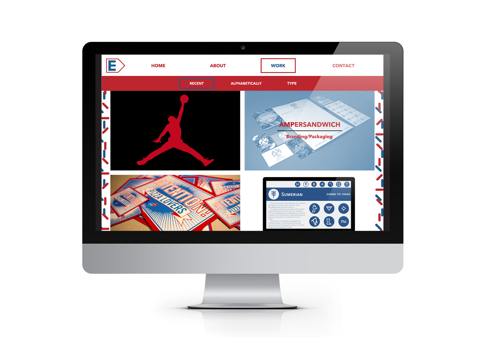
Happy with these pages and the use of the pattern, I applied this to the 'Work' page and redesigned it to fit in more with how everything else was looking. I also added a bit of a filter system to this page.


At this point I reviewed all the pages and am very happy with how they all look and work together. I believe I have created enough pages to show exactly how the website would work and the interactive elements.
Final Website Pages:
Home page:

Scroll down from the home page - First About page:

Scroll down - second About page:
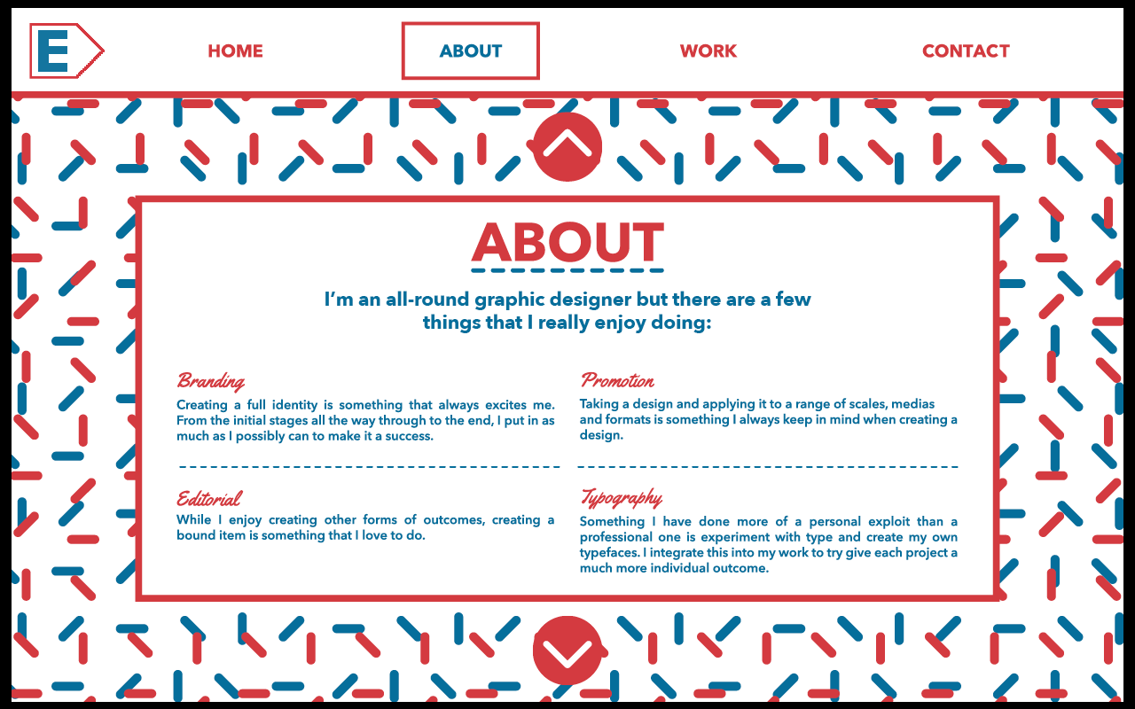
Scroll down - third About page:

Scroll down - second Work page:

Hover over an image - project name appears:

Click on an image - individual project page:

Click the text arrows - full screen image:

Scroll to next images:


Contact page - interactive buttons:

After this I decided to go through the pages and refine them to look more professional because, at the minute, I don't think that everything is as good as it could be.
Final Website


No comments:
Post a Comment