This is a client brief which I got after winning the initial identity design competition. The client wants this identity extended across both printed and digital material for promotional purposes.
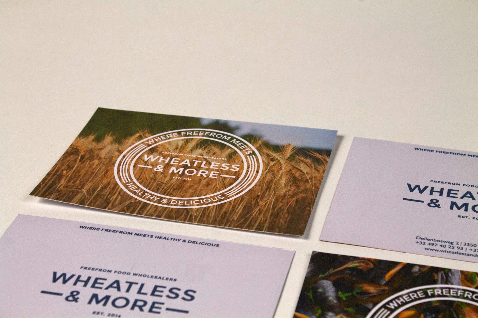
The original logo is very simple and clean, something which needs to be considered in the overall design of all the elements. The logo is to be the main focus on a lot of the promotional material, so the supporting design must follow the same simple aesthetic and not be overpowering.
The branding colours are the only colours that must be used across all material. There are also a number of supporting images which can be used to variate from block colours. All the material must work well together to create a strong and simple identity for the brand.
Final Images


Design Boards
No comments:
Post a Comment