Today we did our presentation to the rest of the group.
Overall I think the presentation went well. We remembered to say anything, and although the presentation might have been seen as quite short, we do believe we were to the point with our content and successfully showed what we had each individually contributed to the project as well as how we work as a group and how the business would work.
Showing posts with label Life's A Pitch. Show all posts
Showing posts with label Life's A Pitch. Show all posts
Tuesday, 29 April 2014

Thursday, 24 April 2014
OUGD502 - Life's A Pitch: Presentation Preparation (2)
Today we got together to finish off the remainder of the presentation.
The main thing we had to do was get all of our figures sorted. With some research that Caitlin and Charlie had previously done, we started to sort out what was appropriate to our business and what were going to one off costs for start up.
Before doing this we worked out how many hours a year we could work.
The average working week is 40 hours, meaning that for our business it would be 200 hours with the five of us.
Average amount of holidays per year is at 4 weeks.
We also took bank holidays into account. These are 8 days.
We rounded this to 7, giving us 5 weeks holiday all together.
Hours per year = 200 x 47 weeks = 9,400
Hours per year = 9,400
Hours per year (individual) = 1,880
After this we started working on the costs for the business.


 The pages I will be speaking through are the three 'who we are' pages and the four 'terms and conditions' pages.
On the evening I decided to go over the figures again and work out if there was something we were missing. We are not entirely confident in them and don't want to go into a presentation feeling this, especially if someone could ask a question about them. I decided to look over them as I am the only one in the group who has a background in working with things like this as I did business studies for A level.
While I originally didn't want to do the figures, I realised that while we can work on them as a group, the others don't know as much as I do about how business figures work.
The first thing I realised was that we hadn't included our salary into the start up costs, which changes all of the figures for our costs, loans and how much we would have to charge per hour.

£50 a desk per week.
Office = 6 desks.
Building charges 20% tax on top of price.
£50 x 6 = £300 per week.
£300 x 52 weeks = £15,600 per year
£15,600 / 12 months = £1,300
£1,300 + 20% tax = £1,560 per month
Final cost per moth = £1,560
Salary
Standard wage of junior designer = £22,000 per year
Employees = 5
£22,000 x 5 = £110,000 per year
£110,000 / 12 months = £9,166.67 per month
Final cost per month = £9,166.67
iMacs
Individual iMac = £1,599
iMacs needed = 5
£1,599 x 5 = £7,995
Final one off cost = £7,995
Printer
Final one off cost = £145.20
Printer Supplies
Final costs per month = £70
Wacom Tablets
Individual Wacom Tablet = £118.50
Wacom Tablets needed = 2
£118.50 x 2 = £237
Final one off cost = £237
Laminator
Final one off cost = £175
Insurance
Final cost per month = £30
Food
Final costs per month = £600
Utilities
Final costs per month = £150
Accountant
Annual charge = £1,200
20% tax on top
£1,200 + 20% tax = £1,440
£1,440 / 12 months = £120
Final cost per month = £120
Stationary
Final one off costs = £400
Travel
Final cost per month = £1000
Working out start up costs
£1,560 (rent)
£9,166.67 (salary)
£7,995 (iMacs)
£145.20 (printer)
£70 (printer supplies)
£237 (tablets)
£145 (laminator)
£30 (insurance)
£600 (food)
£150 (utilities)
£120 (accountant)
£400 (stationary)
£1000 (travel)
Final start up costs = £21,648.87
Working out the monthly loan is now something I can do. We decided as a group that we would choose to repay the loan over a three year period, as after three years we feel that the business could be at a point where we consider expansion and moving location.
Loan = £21,648.87
7.9% interest
£21,648.87 / 3 = £7,216.32 per year
£7,216.32 + 7.9% = £7,786.41
£7,786.41 x 3 = £23,359.23 (total cost of loan for the three years)
£23,359.23 / 36 months = £648.86
Final cost per month = £648.86
With this, I can now work out the monthly expenses.
Working out monthly expenses
£1,560 (rent)
£9,166.67 (salary)
£70 (printer supplies)
£30 (insurance)
£600 (food)
£150 (utilities)
£120 (accountant)
£1000 (travel)
£648.86 (loan)
Final cost per month = £13,345.53
To work out our hourly rate I first need to work out how much the expenses are for the first year, and then divide it by the number of hours the business does in the year.
Start up costs = £21,648.87
Cost per month = £13,345.53
Start up costs + (Costs per month x 11) = total year cost
£21,648.87 + (£13,345.53 x 11) = £168,499.70
First year expense = £168,499.70
Hourly rate = first year expenses / hours working
£168,499.7 / 9400 = £17.92 per hour
We had previously decided that while our hourly costs were low, we didn't want to charge this to the client, and wanted to have a margin. We had previously decided on £40. We thought that this was reasonable as we are wanting to work for all types of businesses and don't want a higher price to put off small start up businesses.
With 20% tax our cost per hour = £21.50
This means for every £21.50, we are making £18.50 profit.
With this being the first year, we agreed earlier that it was unlikely that we would be working all workable hours. We agreed that a likely amount would be about 60% of the hours, spending the other 40% promoting ourselves or even potentially without work. With our hourly rate almost double, we thought that this was adequate enough to be able to support the business if this is what happens.
With this in mind I worked out what our first year turnover, gross & net profit would be. As we are a limited company, we do have to pay 20% corporate tax.
Turnover
Hourly rate x hours = turnover
60% 9,400 = 5,640
£40 x 5,640 = £225,600
Turnover = £225,600
Gross profit
Turnover - expenses = gross profit
£225,600 - £168.499.70 = £57,150.30
Gross profit = £57,150.30
Net profit
Gross profit - tax = net profit
£57,150.30 - 20% = £45,720.24
Net profit = £45,720.24
Profit for first year = £45,720.24
Overall this means that in the first year our business is profitable and makes quite a good profit.
I then moved onto working out a potential second and third year. We had agreed that in the second year we would be working at 80% hours, and the third would be 100%. Also our overall expenses would go down as we don't have to pay the start up costs again.
Second year
Yearly expenses = monthly expenses x 12 months
Working out monthly expenses
£1,560 (rent)
£9,166.67 (salary)
£70 (printer supplies)
£30 (insurance)
£600 (food)
£150 (utilities)
£120 (accountant)
£1000 (travel)
£648.86 (loan)
Final cost per month = £13,345.53
£13,345.53 x 12 = £160,146.36
Yearly expenses = £160,146.53
Working hours - 80% 9,400 = 7,520
Turnover
Hourly rate x hours = turnover
£40 x 7,520 = £300,800
Turnover = £300,800
Gross profit
Turnover - expenses = gross profit
£300,800 - £160,146.53 = £140,653.47
Gross profit = £140,653.47
Net profit
Gross profit - tax = net profit
£140,653.47 - 20% = £112,522.78
Net profit = £112,522.78
Profit for second year = £112,522.78
Third year
Yearly expenses = monthly expenses x 12 months
Working out monthly expenses
£1,560 (rent)
£9,166.67 (salary)
£70 (printer supplies)
£30 (insurance)
£600 (food)
£150 (utilities)
£120 (accountant)
£1000 (travel)
£648.86 (loan)
Final cost per month = £13,345.53
£13,345.53 x 12 = £160,146.36
Yearly expenses = £160,146.53
Working hours - 9400
Turnover
Hourly rate x hours = turnover
£40 x 9,400 = £376,000
Turnover = £376,000
Gross profit
Turnover - expenses = gross profit
£376,000 - £160,146.53 = £215,853.47
Gross profit = £215,853.47
Net profit
Gross profit - tax = net profit
£215,853.47 - 20% = £172,682.78
Net profit = £172,682.78
Profit for third year = £172,682.78
Overall profit for first three years = £330,925.80
The main thing we had to do was get all of our figures sorted. With some research that Caitlin and Charlie had previously done, we started to sort out what was appropriate to our business and what were going to one off costs for start up.
Before doing this we worked out how many hours a year we could work.
The average working week is 40 hours, meaning that for our business it would be 200 hours with the five of us.
Average amount of holidays per year is at 4 weeks.
We also took bank holidays into account. These are 8 days.
We rounded this to 7, giving us 5 weeks holiday all together.
Hours per year = 200 x 47 weeks = 9,400
Hours per year = 9,400
Hours per year (individual) = 1,880
After this we started working on the costs for the business.
Costs to consider:
Rent
Travel Expenses
iMacs
Printer
Laminator
Wacom Tablets
Insurance
Salary
Loan payments
We found a business loan from Halifax which seemed quite good. It allows us to choose from 1 to 10 years repayment, with a 7.9% interest rate per year.
At this point we have worked everything out, but it has all come out at quite low costs and doesn't seem quite right in terms of how much we would have to charge an hour to cover our costs. It came out at around £12.50, which we thought was far too low and we had clearly done something wrong.
After looking over the figures we looked at the document given online for us to refer to and saw that we had missed out a few important things. We also looked back over everything where we got out figures from and found that we had got the rent wrong and only been putting the rent on per week as the per month.
The costs of everything still came out low, but it was a bit more reasonable so we left it at that for now and moved onto adding these to the presentation and going through it as a group to decide the running order.
Running order:
On the evening I decided to go over the figures again and work out if there was something we were missing. We are not entirely confident in them and don't want to go into a presentation feeling this, especially if someone could ask a question about them. I decided to look over them as I am the only one in the group who has a background in working with things like this as I did business studies for A level.
While I originally didn't want to do the figures, I realised that while we can work on them as a group, the others don't know as much as I do about how business figures work.
The first thing I realised was that we hadn't included our salary into the start up costs, which changes all of the figures for our costs, loans and how much we would have to charge per hour.
Costs
Rent£50 a desk per week.
Office = 6 desks.
Building charges 20% tax on top of price.
£50 x 6 = £300 per week.
£300 x 52 weeks = £15,600 per year
£15,600 / 12 months = £1,300
£1,300 + 20% tax = £1,560 per month
Final cost per moth = £1,560
Salary
Standard wage of junior designer = £22,000 per year
Employees = 5
£22,000 x 5 = £110,000 per year
£110,000 / 12 months = £9,166.67 per month
Final cost per month = £9,166.67
iMacs
Individual iMac = £1,599
iMacs needed = 5
£1,599 x 5 = £7,995
Final one off cost = £7,995
Printer
Final one off cost = £145.20
Printer Supplies
Final costs per month = £70
Wacom Tablets
Individual Wacom Tablet = £118.50
Wacom Tablets needed = 2
£118.50 x 2 = £237
Final one off cost = £237
Laminator
Final one off cost = £175
Insurance
Final cost per month = £30
Food
Final costs per month = £600
Utilities
Final costs per month = £150
Accountant
Annual charge = £1,200
20% tax on top
£1,200 + 20% tax = £1,440
£1,440 / 12 months = £120
Final cost per month = £120
Stationary
Final one off costs = £400
Travel
Final cost per month = £1000
Working out start up costs
£1,560 (rent)
£9,166.67 (salary)
£7,995 (iMacs)
£145.20 (printer)
£70 (printer supplies)
£237 (tablets)
£145 (laminator)
£30 (insurance)
£600 (food)
£150 (utilities)
£120 (accountant)
£400 (stationary)
£1000 (travel)
Final start up costs = £21,648.87
Working out the monthly loan is now something I can do. We decided as a group that we would choose to repay the loan over a three year period, as after three years we feel that the business could be at a point where we consider expansion and moving location.
Loan = £21,648.87
7.9% interest
£21,648.87 / 3 = £7,216.32 per year
£7,216.32 + 7.9% = £7,786.41
£7,786.41 x 3 = £23,359.23 (total cost of loan for the three years)
£23,359.23 / 36 months = £648.86
Final cost per month = £648.86
With this, I can now work out the monthly expenses.
Working out monthly expenses
£1,560 (rent)
£9,166.67 (salary)
£70 (printer supplies)
£30 (insurance)
£600 (food)
£150 (utilities)
£120 (accountant)
£1000 (travel)
£648.86 (loan)
Final cost per month = £13,345.53
To work out our hourly rate I first need to work out how much the expenses are for the first year, and then divide it by the number of hours the business does in the year.
Start up costs = £21,648.87
Cost per month = £13,345.53
Start up costs + (Costs per month x 11) = total year cost
£21,648.87 + (£13,345.53 x 11) = £168,499.70
First year expense = £168,499.70
Hourly rate = first year expenses / hours working
£168,499.7 / 9400 = £17.92 per hour
We had previously decided that while our hourly costs were low, we didn't want to charge this to the client, and wanted to have a margin. We had previously decided on £40. We thought that this was reasonable as we are wanting to work for all types of businesses and don't want a higher price to put off small start up businesses.
With 20% tax our cost per hour = £21.50
This means for every £21.50, we are making £18.50 profit.
With this being the first year, we agreed earlier that it was unlikely that we would be working all workable hours. We agreed that a likely amount would be about 60% of the hours, spending the other 40% promoting ourselves or even potentially without work. With our hourly rate almost double, we thought that this was adequate enough to be able to support the business if this is what happens.
With this in mind I worked out what our first year turnover, gross & net profit would be. As we are a limited company, we do have to pay 20% corporate tax.
Turnover
Hourly rate x hours = turnover
60% 9,400 = 5,640
£40 x 5,640 = £225,600
Turnover = £225,600
Gross profit
Turnover - expenses = gross profit
£225,600 - £168.499.70 = £57,150.30
Gross profit = £57,150.30
Net profit
Gross profit - tax = net profit
£57,150.30 - 20% = £45,720.24
Net profit = £45,720.24
Profit for first year = £45,720.24
Overall this means that in the first year our business is profitable and makes quite a good profit.
I then moved onto working out a potential second and third year. We had agreed that in the second year we would be working at 80% hours, and the third would be 100%. Also our overall expenses would go down as we don't have to pay the start up costs again.
Second year
Yearly expenses = monthly expenses x 12 months
Working out monthly expenses
£1,560 (rent)
£9,166.67 (salary)
£70 (printer supplies)
£30 (insurance)
£600 (food)
£150 (utilities)
£120 (accountant)
£1000 (travel)
£648.86 (loan)
Final cost per month = £13,345.53
£13,345.53 x 12 = £160,146.36
Yearly expenses = £160,146.53
Working hours - 80% 9,400 = 7,520
Turnover
Hourly rate x hours = turnover
£40 x 7,520 = £300,800
Turnover = £300,800
Gross profit
Turnover - expenses = gross profit
£300,800 - £160,146.53 = £140,653.47
Gross profit = £140,653.47
Net profit
Gross profit - tax = net profit
£140,653.47 - 20% = £112,522.78
Net profit = £112,522.78
Profit for second year = £112,522.78
Third year
Yearly expenses = monthly expenses x 12 months
Working out monthly expenses
£1,560 (rent)
£9,166.67 (salary)
£70 (printer supplies)
£30 (insurance)
£600 (food)
£150 (utilities)
£120 (accountant)
£1000 (travel)
£648.86 (loan)
Final cost per month = £13,345.53
£13,345.53 x 12 = £160,146.36
Yearly expenses = £160,146.53
Working hours - 9400
Turnover
Hourly rate x hours = turnover
£40 x 9,400 = £376,000
Turnover = £376,000
Gross profit
Turnover - expenses = gross profit
£376,000 - £160,146.53 = £215,853.47
Gross profit = £215,853.47
Net profit
Gross profit - tax = net profit
£215,853.47 - 20% = £172,682.78
Net profit = £172,682.78
Profit for third year = £172,682.78
Overall profit for first three years = £330,925.80
Wednesday, 23 April 2014
OUGD502 - Life's A Pitch: Presentation Preparation (1)
Today we started preparing the presentation. Grace had started this yesterday, but today we felt confident that we had the majority of the content to be able to design most of the presentation.
Grace showed us the initial few pages that she had done yesterday.
At this point we also looked at everything each other had done in preparation for today. We also discussed how this was all going to look on the projector during the presentation.
A worry for us was that our logo and the majority of our designs are in yellow and white, and with the projector, we are not sure how well this will show. If it doesn't show well, that means our whole presentation won't be as visually good as we would like it to be, which would be a huge disappointment.
With this in mind, we went through to Studio 3 and put up an image of one of the presentation slides which had a large amount of yellow and white to see how well it showed on the projector.
We found that it didn't show well at all, which made us glad that we checked otherwise our whole presentation could have been ruined visually.
With this in mind, we went back into illustrator and tried out five different variations of the colour to see which one worked best on screen. This does mean that the colour of our branding isn't necessarily what we want it to be, but with the delivery method in mind, we do need to change it to suit this.
We chose five different kinds of yellow, trying not to go too far away from our original colour.

We all sat at different distances away from the screen and agreed that the 'caitlin' colour was the best on screen as it was very clearly yellow, but a darker shade so it worked much better.
We then took this colour and applied it to our logo.

Colour applied:

We then started working on the presentation content.
The rest of the group thought that the idea I had yesterday, laying the logo over photographic image of eggs gave the business a professional look. We decided that this should be what we used on the first page to introduce us as a business.

I worked on creating the terms and conditions pages, laying them out in a simple format, as well as putting together the 'our work' pages with Charlie.
Grace worked on the general layout of the presentation, and Anna worked on our personal 'top trumps' to be put into the presentation.
During the afternoon it got to the point where it was just Charlie and myself working on the presentation as the others had other commitments, so we worked on the development of the presentation.
While we wanted to keep it very simple, as it has been up to this point, we both agreed that there was a difference between being sparse and simple, and thought that we needed a bit more branding to the pages to bring it all together. The pages already had the logo in the bottom right hand corner, but we thought there needed to be a bit more.
I came up with the idea of having a bit of a boarder around everything, which Charlie then agreed with and came up with the idea of it going round the logo to incorporate it a bit more.
For the terms and conditions, I decided that we didn't need to show all of them, just a few of the main points.
I went through these with Charlie and decided on four of the main points, all of which I had created appropriate imagery for. I then put them in an order as if to go through the design process and order that they would happen in:
25% deposit:



At this point the majority of the presentation is done and there are only a few extra things that need to be added/changed. This is something that we will do a group tomorrow.
Tuesday, 22 April 2014
OUGD502 - Life's A Pitch: Branding/Presentation Task
The task I had to do today is to visually represent the terms and conditions that I wrote to be shown in the presentation as we don't want there to be a lot of text.
Before doing this task, I did a few quick experiments into some branding ideas I had in terms of how our logo could be seen.
Caitlin had done a couple of ideas where the logo was over the top of a chicken and a fried egg, going with the egg theme, so I thought I would carry this on. She experimented with opacity, so I thought I would experiment with lightness and colour as this could help us get a more clear idea on branding four our company.


I started by experimenting with a few different ideas of how I can visually use the egg. I decided on using the '25% deposit' as the base as this is one that we discussed as a group and wanted to show as a quarter of the egg cut out. I wanted it to be obvious that the shape was still an egg, while showing the 25% well.

From this I then tried a few variations of the faded colour to see what worked best.

I then went about creating very simple designs to represent the terms and conditions. I first read over them and decided which points were the ones that were the important ones and should be included in the presentation.
The way I wanted to do it was to create a few general designs which represent areas of the terms and conditions, and then combine them to make up the individual conditions.
Designs created:


OUGD502 - Life's A Pitch: Group Meeting
Today we had a group meeting to sort through everything we had researched over Easter as we only have three days until the presentation.
We spoke about all the content we had, and everything we needed to get done before the presentation, and sorted out a running order for our presentation.
Presentation order:
Slide 1 - Logo, who we are, some egg puns & who our clients are
Slide 2 - How eggcellent we are, Our specific job titles
Slide 3 - Our work
Slide 4 - Where we nest
Slide 5 - How we work in terms of payment
Slide 6 - Copyright info
Slide 7 - Testimonials

 We then started looking at colours. We tried a few different ones before deciding that yellow was what we wanted, and we looked at a few different kinds of yellow.
 We decided that the original yellow chosen was the best one to go for as it stands out against white, isn't too light, and isn't to murky either.
The idea for the logo is to have this type in an egg shape, and then we could have 'œ' in the egg shape as an icon to use if it needs to be on a small scale.
I mocked this up on illustrator.
 Caitlin then suggested that for a second colour we could try a cream as this is the colour of an egg.

We spoke about all the content we had, and everything we needed to get done before the presentation, and sorted out a running order for our presentation.
Presentation order:
Slide 1 - Logo, who we are, some egg puns & who our clients are
Slide 2 - How eggcellent we are, Our specific job titles
Slide 3 - Our work
Slide 4 - Where we nest
Slide 5 - How we work in terms of payment
Slide 6 - Copyright info
Slide 7 - Testimonials
After this we then started working on a logo. We looked over the drawn mock ups that everyone in the group had done before we had a discussion about the name of the business itself.
While we think 'Good Egg' matches what we are about as a business, we don't feel that it is a particularly interesting name or anything any of us are excited about. It was fair to say we were all having a bit of a hard time coming up with a logo and direction too.
With this in mind we started thinking about other potential names.
We decided on the name 'œuf' - which is French for egg. We like this because it keeps in with the egg theme that we were happy with before, but think it sounds a bit better and quite individual for a business name. We also thought that it is something international and multicultural.
With this, we moved onto designing a logo together. We still wanted to keep the egg as a large part of the design, but with our new name, we felt a new direction was in order with a simple design and friendly colours that put across that we are professional but informal and friendly.
I opened up Illustrator and typed the name in, and then went through the fonts with the rest of the group.
We found two that we liked:
We all agreed that the top one 'Brixton' was the one we wanted to go for as it was quite an informal and friendly font.
The idea for the logo is to have this type in an egg shape, and then we could have 'œ' in the egg shape as an icon to use if it needs to be on a small scale.
I mocked this up on illustrator.
At this point we are happy with the logo. We then started looking into the presentation and how we could show all of our content in an interesting way as we want it to be very visual and not have much text on.
In showing us as individuals and a group, we decided on doing a 'top trumps' of each of us, with our names done like the logo in the eggs, and then a few quick facts about us: name, place, job title, skills, how we like our eggs.
We want to keep the presentation light and friendly, with a few egg puns thrown in the mix to put across the tone of voice for our company as a whole.
For the design of the presentation, we want to keep it very branded throughout. We decided on having the size of the page to the ratio of a 6 egg carton, which is a 1:1.4 (HxW). We felt that this was a small element, but something that shows we are thinking about our presentation as a business.
I emailed the logo designs and typeface to the rest of the group and we decided on the tasks that we each were going to do to get all the content for the presentation.
My task is to go through the payment and our terms and conditions and try visually represent these using the eggs.
Friday, 18 April 2014
OUGD502 - Life's A Pitch: Design Research
In discussion on our Facebook group, with just over a week to go until the presentation, Grace said that we needed to see what we need to include in the presentation so we know what we are missing and what we have already covered.
She went about looking over previous session presentations to see what points we had not gone over yet.
The main thing was our branding, which we all know about.
The second is the type of work we want to do. While we are set on food and drink, we haven't really pin pointed the style or visual look of work that we would imagine ourselves to create.
The third is money. While some of this has been covered in the copyright I wrote (such as how the client pays etc), other areas have not, such as how we each get paid from each project etc.
The fourth thing that we need to work on is our business values and testimonials.
After a short conversation I said that, while continuing with branding ideas, I would look into different design work in the food and drink sector to find the sort of work which we would like to produce.
A reason why we decided on doing a food and drink based company is that we have all done at least one brief in this area, and across a range of media. This is helpful to me in looking for design work we want to do, as I have a clear base of all fig of our design works in this area.
I decided that the best place to find work similar to those that I think we would produce is to go onto Behance and work from there as we had quite a difficult time trying to find food and drink specific design companies beforehand.
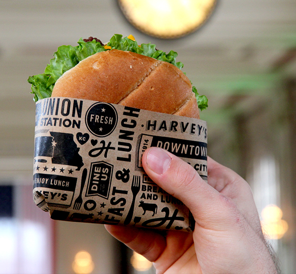
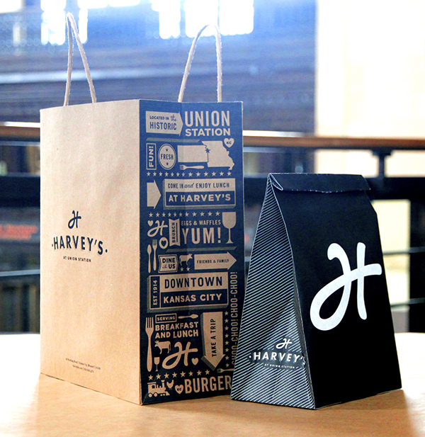
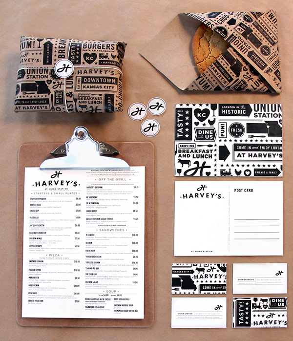
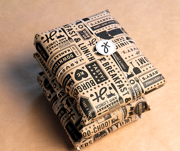
Almost immediately I came across a couple of projects which I thought were really creative, really simple and very well executed which would be the kind of design that we could all definitely do.
Harvey's
Link



She went about looking over previous session presentations to see what points we had not gone over yet.
The main thing was our branding, which we all know about.
The second is the type of work we want to do. While we are set on food and drink, we haven't really pin pointed the style or visual look of work that we would imagine ourselves to create.
The third is money. While some of this has been covered in the copyright I wrote (such as how the client pays etc), other areas have not, such as how we each get paid from each project etc.
The fourth thing that we need to work on is our business values and testimonials.
After a short conversation I said that, while continuing with branding ideas, I would look into different design work in the food and drink sector to find the sort of work which we would like to produce.
A reason why we decided on doing a food and drink based company is that we have all done at least one brief in this area, and across a range of media. This is helpful to me in looking for design work we want to do, as I have a clear base of all fig of our design works in this area.
I decided that the best place to find work similar to those that I think we would produce is to go onto Behance and work from there as we had quite a difficult time trying to find food and drink specific design companies beforehand.
Almost immediately I came across a couple of projects which I thought were really creative, really simple and very well executed which would be the kind of design that we could all definitely do.
Harvey's
Link
"Harvey House Diner was a staple in Kansas City’s Union Station starting in 1914. The diner would greet thousands of travelers as they would arrive from all over the country by train at the historic Union Station. Fred Harvey’s original Harvey House has been long gone, but our new Harvey’s at Union Station is a nod to that historic diner. Despite almost 100 years between the two concepts opening their doors, both the new Harvey’s and the original share the same core values of quality food, quality service and quality company. Brand components consisted of, logo system, brand identity, menus, interior and exterior signage, environmental graphics and apparel."
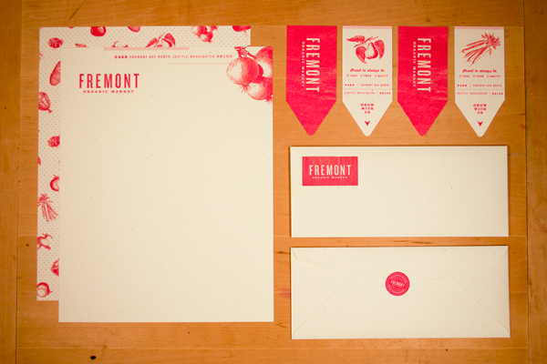
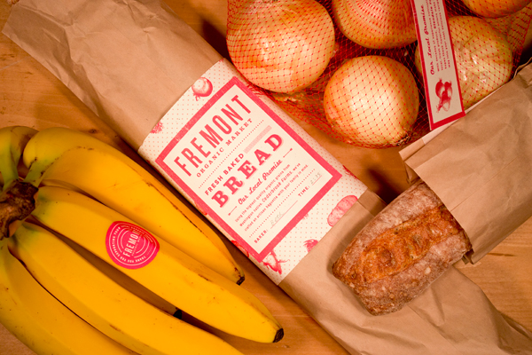
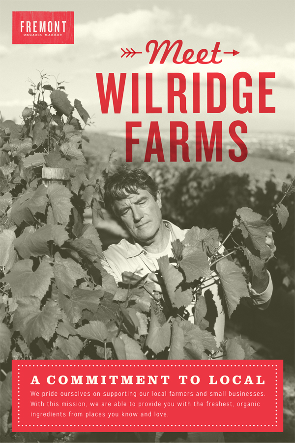
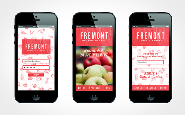
Fremont Organic Market
"Following the organic and local food movement, Fremont Organic Market is a fictitious grocery store. Through its branding, Fremont gives off a farm-fresh and organic feel to ensure its quality and promise to local farmers and suppliers. In addition, a mobile app is available to provide customers with a quick guide while shopping. Together these elements, create a brand that captures the essence of real, farm fresh food for people to enjoy safely and happily."
Sacco
"Sacco is a store that offers a new street food product: a bread pocket containing the recipes of the Italian tradition in a completely new way. “Sacco” (in english: sack) is a container of fresh ingredients, especially of the main Scarpetta’s ingredient: the flour. The name evokes an ecological and simple world, focused on the substance. In the traditional italian language, the word “sacco” is also used in the expression “pranzo al sacco” (in english: “packed lunch”) that can be considered as the forefather of the street food concept."
SnapEat
"SnapEat is a mobile app for people to find and share food photos. Users take a photo of food ordered in a restaurant and share it via Geotag. Users can find food they crave and base their choice on popular opinion."
Thursday, 10 April 2014
OUGD502 - Life's A Pitch: Initial Branding Ideas
Following our last meeting, we all decided that we would all go away and come up with branding ideas and present them to each other over our Facebook group and when we got back after Easter.
I decided on doing a quick task on Illustrator to do the starting point of my idea for the branding.
I think we were all on the idea that we are a young, contemporary and fresh design company, so wanted the logo to reflect that.
I personally didn't think that the logo should be too complicated at all. Some contemporary style text and a simple icon. In some contemporary, bright colours. I think the use of an icon of some sort will be good as this is a small piece of design that we can use to brand on a variety of different media instead of having the full logo.
With this in mind I played around on Illustrator and came up with a possible idea:

 I put this up onto the Facebook group for the others to see. Feedback from them was what I expected and knew in the fact that it was alright for a good starting point, but there is obvious room for improvement.
As a starting point I think it's alright, but I know that development is needed to get something a lot cleaner and professional. However I think doing this small task has given me an idea of what works and what doesn't work, as well as colours that we could potentially use.
I also don't think I should include the 'food and drink design', instead I should experiment with trying to use some kind of slogan or strap line that relates to us as a design company.
At this point I will definitely take a step back and learn from this, and draw out some more ideas I have and develop a couple of the stronger ones and see what happens.
I decided on doing a quick task on Illustrator to do the starting point of my idea for the branding.
I think we were all on the idea that we are a young, contemporary and fresh design company, so wanted the logo to reflect that.
I personally didn't think that the logo should be too complicated at all. Some contemporary style text and a simple icon. In some contemporary, bright colours. I think the use of an icon of some sort will be good as this is a small piece of design that we can use to brand on a variety of different media instead of having the full logo.
With this in mind I played around on Illustrator and came up with a possible idea:
As a starting point I think it's alright, but I know that development is needed to get something a lot cleaner and professional. However I think doing this small task has given me an idea of what works and what doesn't work, as well as colours that we could potentially use.
I also don't think I should include the 'food and drink design', instead I should experiment with trying to use some kind of slogan or strap line that relates to us as a design company.
At this point I will definitely take a step back and learn from this, and draw out some more ideas I have and develop a couple of the stronger ones and see what happens.
Subscribe to:
Posts (Atom)