Showing posts with label Critical Evaluation. Show all posts

Monday, 27 October 2014

OUGD603 - Group Crit

Today we had a crit where we were split into groups and had to present our work up to this point. As we are all working on completely different projects with different timescales it made for quite an interesting crit. Before this we were all on the same sort of timescales and briefs, so the content was all quite similar, but now as we are all writing our own briefs and self directing it, it makes things a lot more open and feedback is different.

In preparation for this I looked over the work that I had done up to this point on my Italian Bakery/Cafe and decided that this would be a good point to present it at and get some feedback, especially because I wanted to resolve it within the week.

I printed off the bakery and cafe menus as well as the brand guidelines, and presented them to size and how I was thinking of doing the covers at this point.

Printed booklets

I printed these all as booklets, and have the intention of binding them in this format at this point

I also created three boards on the other work I had done which wasn't printed. I decided that instead of making them all look through the brand guidelines, I'd create a board which showed the main points to the branding. I also created a board for the website, and one for promotion.

While I hadn't done any work on promotion at this point, I had a general idea of what I wanted so created a few quick digital mock ups of the direction I wanted to go in.

Boards:


I said that I intended to resolve the brief imminently once I had sorted the packaging designs, however feedback was that I shouldn't do that because it would be a good brief to extend out a bit longer and make a large body of work for. This is something that I do want to do, however I do need to consider other briefs that I want to start and have finished for the Interim Deadline on December 11th.

Feedback on what I had up to this point was positive and I was given some good feedback in terms of the final presentation and photography of the products. They said what I had been thinking myself about how the final photography should be, with including items which fit in with the branding, such as chopping boards/coasters/bread etc.

In terms of printing the covers for my publications, it was said that I should spend some time to consider the stock I want to use as well as the binding method as this would be important in the choice of stock and presentation of the book. Foil blocking was suggested, as was embossing. I think that I do want to definitely consider the idea of foiling as this means I can consider a wider stock choice than I have if I was just digitally printing.

Overall I found that the crit was useful and helpful. I found that a lot of what was said was things that I was already considering but not sure about, so that reaffirmed my ideas of the print productions to undertake.

Tuesday, 22 April 2014

OUGD503 - Module Evaluation

1.  What skills have you developed through this module and how effectively do you think you have applied them?
The main skill that I have developed through this module is my ability to take a brief and deconstruct it to find out exactly what needs to be done, whether the client is asking for it or not. I have found that this has been an essential part to my practice during the course of the module and has aided me in creating some outcomes which I can be proud of as I know they are good solutions to the brief.

Another skill I have developed through this module is my ability to take briefs from different areas of design and apply my skills to them. Initially when starting this module I was quite unsure about how far my skills could be applied and in which fields of design, however I have found that I have adapted myself quite well to a lot of different briefs.

I have also used this module as a basis of improving my Illustrator drawing skills. While I am confident in my use of software, drawing images in Illustrator is something I tended to avoid in the first year. In the second year I felt this is the time where I must address this and get over the fear I had of the skill.

2. What approaches to/methods of design production have you developed and how have they informed your design development process?
I have particularly found the studio sessions helpful in opening my eyes to the way in which to respond to a brief. While it all seems pretty standard things being discussed, saying them really put it in my mind and has helped me when I have received a brief and started designing a solution for it.

This has definitely helped me in my approach to the larger competition briefs as initially these seemed quite daunting and had a lot of elements to work out and around. However after deconstructing the briefs it made them much easier to follow and come up with a concept.

This module has also shown me that I don't need to spend a huge amount of my time on a brief which has only a small outcome. Time management has been key throughout this module as there are deadlines for each brief, so working around how much time was left and deciding how much time to spend on each brief has massively improved my designing for each brief as I am working to the time restraints and not taking as long or little as I want to.

3. What strengths can you identify in your work and how have/will you capitalise on these?
The main strength I have is in my ability to quickly turn drawn initial ideas into digital versions. This has always been the case, but this module has really helped me develop this skill because of the time scales of each brief. I intend to take this forward and continually develop the quality of this initial design work so that by the end of a brief I have a piece of design which I am very happy with.

Another strength I have in my work is my ability to come up with an idea and then quickly think about how this could be spread across a large range of media. This has helped me immensely because I know the minute I can't think of how it would span over a variety of media, it is not the idea to take forward. This skill also helps me as I am constantly developing these distribution methods along with the development of the brief.

4. What weaknesses can you identify in your work and how will you address these in the future?
I still think my weakness is in my Illustrator drawn work. While I do feel I have improved, I know I still have a long way to go to feel truly confident in this area of design, and I do think that my inexperience shows in some of my design work. To try counter this I have kept some designs simple where I would have liked to be a bit more complex, and I do think that this is a shame and has deterred my progress in this area. However as I know this, I will start to try respond to briefs in a way in which I can include this skill and try develop it to a good standard.

Another weakness is in a couple of the smaller briefs. I do feel that there was a point half way through the module where I got a bit lazy, and the design work shows that. This is obviously not good for my practice or for my portfolio as it shows some work which clearly hasn't had a lot of time spent on it. To address this I will be stopping myself from jumping from initial ideas straight to the computer, to try and develop them first and get a good concept built up.

5. Identify five things that you will do differently next time and what do you expect to gain from doing these?
  1. Find another large brief - I thoroughly enjoyed doing the Domino's brief and do regret not choosing another larger campaign brief to do. While I enjoy small briefs, I do get much more enjoyment out of developing an idea over a number of weeks and strengthening it as I go along.
  2. Design for a wider range of briefs - Something I do regret through this module is not looking around a bit more for some other kinds of briefs. I did have an editorial brief which I never got round to, and very much regret now. By doing a wider range of briefs it develops my skills in a variety of areas and makes me a much more confident designer.
  3. Work more conceptually - While a few of the briefs are built up on concepts, the others are missing the concept element to the designs. Building up a concept is beneficial to creating good design and I will continue to develop my skill in this area.
  4. Work with photography - While I did do a couple of briefs where I experimented with photographic images, I didn't do many. I regret this now as the whole module seems to be based on vector designs and not a large variety of work.
  5. Design for another media aside from digital - something which I haven't done through this module at all is design for another media apart from digital. While I understand this is obviously a fundamental part to design, I do feel I have missed out by not designing something by hand or for a manual process.

Thursday, 20 March 2014

OUGD503 - After Crit Progress Review

After the final crit for this module, and everything that was discussed in that, I decided that it would be best to review all the work I had done for the module at this point to see if there were any gaps or issues in the work I had done in each brief and for the module as a whole.

At this point, my two large briefs, Domino's & Oasis, are at the point where they need to be submitted in a few days so huge changes can not be made on them. On review of these, I decided that the Domino's brief was completely at the point for submission and didn't need anymore work on. However when it came to the Oasis brief, both Daisy and I had read the feedback given and agreed that there were a few issues that needed addressing, mainly in the way our response has been executed and put together. While we have done what the brief asked and answered each outcome, there is not really an overlying concept behind the work, which is definitely something we need to address to tie it all together and make it much stronger.

The main focus of my review is on my individual briefs. In reviewing these, I looked back at what I initially set out to achieve in this module, and what I wrote in my interim evaluation in January.

Overall there is a sense that I have fulfilled everything I wanted to get out of this module and everything I wanted to do in this module.
Things I have achieved in this module so far:
  • Improved presentation skills
  • Improved quality of work
  • Improved conceptual ideas & carrying them through
  • Submitting to live briefs confidently
  • Good time management
  • Creative compromise
  • Experience working on a real brief for a real cause (not just a university driven brief)
  • Win a cash prize
  • Improved portfolio
  • Improved quantity of work
  • Worked on briefs which I wouldn't have necessarily done before/areas of design I had not have much experience in before
  • Experience working with a client and their vision

I do feel that I have done a lot of work for this module and have thrown myself into as many live briefs as I could find and had an interest in. However, what comes with that is that I do have a sense that some of the work I have created for this module, for the smaller briefs, has not necessarily been to the best of my ability, and that is a bit disappointing to me as a designer. I wanted to create work which pushed me as a designer throughout the whole module, and while I do think some of the work has achieved this, there is some work that hasn't.

Some of this that can be put down to the clients brief or vision. I have found it hard with some of the briefs to create visually good work when their idea of a good design is not my idea of a good design. However I don't think that this is an excuse for some of the work I have created as some of it has been lazy and not had a lot of time spent on it. At this point I would say that at least three of the briefs are not up to par and don't have enough developmental work or good work in general.
These three are:

  • Tigerprint Christmas Cards
  • Charlie & Reed, Charlie's Foodshop
  • Harry's Bar & Grill

I also feel that while I enjoyed the 'Object Marketing' brief I skipped a lot of developmental work because I got one idea and went straight into it without taking a step back and planning it all out. I think that this has been the underlying issue with the other three briefs above. I got one idea and then stuck with it, making the brief very quick and easy without thinking what else I could do and how else I could approach my response.

At this point I think that there is not much point trying to reinvent my response to the Tigerprint brief as I never saw this as a brief to focus my development on. It was more of a fun brief to do and play around with. The response I am particularly disappointed in is the Charlie's Foodshop brief, as I feel I did not create a very good response at all and did it very quickly without much thought. There doesn't seem to be much design in it. I feel like I just put some words in a hiarachy and put it in a box. This is a brief that I would like to revisit and create a response that is a bit more visually interesting and has a running concept through it.

Something I have also noticed is that there is quite a lack in image work throughout my responses to briefs too, which is disappointing to me as this is something that I wanted to experiment with and improve my skills with during this module. While I have worked with images in Glacier Coffee, Tigerprint & Secret 7", I feel that this is because the briefs required image work and not because I decided to include it myself. I would like to use this and incorporate this into the reinvention of the Charlie & Reed brief.

It was also mentioned in peer feedback that I hadn't done any work with photographic images. While I did experiment with this in Secret 7", the final design was vector based. With this in mind I would like to find a brief which does incorporate the use of photographic images in some way.

It was also said that I had a lot of small briefs which were quick, and didn't have many which were a bit larger. I would like to address this and find a brief where I can be a bit more developmental and create a larger amount of work. I have found that the majority of the large briefs are now finished or very close to the deadlines so it would be unrealistic to attempt to do one of these. In hindsight I do think I should have created a response to one of the Starpack packaging awards briefs. These were briefs which needed a lot of work and had good prizes for winning, and I do think I should have taken advantage of this while I had the chance. I will try find a couple of briefs that I can use as larger briefs and create a larger response to.

While I have a fair few logo design briefs, I do feel that I could definitely find another one which I can develop and create a very strong response to, and create a whole brand identity behind it. This is definitely something I want to explore, and to create an outcome which I am proud of. Another type of brief that I haven't had much experience with is creating an App or Website. I am not so confident in my ability to create something commercially viable for a client in this area, but the only way to get confident in this is to find a brief and respond to it. 

With all of this in mind, the next step I will take is to find a couple of potential briefs addressing these issues I have, and to reinvent the Charlie & Reed brief.

OUGD503 - Studio Brief 1/2 Final Crit

Today was the final crit for both the studio briefs 1 & 2. For this we needed to bring along boards of every brief I had done up to this point.

I took my 10 final Domino's boards, the 11 final Oasis boards and my 9 small briefs.

The first part of the brief was to present our collaboration boards and spend half an hour walking around and criting other peoples boards.

Overall the feedback on our collaboration was good, but a lot of comments were made on the fact that  we had quite a lot of boards and could do with condensing them down. Comments were also made on the fact that the images were very bold so more white space on the boards might be a good idea.

Daisy and I discussed the comments made and agreed that we would need to make changes to our boards as they were not yet professional looking or showed off the images as well as they could.

The second part of the crit was on our individual boards. In pairs we went around the table and looked over everything each person had and filled in a peer review form, stating the strengths and suggestions for the following sections:

  • Presentation
  • Project Management
  • Have you answered the brief?
  • Any other comments
My feedback:
Overall the feedback I received was positive. There were a few good suggestions pointed out to me. One was that in my smaller briefs I had been working in vectors for all of them and hadn't really worked with photography or any other kind of media. This was something that I hadn't really realised until it was commented on until now so if I have time I will try find a brief which will work with other media.

Another comment was made that I didn't really have any substantial briefs apart from my two main ones, Domino's & Oasis. Although I agree with this, a couple of the smaller briefs have been larger than I have put across in the boards, so this is something I want to work on and represent my work in a much more fair view of what has gone into the designs. With this in mind, I am intending to find a brief that does need a bit more of a development stage to it and a bit more experimentation. A comment was made on the fact that I had gone by the briefs and not really 'broken' them, however I do feel I did this to an extend with my response to the Domino's brief. While I did create a campaign to advertise the deal, the angle I took for it wasn't the typical angle advertisements take.

Thursday, 6 March 2014

OUGD503 - Studio Brief 2: Session 4/Crit

For today's crit I made five design boards for Daisy and I showing the brief and our responses.
An immediate issue with these boards was that we were told the feedback was going to purely be on the boards and not the actual work. I had designed these boards to display the content, not to be final submission boards so immediately knew the feedback we got wouldn't be brilliant, especially because they were being reviewed by people who knew nothing about the brief and our response.

Feedback:
Overall the feedback wasn't too great, and this was expected. However a few of the comments on the second sheet were a little harsh and a bit unintelligent. One comment says we need to give more information on the scale and format of advertisements, but there is a clear situational image of an advertisement showing scale, format and placement. Another comment was that we need some consistent weights in our type. All the type has been done to be the exact same size and weight throughout, so this is an irrelevant comment. Another comment was made on the fact that it wasn't clear who the audience is, however on the first page there is a written explanation stating that these messages will be placed inside the Oasis store primarily, with the clear audience of their customers. Another comment is that we haven't shown one of the messages. As these were design boards, we didn't feel it was necessary to show all the work as it is all proposals and all very similar so it seemed like a waste of space to put these on when there were other deliverables that needed to be shown.

The feedback on the first sheet was definitely more constructive and was actually positive in some areas, whereas the second wasn't positive at all and seemed like it hadn't been done with much look into what was actually on the boards.

Thursday, 23 January 2014

OUGD503 - Domino's Final Crit

For this final crit we were asked to create five boards for our competition brief. We were also asked to bring any collateral we had to go along with it.
Boards:

We were then put into groups of six and split into pairs. We then were told to choose two other people in the group and go crit their work. We were given about an hour and a half to do this. I paired up with Anna, and we gave feedback to Sarah & Charlie.
Grace & Joe gave feedback for my work.

Comment on the effectiveness of the product/proposal in relation to the original brief
Strengths
Appeals to the target audience - youthful and current
Attention grabbing - campaign sticks in your head because it is offensive
Weaknesses
Tone the offensiveness down or focus the offence on everyone else but the individual, e.g. 'you're awesome because you do two for tuesdays. everyone else is a sad loner' etc.

Comment on the appropriateness of the response to the identified audience and/or context
Strengths
Young people don't get as easily offensive so it works
Weaknesses
Older people might be offended or not understand

Comment on the visual quality of the final resolution
Strengths
Very striking, eye catching aesthetic.
Very clear and crisp
In line with Domino's identity bus is extended well.
Like the use of pattern & line

Weaknesses
Strap line below banner on A5 flyer too small to read.

Comment on the quality/effectiveness of the presentation of the product/proposal
Strengths
Good Aesthetic & layout of boards
Good visual elements

Weaknesses
Understanding the concept was difficult - not obvious straight away. A bit more written explanation would be good.
A bit more written explanation would be good.
Also no explanation of audience & relation to concept

General comment on work presented 
Pretty awesome
Tone down offence or direct it at everyone else but the individual - make that obvious

Overall the feedback was generally positive, with some suggestions that are very helpful. The main issue that they had with my brief response was that I didn't indicate my audience on the boards created, which in turn made it hard for them to generally judge whether the response was appropriate.
I have also taken into consideration what they have said about how offensive it is and maybe toning it down a little.

Thursday, 9 January 2014

OUGD503 - Domino's Interim Crit

For this crit we were put into groups of five and given a couple of hours to talk through our briefs. The main aim of this crit was to make sure that the concepts and our responses made sense and were appropriate to the brief, as well as enough design ambition and scope.

I prepared the following design boards to show my proposal.
Feedback on the concept was positive as it wasn't a typical take on advertising the brand, more of an anti-advertising but still working to promote the deal. The focus on printed advertisements was agreed that it is the right direction for the type of design/concept I have, and it was suggested that I could experiment further with the digital side of the campaign.

After this crit we were told the final crit was in two weeks time where we would need 5 final design boards representing our responses in the best way possible.

Wednesday, 8 January 2014

OUGD504 - Design For Print & Web: Final Crit

Today we had the final crits for our Design For Print & Web briefs. For this we were put into groups and each given a Crit Feedback sheet to fill in for the person to our left.
We were given around ten to fifteen minutes each to talk through our response to our chosen brief, and told that the feedback must not be about changing the content or design of it as there are time constraints, that it must be about the response in general and what could be included to improve it.

The feedback I was given:

Strengths

  • The type used on the inside of the packaging is effective
  • Good use of packaging
  • Really strong concept
Areas for Improvement
  • Experiment with fading out the type pattern on the front of the menus
  • Consider working with more of the photography - it works really effectively
Overall the feedback was positive about my response to the brief, with everyone seeming quite enthusiastic about the concept and about the work I had done for it. I think the feedback given as definitely helpful and the points made will improve my final printed outcomes.

Saturday, 14 December 2013

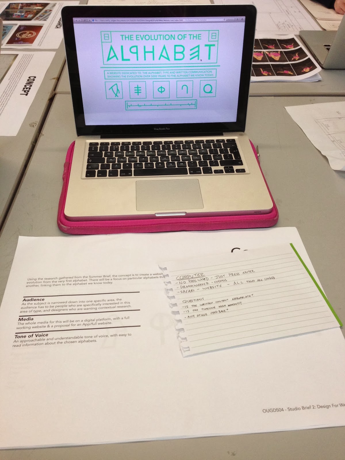
OUGD504 - Final Web Crit

For this crit we were asked to prepare design sheets and leave our laptops to show how far we had come on with the website. We we were also told to think of some questions that we wanted answering.
My questions:

  1. Is the written content appropriate?
  2. Is the timeline page needed?
  3. Any other feedback?
The majority of my feedback didn't actually answer my questions, which was a little annoying, but the couple of people who did answer those questions were helpful and made my decisions easy for those two queries.
The majority of the feedback was design related. There was positive feedback in terms of the overall aesthetic and control of the website. The main point that was brought up was the colour scheme again. Although they agreed that the green was easy to read on screen, a darker colour might be more fitting for the subject and audience as it makes everything a little easier to read.


A comment was made about the navigation being 'daunting' because you didn't know what you were going on until you hovered over it. Although that's sort of the whole point to the rollover buttons, I have taken this comment into account.
One person said that I should consider the audience and their wants and needs for this website, saying that they might not necessarily want such a contemporary design.
Overall I found the crit to be a bit of a mixture between helpful and not. My main queries weren't really answered, but I was given a lot of other feedback related to the design that I will have to take into consideration.

Tuesday, 26 November 2013

OUGD504 - Web Interim Crit

For this crit we were put into groups and had to present our website concepts, wire frames & potential coding, talking through the way in which the website was going to work & navigate.
I showed the three wireframes for my pages as well as the half finished website, which had all the images on but no written content.
Content shown:
 Feedback was generally positive, with people liking the simplicity of the design and the use of vector images instead of photographic images.
The only slightly negative feedback I got was about the colour chosen, more on the reason on why I chose the colour as there was not much significance to it, or a related reason to use it for the content. It was suggested that I change all the colour to black as some people felt it would be more striking.
However I think that colour choice is down to personal preference at the end of the day and I certainly prefer having the green colour over black.
I found this crit useful as it affirmed my ideas on this brief and gave me some useful suggestions and other people's insight into how well the website worked and put across the content & concept.

Tuesday, 12 November 2013

OUGD504 - Progression Crit

Design for Print/Design for Web Crit 2

For this crit we were put into groups of six and also had a tutor (Lorraine). Like the last crit we were given a few minutes each to talk through our two briefs and talk about any queries and concerns we had, as well as getting feedback in terms of the concept/design ideas.

Design for Print
For this crit I brought along my new concept for helpful information for new students at LCA, producing a couple of print outs of the flowcharts I have been creating, and talking about the supporting material which will go with them.
Overall the group was positive about my concept, a lot more positive than in my last crit. They thought the concept of flowcharts was an interesting one and was genuinely useful, especially if they were to be put in the right places, near the technology/processes they are associated with.
I was told to think more about the supporting materials and the form in which these will take, maybe thinking about something more interesting than standard booklets/leaflets.

Design for Web
I also brought along my new concept for the website, looking into the evolution of the alphabet instead of into hand drawn type.
I got a positive response to the minimalist layout design and simplicity of it, however it was mentioned that it is hard to know exactly what the website is about, so a small description or 'about' section will be useful to include.
In reference to content, it was said that I need to focus it down and read over the research and pick out the important points to write about and make it relevant and worth knowing instead of just writing content for the sake of writing it. It was suggested that I look into why the alphabets are the way they are and why people needed the alphabets in their times.

Overall I found this crit was a lot more positive than the last and did help me in reaffirming that I had made the right choice changing both of the ideas in the way I have. The feedback was constructive and definitely something I will consider when designing further material for both briefs.

Tuesday, 5 November 2013

OUGD504 - Peer Interim Crit/Study Task 7

Design for Print/Design for Web - 5/11/13
In this crit we were put into groups of about 8 and given a couple of hours to go round and talk about our project concepts and design decisions, and then criting each other. In our group we decided to talk about Design For Print first as we thought this brief was more important for the minute, and then do a quick crit for Design For Web at the end for those who wanted it.

Design for Print
I presented my initial ideas for my brief, which was to create a book containing all the information a new designer would need to know about designing for print and information on how to design for print, with tips and illustrations to show print processes etc.
I showed my initial design ideas, showing the two completely opposite ideas I had for the overall aesthetic of the book; the first being a more playful & hand drawn aesthetic which largely played on screen printing, with packaging that highlights this. The second is a completely digital look with a very clinical & clean approach.
Overall the reaction to the first idea was positive, especially for the packaging, however it was commented on that I hadn't narrowed the research down because I hadn't chosen a specific audience. As I had gone for a broad audience, it is hard to narrow the research down, so I had planned to make a book including everything.
At the time I didn't think this crit was successful as it made me question every design decision I had made until this point, however in hindsight it has had a positive affect because it has made me think a lot more about who this will be aimed at, why, and what they would need it for.

Design for Web
I presented my plans for a website on hand-drawn type, and like the crit for print, audience was brought up again. Who would want to go on the website, and what would they expect/want to find on it?
Initial thoughts were that they liked the layout design I had done for the homepage, but needed to think more about the content I was using on the website and why I was using it. To do this I need to go back to my research and look over it, research further and decide exactly what needs to be included and have a good reason for it.

Friday, 26 April 2013

OUGD406 - Speaking From Experience Final Crit 26.04.13

In this crit we were put into small groups and had to give a short presentation of our work, and say specifically what we wanted feedback/help on.

As my content was finished, my queries were on the stock choices. I had already chosen the stock to use for the coloured sheets.
Coloured stock chosen
However I was having trouble choosing out of the four stock types I had chosen for the main pages.
Stock Choices
The print quality was all the same on each, but I was having trouble choosing between them. I had already ruled the Grey Marl (3) out as the red made the paper seem a bit of a green colour and it didn't go with the burgundy stock at all when this happened.
My initial thought was between the two lighter stocks, Antique White (2) & Bulky Newsprint (4), but I was unable to decide, and I did like the texture of the sugar paper (1).
The feedback was mixed about the stock choices, evenly spread across the three, so we had a discussion about it and worked it around the burgundy stock.
Like me, people liked the texture of the sugar paper, but when it came to which went the best with the coloured stock, it was between the antique white and bulky newsprint as they were both white and clear. In the end the majority decided upon the bulky newsprint as it was a smoother stock.
Other feedback given was that on the section definition page. The text is in the same point size as on the designer pages, however as it is on coloured stock, which is quite dark, people found it was quite hard to read and suggested trying out different point sizes for it.
Overall I found the crit useful and think we all helped each other out a great deal. Doing a crit in a smaller group, where we can say exactly what we want feedback on is definitely a lot better than people just telling you what they think. I found it was helpful and specific and told me what I needed to know, and not make me think about design decisions that they have questioned because of their own opinions.

Friday, 19 April 2013

OUGD406 - Speaking From Experience Crit 19.4.13

The format of this crit was as a group of 11 individuals & groups, showing how far we had all got with the brief and asking for feedback.
I showed the content of my book that I had so far, which was all images filtered & imported as well as all the designers names, section title pages & front cover.
Feedback was generally positive, with many people saying they thought the concept was a good one and would have been very useful for when they started the course. People were also positive on the idea of keeping the layout simple and consistent throughout the book, as well as keeping to the simple colour scheme of just red & black for text.
It was suggested that an infographic about finding a designer/how to research might be useful to include as a double page spread or poster, or some kind of added extra.

Friday, 22 March 2013

OUGD406 - Speaking From Experience Crit 22.3.13

The format of the crit was presenting the concept, method of delivery and production ideas to a small group, Simon & Amber, and two third years.

Feedback given:
The main bit of feedback I had to take into consideration was the production and final outcome and how costly it could be to make a book. If this was the case the cost would be high, especially if I intended to have full colour throughout.

Things I need to consider from feedback:
Publication type - does it need to be a book? Would a poster/cards be cheaper & easier to produce?
Colours - full colour vs limited palette
Tone of voice - informal or formal?

Friday, 1 March 2013

OUGD406 - Communication is A Virus Crit 1.3.13

This crit was with Simon and two other groups, each with a different topic to us so we could get some decent feedback which would be beneficial. We discussed our concept, initial ideas, how far we had gotten with it all and what our problems were.

Our main problem was interaction from the audience it is aimed at. We have found it difficult to get feedback and get people involved in it. To address this, feedback given was that maybe we should go down the route of doing bold, shocking posters/leaflets which would catch people's eyes, and put them around the university.

All feedback was positive and helpful to us, and we found it will definitely help us get a solution. They all liked the concept and our method of delivery, but agreed that it needed some work to get it to reach the audience and for them to interact with it.

From the feedback we have decided to create a series of posters which are bright and catching, and get the point across very easily.

Monday, 25 February 2013

OUGD406 - Communication is A Virus Crit 25.2.13

This was out second crit of the project, where we had ten minutes to explain the concept and development to Amber, and discuss how it will work and could be developed further. We also handed in our completed brief.
Completed brief form
Overall the feedback was positive on the new concept we have made - getting people to tweet only five times a day with tweets that aren't pointless, and have a reason. However our method of delivery still needs some working on as we are trying to make it viral.
Our ideas of putting up stickers where people are waiting and tweet a lot, is a good one, but is flawed in the fact that it might not really be effective in making people take note and actually visit our twitter page.
Tweeting people directly with photos of the sticker in places they've been is a bit too personal and could be considered creepy - I agree.
So perhaps stickers should be used in a different, more creative way.
It was suggested that creating everything digitally and sending out E-leaflets/posters etc would be a better idea as people are already on the computer and internet, and would be more likely to go onto our page.
Also suggested was the idea of making a desktop background for computer and phones that perhaps reminds people of our message and makes them think more consciously about it. I think this is definitely something to explore as it could end up being quite effective. (Also the use of an E-book which is printable).
It was also said that using a twitter page to counter the amount of twitter page is a little bit contradictory of itself and had to be done carefully. This is true, but twitter is an easy way to get the message out and get to the mass audience.

Friday, 22 February 2013

OUGD406 - Communication is A Virus Crit 22.2.13

Initial ideas
Initial Ideas Development

Our first crit is going through our initial ideas and the concept with Amber & Simon. Our initial idea was to make people use twitter/social networking sites 5 less every day/week. For this we wanted to make a twitter account & an App which people could use to track their progress.

Initial reaction was that the concept was a good one - trying to get people to use social networking more effectively/5 times less a day/week, however the main issue was with our method of delivery. As we have to physically make the App and see if it has worked, it is something which we wouldn't be able to do given the idea. It is probably not possible to create an App that does what we want it to do. So because of this we have to rethink our method of delivery to something that is more possible and easier to do over a short space of time.

Friday, 15 February 2013

OUGD406 - Design Is About Doing Crit

Secret7" Practice

We got into groups for the crit and spoke through our ideas. I presented the 30 thumbnails, 5 final variations & the colour variations for each.

30 Thumbnails


5 variations

The feedback I got was that it was useful to have the colour variations I had done, as it gave them an idea of how the piece worked in general, and how the other colours looked so the colours showed in the final 5 didn't drive their complete opinion of the piece.
Their opinions were mixed, ideas 1, 2 & 4 being the favourite three.
They all agreed that idea 2 was interesting because it was so different to the other 4 and didn't reply on geometric shapes, relying on the concept of it instead. However my personal opinion clashed with theirs, as I was not a fan of it because I didn't feel it was as clean and professional as the others.
They were not a fan of the blue used, but did like the red & yellow used in the others, & they liked the spirograph idea.

Wednesday, 30 January 2013

OUGD405 - Self Evaluation: Research, Collect, Communicate

At the end of this project,  I can definitely say I worked hard, and the final product shows that. Setting myself a magazine is a big task and I think I managed my time well and got it finished to a high standard.
I think it flowed well and stayed consistent throughout. The movie posters I recreated also fit in well and looked part of the magazine instead of completely different, which was one of my main aims of the project.
The posters worked out well and each was individual - with their own colour scheme & images/typefaces. However the poster I would think about redoing is the 'Beasts of the Southern Wild' one, as I feel that I did not do that one to the best of my ability. This is down to the fact I have not seen the film and there weren't really a lot of images with distinctive items or anything in, in which I could use on the poster. I would also consider redoing the 'Silver Linings Playbook' posters as I don't think I fully explored the potential ideas and layout designs I could have. Other than those two, I do think they all worked well and integrated into the magazine well.
For some of the information I got, I did find it quite hard to come up with images to represent them, which is because a lot of the information was statistics or films I had not seen so could not make adequate images for them. I did it where I could (Avengers & James Bond) but if I had more time, I would consider breaking down some of the pages and include some more images.
The simple book binding worked well and fit in with the style well, I think. If I had considered the size of the magazine/margin size a bit more, I would have liked to do something a little more decorative, but the simple binding works well on this occasion.
The calendar was a last minute decision but I think overall it worked well, and stayed consistent with the style of the magazine. I would have liked to create new images for this, however given the time constraint, this was not possible. I would have liked to have created images for one of the films that was coming out in the month - the issue arising that a lot of the films I had not heard of/had not been advertised yet.
Overall I think the project was a success and is definitely the best I have done so far. I enjoyed creating the magazine, however next time I will perhaps not put the constraints of Saul Bass style on it, as I would have preferred to do something a little more post-modern & Carson like as this is what I prefer. For this though, the style worked well and looked clean and professional in the end.

In the final crit, the feedback was mainly positive, the only negative being the amount of information on a few pages - which I do agree with - and that I should consider the use of white space and how effective that can be instead of overloading the page.