Wednesday, 28 January 2015

OUGD602 - Studio Brief 2: Portfolio Photographs

The photographs below are of the finished portfolio, printed and bound. I have done two copies at this point.

Coptic bound.
GF Smith Stock for the interior pages, with printed mount board for the covers.
Measures to: 200x280mm.

Overall I am pleased with how these portfolios have turned out. The only issue I have is that the paper is a bit thinner than I thought, and in a lot of light, you can clearly see through to the work on the previous page. The binding does take a while, so if I am to produce more I need to set aside some time for this. There are a few slight printing issues with blurring of the edges of some images, however this is minimal, but is something I need to consider when printing more. I think the binding gives a hand-made feel to the portfolio, which contrasts against the clean and simple layout, showing both sides to my design practice.


Tuesday, 13 January 2015

OUGD602 - Leo Burnett Reply

Today I got a reply from Leo Burnett regarding the placement which I had emailed with previously.

Unfortunately they can't offer me a placement right now, but said to check back in a few months when they would have time for i.

This is disappointing, but I suppose at the same time it will mean that I will be able to look at other places and get more experience in design in other areas/with other studios.

Saturday, 3 January 2015

OUGD602 - Studio Brief 2: Self Branding - Creating a Typeface

After previous reflection on my portfolio and self branding, I have decided that I will move forward with creating a typeface for myself.

I have decided that I wan to use it for headings, dates, and an identity. I also want to include a hand rendered element to the design, and perhaps have a digitised hand rendered typeface as it shows my interest in hand drawn typography as well.

I went through styles of typefaces and decided that I would make a Slab Serif style typeface. It isn't quite as formal as a Roman serif typeface, but also has a bit of individuality to the typeface.

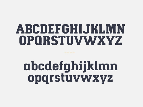
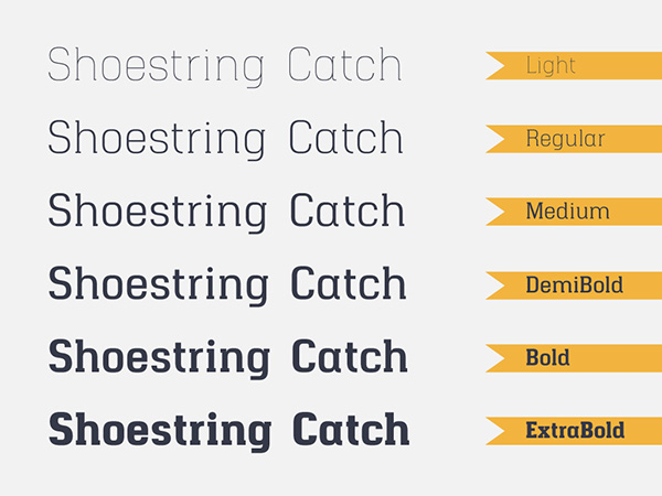
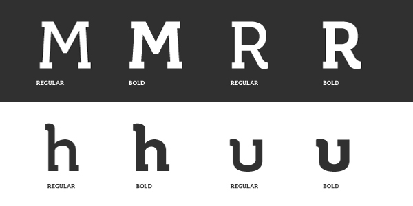
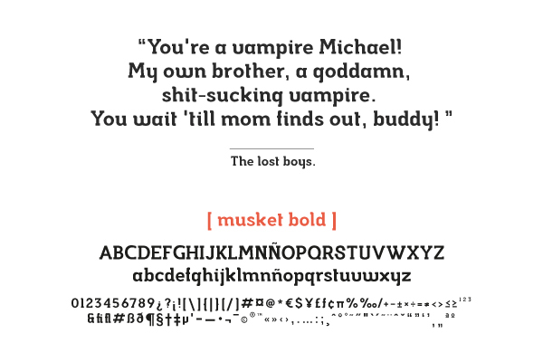
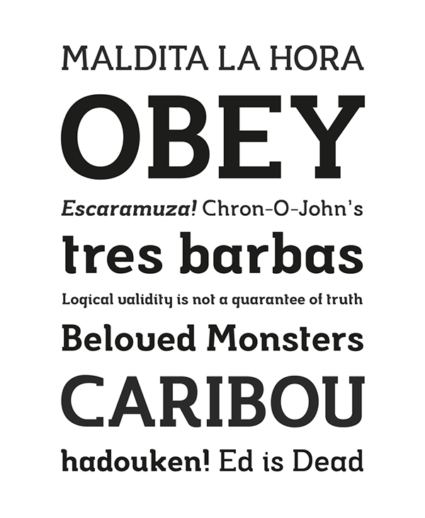
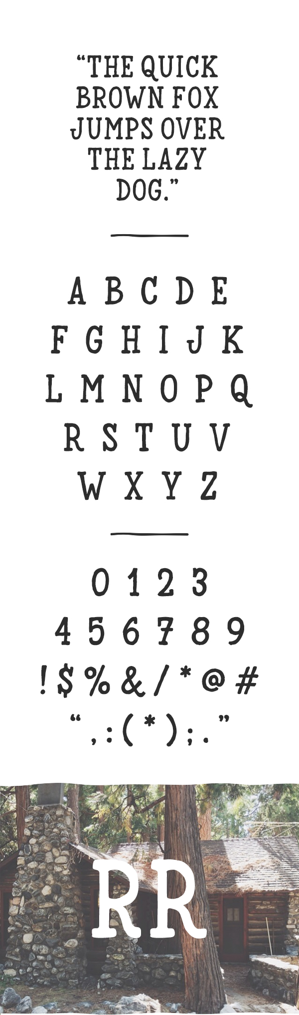
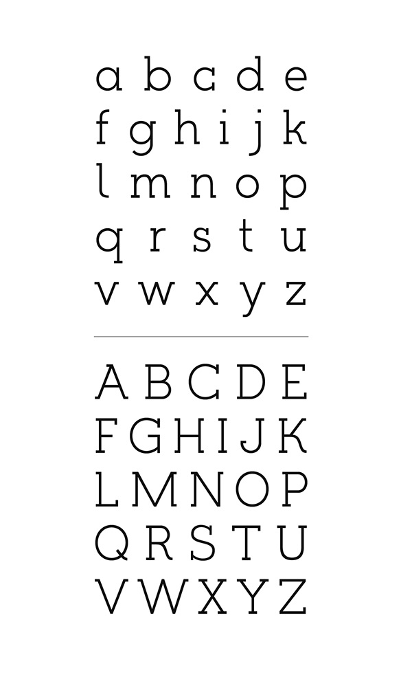
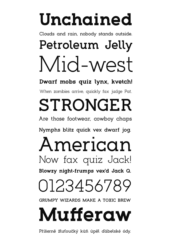
With this, I looked at a variety of Slab Serif typefaces. Below are the ones I particularly like.


Choplin

Hapna

ALEO

Musket

Timber

Kelvin

I collected a wide range of Slab Serif typefaces/logos and put them all on a document, printing it out so I could go through it in more detail and pick out the attributes of each letter that I like. I have found that when I use a typeface, there's always a letter or two that I really don't like, so I really want to make an effort to accommodate my personal tastes in letters while keeping it uniform and consistent.


Points I want to use:
  • The middle of the 'M' must not touch the base line. Vice Versa for the 'W'
  • The font must not be wide like 'Sedgwick' (Above)
  • 'Romanesco' is a good proportion
  • I like the idea of serifs being on the outside of the letter instead of both sides
  • A bit of character of the curves (R & Q marked above)
  • The 'O' and '0' must be different
  • The 'N' shouldn't have serifs on the top left or bottom right
  • A semi-bold to bold weight ('unchained')
  • An Ampersand will be needed (Wheatless & More Client Project)
  • Uppercase
  • Would prefer a fully round 'O'
  • Don't like the serif on the top of the 'A'
  • No serif on the end of the cross bar ('E' & 'F')
  • 'U' and 'V' must be visibly and very clearly different
  • 'B' bowls must be symmetrical

After deciding on these factors I decided on making a start by hand. I want to draw out every letter by hand and then digitally alter them so they are more consistent.

I started by drawing a grid, deciding on 4x4cm, with the thickness being 5mm. There is also an extra 5mm on either side for serifs. Having a square grid means that 'O' will be a perfect circle, and 'X' will be a square.


I initially started with the idea of the letterform filling the 4x4 space and having the serifs in the 5mm outside this.

I also wanted an individual serif shape, so instead of having just a straight slab serif, I want an angle to it.


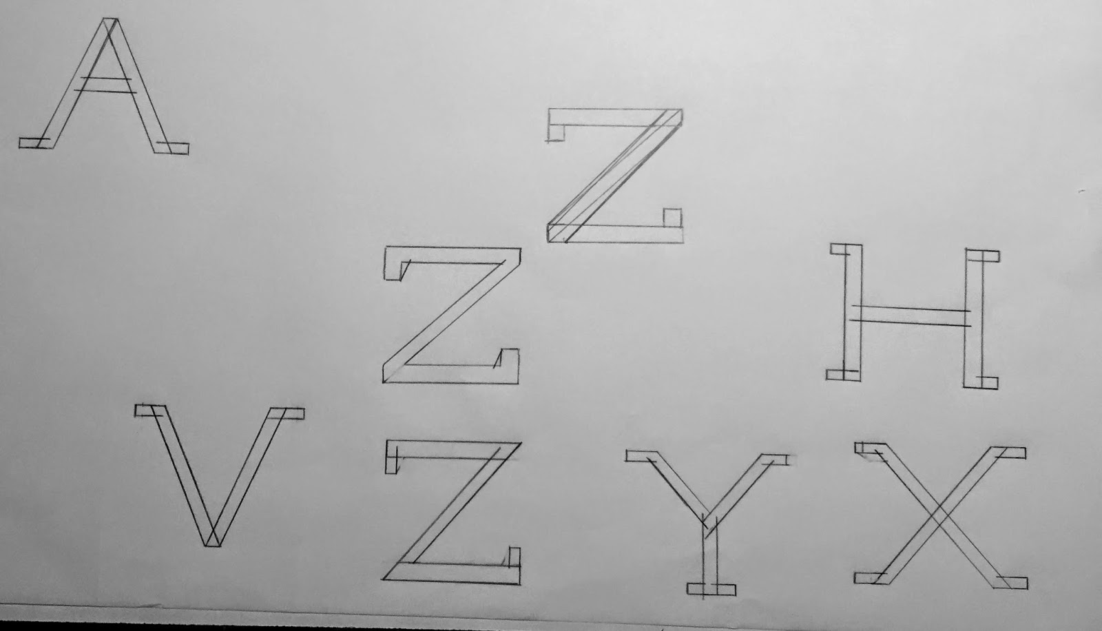
I tried both of these as shown above, however I think that the letters are too wide. While the 'H' and 'N' seem to work well, letters such as the 'X' and 'Y' just don't seem to work so wide. I am also a bit concerned about the style of serif on the letters with diagonals. Once again it works well on the straight letters (H & N) but doesn't work so well on the other letters (X, V, Y). This is because the diagonal of the letter changes the point where the serif bottom meets it. Also the serif size on these letters are different to those like 'H', which is something that I need to really consider.

I did briefly try the idea of having the serif go 5mm from the edge of the diagonal, as shown below, however this made the serif look overly big in comparison to the others, and overall it just doesn't sit right with the character.


I also tried the idea of having a thinner serif. Three variations of serifs are shown in the 'Z' below, with the thinner serif shown on the other letters.


I then tried it with the thinner serif with a diagonal as well, as shown below. However I much preferred it with the thicker serif and diagonal.


After settling on the thicker serif and diagonal I drew out each of the letters to the grid. I expanded it for the 'M' & 'W', and made it smaller for 'I' & 'J'. All other letters were made to fit the grid.

For the 'Q', I added a unique tail instead of having it just a diagonal across the bottom right. I really like how this worked as originally I was a bit unsure.


As I drew these on layout paper, I photocopied them onto a thicker stock so I could create the block shapes without affecting the paper and letterforms.


I then scanned these into the computer and turned them into vectors on Illustrator.


There are clear issues in terms of line width and serif size. While I initially wanted the hand drawn feel to the typeface, I am unsure about it now seeing it vectorised. I feel that it just looks unprofessional like this and perhaps something more digital and clean would look better.

I then went through a few stages of change before finally settling on what I was happy with.

Stages of change:


The first thing that was immediate was that while I had drawn the majority of the letters to the same width, this is not the case in the majority of typefaces, and some letters would benefit from looking thinner. As this is my attempt at creating a typeface that I am happy with in all aspects, I needed to edit letters in the way which I thought worked best. Letters such as 'E' 'F' and 'P' were made thinner in width.

The line weight for letters with diagonals was also an issue that needed to be altered digitally. This is clear in the 'Y' shown above, where the arms of the 'Y' are much thinner in the hand rendered design than in the final design. I wanted the weight to be consistent across all elements of the letter anatomy.

In terms of the serif style, I tried a variety of styles both by hand and digital, and as I created the typeface over a number of days, by the time I had it digital and was on the finishing stages, I found that I much preferred the straight serif as it works well with all the letters and doesn't have the issues that the diagonal serif does with letters such as 'Y'. This is shown clearly above. I also wanted to use the idea of the serif being just on the 'outside' of the letter (Look at 'M'), so decided to keep this as a uniform trait across all letters that needed a serif. While I initially had serifs on both sides of the base in letters such as 'P' and 'F', I like the individuality of the serif to one side. It shows that I have considered the overall look of the typeface and not changed the serif use depending on the letter.

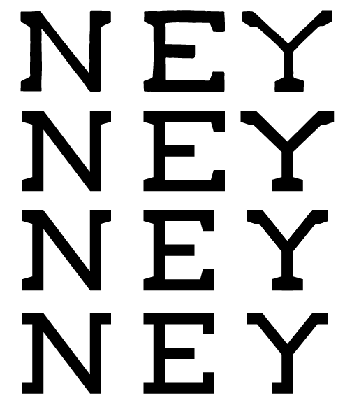
Finished typeface:


While I had initially wanted to create a hand rendered typeface, I do think that the final typeface is far superior to my hand drawn designs. I do think I can say that it has kept true to what I wanted because the hand drawn process is wha really aided the design of this typeface. It gave me a much greater understanding of how the letters work on their own and with others in terms of width, spacing and serifs.

Overall I think the typeface has turned out really well and I am pretty confident that the letters are all individually strong and it works well as a typeface. The serif to the left has really grown on me and I think it is something that differentiates it from any other slab serif typeface. I also did eventually include a serif to the top of the 'A'. I initially didn't like this in other typefaces, however I think it works really well in this typeface.

Typeface is use:


Friday, 19 December 2014

OUGD602 - Studio: Studio Caserne

I have been following Studio Caserne's work for a while now. They are a design agency based in Montreal, Quebec, Canada.


Their website and work is all in french, so it makes it a little hard to get information about them properly, however their behance page is in English, so that makes it slightly easier.

I really like their work because they work across a variety of different styles, from flat design to using photographic imagery. They also seem to do a lot of work for the food and drink sector - something which I really enjoy doing myself.

UQAM


Rutabaga


Tuesday, 16 December 2014

OUGD602 - Studio Brief 2: Portfolio/Self Branding Update

As I am now at a stage where OUGD603 has been handed in for an interim submission and my COP3 module is going well, I decided that I needed to focus on my portfolio again for a few days as I feel it is already in need of an update.

Current Portfolio


While I was happy with the portfolio, I do feel there are obvious improvements to be made and it could be redesigned to suit me much more. I don't feel like the content in it shows off my range of skills as well as it could, and now that I have done a couple of months in the third year and have produced some new work, it would be good to include these also instead of some of the other projects which I am less sure about.

Another thing I want to improve upon is the CV side to the portfolio. I wasn't particularly happy with it in the previous portfolio and I do always find this a bit hard to do well.

The main thing that I want to do is put across my interests and what I am good at. The first thing that I want to do to do this is to create my own typeface to use for this portfolio, and use it as a part of my branding.

Over the past few months, due to my COP, I have had a much bigger interest in typography and now have a much better understanding in how typefaces are constructed and how the letters relate to one another. I think that this knowledge is beneficial to creating my own typeface and I now feel confident to do so.

I have previously created around six or seven different typefaces, however I have never really used them much, unless designed specifically for a project. I want to create a typeface that I am happy to use across a range of materials, and use to create my own logo design and branding.


Content
The first thing I did was look over my current portfolio and make a list of all the projects which are currently in it, and which ones I was unsure about having in there or don't want to have in there anymore.

Projects in Portfolio
  • YCN Domino's Pizza
  • The Evolution of the Alphabet
  • Ampersandwich
  • YCN Oasis
  • Air Jordan Publication
  • Top 10 NBA Players Exhibition
  • Courtside Typeface
  • Finding Vegan App - Client Brief
  • The Family Postcard Logo - Client Brief
  • Mike Marshall Logo - Client Brief
  • The Woodshop Logo - Client Brief
  • Massage Williamsburg Logo - Client Brief
  • The Soul House Logo - Client Brief
  • Classic Quality Meal Service Logo - Client Brief
  • Wheatless & More Identity - Client Brief
Projects I am unsure about/Want to take out
  • The Evolution of the Alphabet
  • Amersandwich
  • YCN Oasis
There are three big projects which I don't want to include anymore because I don't feel they best show off my abilities, mainly because they are all at least six months old, and I have moved on a huge amount in the way I design now.

I have two projects which I would like to include now from OUGD603 - Typography Principles Publication, and 30 Days - the 30 days of hand drawn type.

I think I could also structure the content better and create sections depending on the brief itself. I also want to include some of the typefaces I have previously created as it will show my interest and capabilities in typography design.

With this included it gives me four sections for the portfolio - About Me, Projects, Typefaces & Client Briefs. This will show off a range of work in each of the sections and show what I am capable of as a designer.

Including client briefs also shows that I have communicated with a client and fulfilled work for them, working in a professional manner instead of just having university set work. It shows independence, and that I have completed a variety of different jobs for clients - e.g. an App for FindingVegan, and an identity for Wheatless & More.

Below is a list of the content I want to include in the sections.

Projects
  • YCN Domino's Pizza
  • Air Jordan Publication
  • Top 10 NBA Players Exhibition
  • Typography Principles
  • 30 Days
Typefaces
  • Courtside Typeface
  • + 3 other typefaces created
Client Work
  • Finding Vegan App
  • Logofolio - a folio of logo designs created for clients
  • Wheatless & More Identity
Overall this gives me a total of 11 projects and a logofolio with a variety of client logo designs created. I am unsure whether I need another project in the 'projects' section. The only thing that I have noticed is that apart from the 'Finding Vegan App', I don't really have any digital work. This was originally the 'Evolution of the Alphabet' project's job in showing that, however I really don't think that shows off the best of my ability at all, so I need to think about if there is something I want to include to substitute this.

Friday, 12 December 2014

OUGD602 - Contacting Leo Burnett

Following my week long placement in summer, I contacted Leo Burnett about the possibility of spending another week or two there for a placement.

I really enjoyed it in summer and everyone was very friendly, and I was given the offer to be able to come back for another couple of weeks when I wanted to. I found that I learnt a lot while I was there and was able to see how a large agency works.

Hopefully I can go back and have a week or two working with them again.