Si Scott - http://www.siscottstudio.com
Illustration, Graphic Design, Art


Dion Star Studio - http://www.dionstar.co.uk
Publication, Identity, Installation


Analogue - http://www.madebyanalogue.co.uk
Identity, Print, Digital, Editorial, Packaging


The Consult - http://www.theconsult.com
Branding, Advertising


Alt - http://www.alt-design.net/work/
Branding, Print, Digital


Lono - http://www.lonocreative.com
Digital, Infographics, Editorial


400 - http://www.400.co.uk
Branding & Identity


The Pink Group - http://thepinkgroup.co.uk
Branding, Marketing, Digital


KVGD - http://www.kerrvernon.co.uk
Branding, Identity, Print


The Touch Agency - http://www.thetouchagency.co.uk
Digital, Identity, Print


The Design Surgery - http://www.thedesignsurgery.co.uk
Editorial, Infographics, Brand Identity


Avenue - http://www.avenuelondon.co.uk
Branding, Print, Web design


Ideas Factory - http://www.ideasfactory.co.uk
Branding, Advertising, Identity, Marketing, Digital


Deep - http://www.deep.co.uk
Brand Identity, Print, Digital
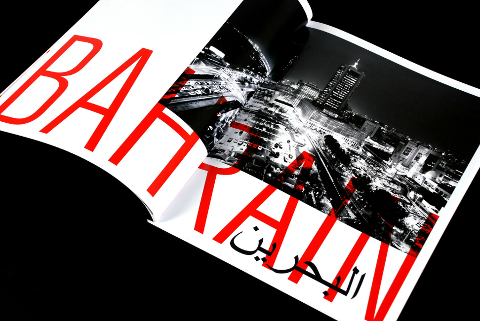


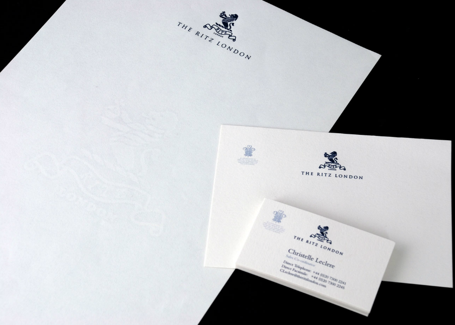
The Chase - http://www.thechase.co.uk
Branding, Digital, Environmental, Packaging, Print, Infographics


Love - http://www.lovecreative.com
Branding


The Partners - http://www.the-partners.com
Branding, Identity


Pentagram - http://www.pentagram.com/work/#/all/all/newest/
Advertising, Branding, Identity, Editorial, Print, Infographics, Packaging, Environmental


Why Not Associates - http://whynotassociates.com
Identity, Print, Editorial, Environmental


Axel Peemoeller - http://www.de-war.de
Brand, Editorial, Infographics, Print,, Environmental


In House - http://www.inhousedesign.co.nz
Branding, Identity


David Airey - http://www.davidairey.com
Brand, Identity


Identity, Packaging, Environmental


Build - http://wearebuild.com
Editorial, Identity, Environmental, Print, Packaging, Digital


David Carson - http://www.davidcarsondesign.com
Print, Branding, Editorial


Buro Destruct - http://www.burodestruct.net/bureaudestruct/home/index.html
Print, Digital, Illustration, Editorial


Alan Kitching - http://www.debutart.com/illustration/alan-kitching#/illustration
Screen Printing


Gen.A - http://generationalliance.com
Branding, Identity, Editorial, Environmental


Pattern Matters - http://www.pattern-matters.com
Typography, Pattern


Identity, Branding, Editorial, Typography


Frederico Landini - http://www.idependonme.com
Branding, Identity, Typography, Editorial


Mike Perry - http://www.mikeperrystudio.com
Print, Screen Printing, Illustration, Typography, Environmental, Digital


Koen Taselaar - http://www.koentaselaar.nl/work/
Illustration, Typography, Pattern


Glazer - http://www.glazer.co.uk/index.html
Branding, Identity, Environmental, Advertising


Pete Rossi - http://www.pgerossi.co.uk/index.php
Identity, Digital, Typography, Editorial, Environmental


Identity, Branding, Editorial, Digital
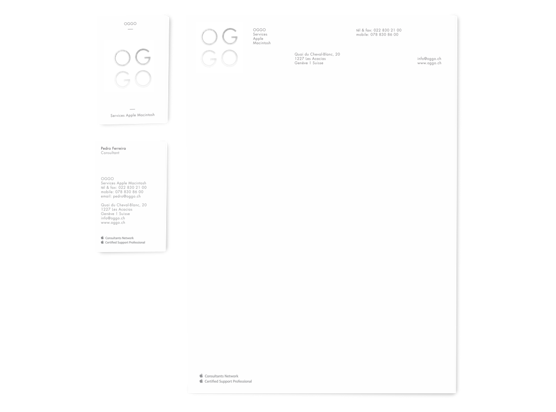


Dave Sedgwick - http://www.designbydave.co.uk/index.html
Branding, Identity, Print, Editorial

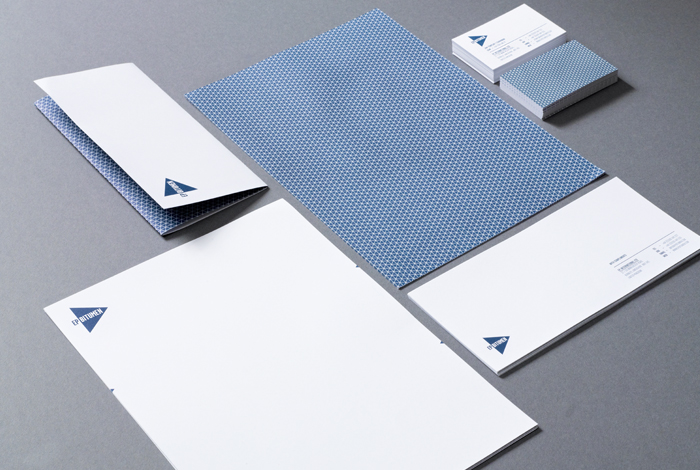


Brent Couchman - http://brentcouchman.com
Illustration, Packaging, Screen Printing


KOMBOH - http://komboh.com
Print, Editorial, Branding, Promotion, Illustration


Salih Kucukaga - http://www.salihkucukaga.com
Branding, Identity, Packaging, Illustration, Editorial, Digital, Typography


Valerie Jar - http://valeriejar.com
Identity, Illustration, Environmental


Michael McMillan - http://michaelpmcmillan.com
Identity, Digital, Print


Erwin Hines - http://www.behance.net/erwinhines
Digital, Identity, Branding, Packaging, Advertising, Print


Homer Mendoze - http://www.homermendoza.com
Identity, Editorial, Print, Packaging


Gregory Hubacek - http://www.gregoryhubacek.com
Dan Cassaro - http://youngjerks.com
Studio MPLS - http://studiompls.com//
Tim Bjorn - http://madebytim.com
Pablo Lobo - http://www.pablolobo.com
Stefano Agabio - http://www.everythingisanumber.com/index.html
Brand Culture - http://brandculture.com.au
Cartlidge Levene - http://cartlidgelevene.co.uk/category/recent
Push - http://www.pushhere.com
BLOW - http://www.blow.hk
Bravo Company - http://bravo-company.info/1021/works
Woody Harrington - http://cargocollective.com/woodyharrington
Cast Iron Design - http://www.castirondesign.com
Experimental Jetset - http://www.experimentaljetset.com
Blogs & Collections
http://www.aisleone.net
http://www.tm-research-archive.ch
Archive of covers/editorials
http://www.dexigner.com
http://www.thedieline.com
Packaging design
http://ilovetypography.com
Typography
http://blog.troychafin.com
http://www.dirtymouse.co.uk
http://www.creativereview.co.uk/home
http://www.theddi.com
http://grainedit.com


