Monday, 18 February 2013

OUGD402 - Study Task 6: What is Design Practice?

Session

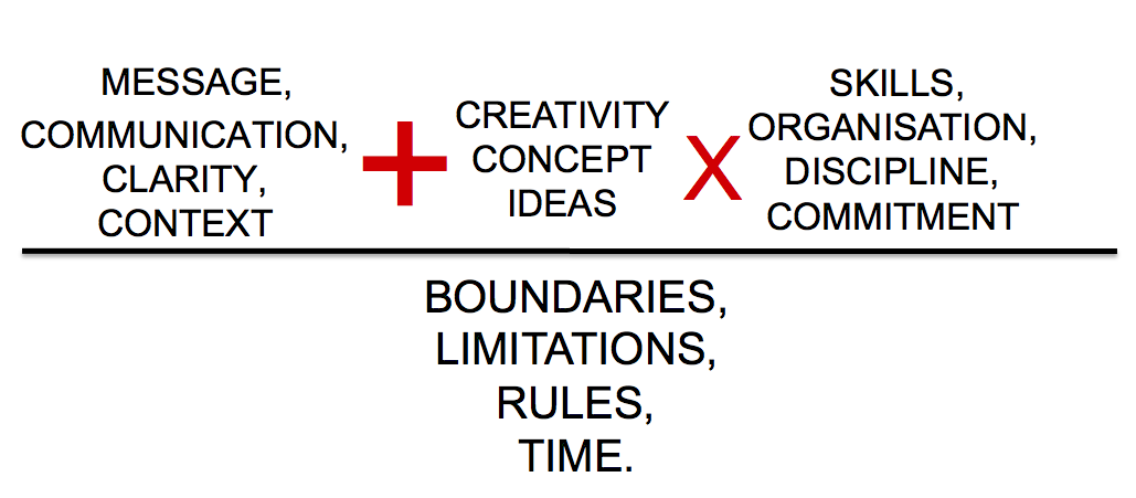
Appropriateness of the Response
  • What is the problem?
  • Who is the audience?
  • What is the context?
  • What is the method of delivery?
  • What is it you want to do or what you need to do?
  • Are you being asked to... or Do you want to...
  • Persuade, inform, promote, educate etc.
  • What is your rationale?
  • What are you doing & why?
  • Driven by concept, idea or research
  • Driven by audience, context or media
  • Driven by creative, ethical or commercial
  • Driven by hand-made, digital or lens base
Quality of resolution
  • Depth of appropriate research
  • Breadth of initial ideas
  • Selection of potential solutions
  • Thorough visual development
  • Attention to detail/crafting
  • Clarity & presentation
  • Type and/or Image
  • Style & individual style
  • Is media the message?
  • Tone of voice
PLAY - Try it, test it, make it better

Collaborate - The space between people working together is filled with conflict, frictions, strife, exhilaration, delight and vast creative potential

Meeting the deadline
Task 1: Answer the following questions
  1. Professional contact details
  2. 5 words that best describe my design practice
  3. 5 words that best describe me as a person
  4. 5 strongest design skills
  5. What areas of graphic design interests me?
  6. 5 favourite designers/design studios
  7. what makes them my favourite?
  8. 5 favourite design blogs
  9. 5 things I want to be
  10. 5 things do I think I need to do to be this?
Answers
  1. Emily Lodge, www.e-lodge1215.blogspot.com
  2. Clean, colourful, professional, bold, to the point
  3. Honest, motivated, Blunt, Kind, Not too serious
  4. Colour theory, Layout design, Typography, Type & Image, Editorial
  5. Branding, Identity & Editorial
  6. Mike Perry, Alan Kitching, David Carson, Josip Kelva, The Design Surgery
  7. They are all completely different styles, but they all influence me and my designs.
  8. Aisleone, Thedieline, ilovetypography, dexigner, troychafin
  9. Successful, Commercial, True to my way of working & style, Individual, A good designer
  10. Be critical, Constantly trying to improve & progress, Analytical of work & designers work, Observant of the environment and design world around me, Stay motivated
We were then put into groups of three and had to ask each other the questions & get the answers.

J'nae
  1. Blog
  2. Eclectic, Editorial, Creative, Research Driven, Digital
  3. Enthusiastic, Cofident, Down to earth, Eccentric
  4. Lens Based, Type, Image, Layout, Digital
  5. Publishing & Editorial Design
  6. Stied Persson, David Foldavi, Alex Mochet
  7. No answer given
  8. Pintrest, WeHeartIt, Visualise, Creative Review
  9. Art Director, Fashion editorial designer, web designer, promotional event designer, featured editor
  10. Take placements, Engage with designers in the same field, Promote my work on blog, Contact specialists
Barney
  1. Blog
  2. Creative, professional, clean, adaptable
  3. Professional, enthusiastic, communicative, rounded, smart
  4. Illustrative, communicative, creative
  5. Packaging, Logos, business side of design
  6. Designers Republic, Attik, Blue Marling
  7. Packaging design for big names
  8. Coolhunting, Designboom, WeHeartIt
  9. Professional, Specialised, Successful, Adaptad
  10. Dedicated, Hard working, Motivated

Task
Create ads based on the answers given by the other two in your group
Barney Waugh
J'nae Saunders
Me

Friday, 15 February 2013

OUGD406 - Design Is About Doing Crit

Secret7" Practice

We got into groups for the crit and spoke through our ideas. I presented the 30 thumbnails, 5 final variations & the colour variations for each.

30 Thumbnails


5 variations

The feedback I got was that it was useful to have the colour variations I had done, as it gave them an idea of how the piece worked in general, and how the other colours looked so the colours showed in the final 5 didn't drive their complete opinion of the piece.
Their opinions were mixed, ideas 1, 2 & 4 being the favourite three.
They all agreed that idea 2 was interesting because it was so different to the other 4 and didn't reply on geometric shapes, relying on the concept of it instead. However my personal opinion clashed with theirs, as I was not a fan of it because I didn't feel it was as clean and professional as the others.
They were not a fan of the blue used, but did like the red & yellow used in the others, & they liked the spirograph idea.

Monday, 4 February 2013

OUGD402 - Study Task 5: Where am I Now?

10 things I have learnt about myself as an individual and a learner:
1. I don't like to plan
Planning is never anything I have ever done, and I have found that I get by alright without doing it. I've become accustomed to living and working without a day to day plan so it doesn't really have a negative affect on me.
Unplanned first brief
2. Past contextual research is just as important as current research into designers
Looking into contextual research of things that don't interest me has never been something I have seen a point to, but while being here at university I have come to recognise that it is important to further my work and mind. I have found it to be useful in m working practice and can now hold a conversation about subjects I couldn't before.
Post modernism by Carson
3. Designer research is key to the success of my final outcome
When I did my foundation level I found that this was a main focus of mine, but when I started this course I found it difficult to get this done within the time limit of a one week brief, and because of this I didn't do enough of this. Now I have learnt to balance the briefs over the week, I have been able to get in this vital research.
Promotional Pack by The Official Manufacturing Company
4. I like to blog early in the morning
Blogging is something that is completely new to me, and I have found it quite hard to get consistent at recording everything in this way. I have found that blogging early in the morning is when I get the most done as I usually arrive to University earlier than most people. I find that I am more productive in those couple of hours than doing some blogging at home during the evening.
Blogger
5. I'm a fast learner on software
When I started this course, I was only familiar with Photoshop as I had been using this for a number of years, but when it comes to Illustrator and InDesign, I was completely new to these. I found that after the Illustrator workshops we did within the first couple of months, I was learning the tools and skills on this program very easily and am now able to experiment with them to create more interesting pieces of digital work.
Alphabet Soup - Illustrator design
6. My final outcome is usually the strongest part of the brief
Final presentation has always been something that is important to me, sometimes more so than the actual concept and idea. I always put in a lot of work to make sure the end product looks the best part of the whole brief, as I think that's the way it should be.

7. I am able to adapt my skills to each brief
Each brief is different, and for each brief I get a different set of criteria and media to use, as well as different concepts and ideas. I have found that whatever brief I have been given, I have not found it difficult to apply my skills to them, as well as experiment with different skills.
8. I have always met the deadlines
I always make sure I work on the final product with a reasonable amount of time until the deadline date, and have always succeeded in finishing the final outcome with good time to be able to go back and review, edit and improve the outcome.
Birth of a font - finished well before the deadline
9. I need to spend more time in the ideas/planning stage of a brief
When it comes to a brief, I usually come up with one main idea right at the beginning, and I usually stick with that one throughout. I do think that this is a good thing, but it does have disadvantages too as I don't take time to consider other ideas, ones which could end up improving the final product. I would like to start spending a bit more time on the ideas generation part of the brief.
10. I need to learn how to make design that all will understand. Just because I understand it easily doesn't mean everyone else will
When given a brief and having the initial ideas as to how this will be carried out, it is easy to get lost in it and forget about the audience and how they will perceive the design. As type is a fundamental part of design, when it comes to designing without it, I do find it hard as I may relate an image to a subject, but someone else might not and will not understand my design decisions.

10 things I have learnt about myself as a designer:
1. I like to only use a few colours in work, sticking to a colour scheme of up to four colours (and black & white)
A consistent colour scheme throughout a brief is important to me. I take time to find a scheme which works well on every element of the brief and stick to it throughout the whole brief, keeping it all consistent.
2. I prefer the use of simple block colours to fades & realistic visuals
Unless working with photographs, I don't really like to design with gradients or realistic style work. I have always preferred working with block colours and vector art.
3. The use of colour is important to me
Colour has always been something that is important to me, and in design getting the right colour for a brief is very high on my list of thing that are necessary. For each brief I try to variate the colour use, but want it to stay well within the context I am designing for. I think colour is very important as it puts across the whole tone of the design work, and getting it wrong could lead to it being perceived in the wrong way by the viewer.
4. I have little interest in infographics or way finding
Infographics and way finding is nothing that interests me, and I do find that the other areas of design are a lot more exciting to me. I have very little experience in designing with these, and don't really want to start now.
5. I have an interest in working in identity
Identity is something which interests me. How one single image makes you think of a company or place in the world. I would like to experiment in this work in the future.
6. I like the idea in working large scale
For the most part, I design on a small scale, but working on things that can be large scale, such as posters is something I do want to start doing more of. It opens up a whole different part of design, and gives the option of retail and promotion work as well.
7. I have an interest in working in editorial & publishing
This is where my main interest in design lies. I much prefer making small pieces of design and putting them over an array of different pages than trying to create one large piece of work. I find layout and structure is something that I find important and like to have a control over, and find I can do this best in a multi-page publication.
8. I like simple packaging & identity design, however when it comes to editorial, I prefer a much more abstract design
When it comes to packaging, I always find myself looking to the ones which are very simple, maybe just a block colour with a logo or a bit of type on. I find these a lot more interesting than ones which are covered in pattern or design.  When it comes to Identity, I like the block coloured designs which are very simple and recognisable. In editorial work I like page layouts which are playful and clearly experimented with.
9. I would like to incorporate hand-rendered work into digital work when possible
Working digitally all the time can get a bit frustrating at times as I don't feel the design has the same personal touches and quirks like they would if it was all done by hand. Digital work is always perfect as it works with vectors etc. I would like  to utilise this as much as possible and combine the two so even when done on the computer, there is a clear personal touch to the work.
10. Typography is more important in my work than image
I have always found it very easy to work with typography compared to working with image. When incorporating the two together, I have always found I just use the image as a background and always put the main focus on the type. I find it easy to manipulate and work around. I will continue to work on this and experiment further with how type can be legible on a piece of design.
Wednesday, 30 January 2013

OUGD405 - Self Evaluation: Postcards

As Photoshop is a program I have been using for a long time, I found this brief to be very easy and quick to do. The restraints of only using this program made it a lot more limited than I liked though. I had gotten so used to using Illustrator and having clean cut vectors that coming back on Photoshop and using it in this sort of fashion was a little irritating to say the least - which was strange to me because before starting with Illustrator on Summer, Photoshop is all I used.
The shape I was given was circle, so after taking photographs, I decided to base the postcards on fire extinguishers as they are circles when looking down at them, but not so obvious when looking directly at them. I thought it was a good idea because even though you might look at it and it isn't obviously a circle, you know it is.
I found that cleaning up and sharpening up the photographs was easy enough, however, when it comes to editing the images to create the postcards, certain filters/effects can make the image look very tacky, so it took some time to get through them to find the ones that looked good and suited the image.
I initially settled with a red filter on them, but found them as a set to be quite boring as they were all the same essentially. So I then started to experiment with other filters and textures I could put over the top to make them all interesting, in the same style, but not repetitive.
In the end, after using a crinkled paper effect and a colour layer, I created the five. I printed them on a off white/almost orange colour piece of paper to see if it would have any affect on the colours printed. I am happy with them, but do think that I could do them better. I don't fully feel happy with them as I don't feel they are really that creative. However, I do think they have fulfilled the brief and at least shown a range of my skills on the program.

OUGD405 - Self Evaluation: Research, Collect, Communicate

At the end of this project,  I can definitely say I worked hard, and the final product shows that. Setting myself a magazine is a big task and I think I managed my time well and got it finished to a high standard.
I think it flowed well and stayed consistent throughout. The movie posters I recreated also fit in well and looked part of the magazine instead of completely different, which was one of my main aims of the project.
The posters worked out well and each was individual - with their own colour scheme & images/typefaces. However the poster I would think about redoing is the 'Beasts of the Southern Wild' one, as I feel that I did not do that one to the best of my ability. This is down to the fact I have not seen the film and there weren't really a lot of images with distinctive items or anything in, in which I could use on the poster. I would also consider redoing the 'Silver Linings Playbook' posters as I don't think I fully explored the potential ideas and layout designs I could have. Other than those two, I do think they all worked well and integrated into the magazine well.
For some of the information I got, I did find it quite hard to come up with images to represent them, which is because a lot of the information was statistics or films I had not seen so could not make adequate images for them. I did it where I could (Avengers & James Bond) but if I had more time, I would consider breaking down some of the pages and include some more images.
The simple book binding worked well and fit in with the style well, I think. If I had considered the size of the magazine/margin size a bit more, I would have liked to do something a little more decorative, but the simple binding works well on this occasion.
The calendar was a last minute decision but I think overall it worked well, and stayed consistent with the style of the magazine. I would have liked to create new images for this, however given the time constraint, this was not possible. I would have liked to have created images for one of the films that was coming out in the month - the issue arising that a lot of the films I had not heard of/had not been advertised yet.
Overall I think the project was a success and is definitely the best I have done so far. I enjoyed creating the magazine, however next time I will perhaps not put the constraints of Saul Bass style on it, as I would have preferred to do something a little more post-modern & Carson like as this is what I prefer. For this though, the style worked well and looked clean and professional in the end.

In the final crit, the feedback was mainly positive, the only negative being the amount of information on a few pages - which I do agree with - and that I should consider the use of white space and how effective that can be instead of overloading the page.

Monday, 14 January 2013

OUGD405 - Research, Collect, Communicate: Rationale & Feedback

PUBLICATION & PROMOTION: WHY HAVE YOU MADE THIS DECISION?
For the subject matter (Film) and information I have collected & want to convey, it is the most suitable route to take. It will be a lot more flexible for the research and is the direction I want to go creatively.

WHO IS THE AUDIENCE AND HOW DO YOU INTEND TO ENGAGE WITH THEM?
Mainly film goers/people who are interested in film & the stats/history of film.
I aim to make it easy to read/easy to understand so the general public could easily read it too.
Up to date film facts - contemporary film facts & stats, along with information on the current awards seasons - in particular the Academy Awards.
Intend to include reinvented film posters as well.

WHAT IS THE FUNCTION OF THE PRODUCT - IS IT SUPPOSED TO INFORM/ EDUCATE/ DOCUMENT/ ENTERTAIN/INSTRUCT? WHAT HAS INFORMED THIS DECISIONS?
Inform & entertain - After looking into other film magazines/apps I have found there is a mix of the two - information is done in an entertaining/fun way which is easy to read and not boring.

HOW WILL THE AUDIENCE INTERACT WITH THE PRODUCT?
I intend it to be a magazine so it will be read.

GROUP FEEDBACK:
  • Look into what specifically will go on the inside
  • Keep the whole thing consistent
  • Consider where it is going to go and where it will be in context